Best Practices
- 2 minutes to read
Guidelines provided with this topic help in answering some questions you will encounter when creating Ribbon elements.
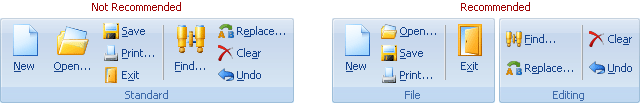
To minimize tab switching, place frequently used commands in the first tab.
To facilitate tab navigation by end-users, the number of tabs should not be more than nine.
Commands on the contextual tabs should not duplicate commands on the normal tabs, because the contextual tabs are only an addition to normal tabs and are displayed in a certain application context.
To facilitate browsing of tab groups by end-users, the number of groups should not be more than seven.
Don’t use large tab groups – avoid tab groups that contain more than ten items. It’s better to arrange items into small, logical groups.
Provide small (16x16) and large (32x32) images for bar items – when the Ribbon is narrowed, large icons are automatically transformed into small icons so that bar items can be stacked vertically. As a result, more items are shown in a small space. Two of the Ribbon areas – the Ribbon Quick Access Toolbar and Ribbon Tab Area Toolbar – can only display small icons.
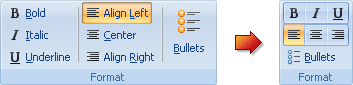
Use button groups – in some instances it’s better to use button groups (see the item link’s ButtonGroup property) instead of displaying individual bar items. When you create button groups, avoid groups that contain more than five items.
Use bar item captions (along with large and small icons) where possible.
Since the Ribbon provides a flexible layout (it can be dynamically resized by end-users at runtime), create toolbar and bar item captions that are as short as possible.