SwipeContainer Class
Contains appearance and behavior settings for data items that users can swipe.
Namespace: DevExpress.Maui.CollectionView
Assembly: DevExpress.Maui.CollectionView.dll
NuGet Package: DevExpress.Maui.CollectionView
Declaration
[DXLicenseMAUI]
public class SwipeContainer :
    DXViewBase,
    ISwipeContainer
Remarks
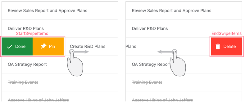
You can enable users to swipe items in a CollectionView to perform custom actions (for example, modify, reorder, or delete data). To do this, assign a data template with a SwipeContainer object to the DXCollectionView.ItemTemplate property and specify the following properties of this container:
- ItemView - defines the appearance of CollectionView items.
StartSwipeItems / EndSwipeItems - store collections of swipe items. A swipe item is a visual element that appears on the left or right side of a data item on a swipe gesture and performs a custom action on tap. If the CollectionView is horizontally oriented, it displays swipe items on the top or bottom of data items. Swipe items can be of the following types:
- SwipeContainerItem - displays a swipe item as a button for which you can specify the image, caption, and text settings.
- CustomSwipeItem - allows you to specify a custom view for a swipe item.
To assign an action to a swipe item, define a command in a view model and bind this command to the swipe item’s Command property, or handle the Tap event.
FullSwipeMode - specifies whether the CollectionView should perform the first action from the StartSwipeItems collection and the last action from EndSwipeItems in response to a full swipe across a data item.