Blazor Grid
- 8 minutes to read
The DevExpress Grid for Blazor (DxGrid) allows you to display, manage, and shape tabular data.
API Reference
Refer to the following list for the component API reference: DxGrid Members.
Data Binding
The DevExpress Blazor Grid supports various data binding scenarios:
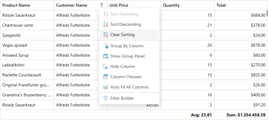
Sort Data
Users can sort data by an unlimited number of columns. The sort glyph indicates the current sort order (ascending or descending). You can also sort data in code.
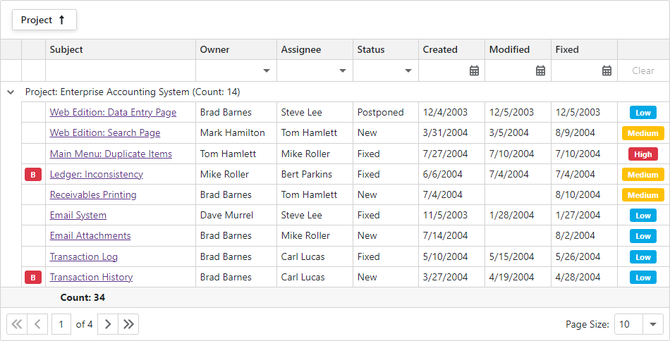
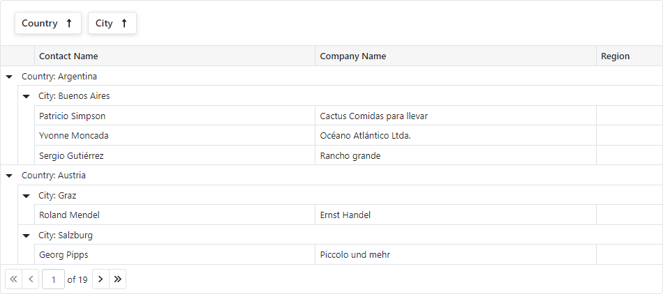
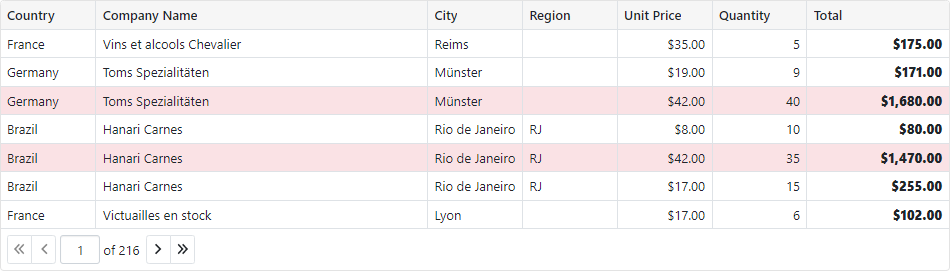
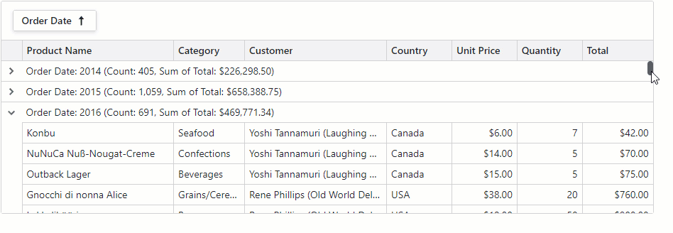
Group Data
The Grid supports grouping by value and display text, interval grouping, and custom grouping algorithms. Users can drag and drop column headers onto the group panel to group Grid data. You can also group data by any number of columns in code.
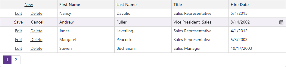
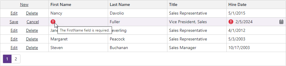
Edit Data
DevExpress Blazor Grid supports multiple data edit modes:
- Inline Edit Form
- The Grid displays the edit form instead of the edited data row.
- Pop-Up Edit Form
- The Grid displays the edit form in a pop-up window.
- Inline Edit Row
- The Grid displays inline editors instead of the edited row.
- Cell Editing
- The Grid displays an in-place editor instead of focused cell content. Unlike other modes, the Grid in
EditCellmode allows users to click a data cell to edit it. The Grid validates and saves all cell values simultaneously when focus leaves the edited row. - Batch Editing
- You can implement batch data editing based on the
EditCellmode. Batch data editing allows users to accumulate changes in memory and post them to the database when desired.
Validate User Input
In every edit mode, you can enable the standard Blazor validation mechanism (based on DataAnnotationsValidator) or create custom validator components.
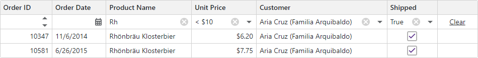
Filter Data
The DevExpress Blazor Grid ships with the following UI elements that allow users to filter data:
- Column Filter Menu
- The Excel-inspired filter menu displays unique column values as a checklist with a Select All option. An integrated search box is also available. You can modify the value list or use a template to customize the menu.
- Filter Row
- The filter row displays in-place editors where users can type filter values. The grid can filter data by value or display text.
- Filter Panel and Filter Builder
- The filter panel displays the current filter condition and allows users to deactivate/clear it. Users can click this filter condition to open the filter builder dialog. In the dialog, they can edit and combine filter criteria applied to Grid columns.
- Search Box
- Users can type text in the search box to filter and highlight data.
- Semantic Search
- DevExpress data-aware components (including Grid) support semantic search integration. You can modify the demo source code as needed.
You can also filter Grid data in code using criteria operator syntax.
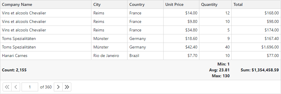
Summary
You can compute summaries across all Grid records (total summaries) or for individual groups (group summaries).
The Grid includes predefined aggregate functions: Sum, Min, Max, Avg, and Count. In addition to these functions, you can implement custom summary algorithms.
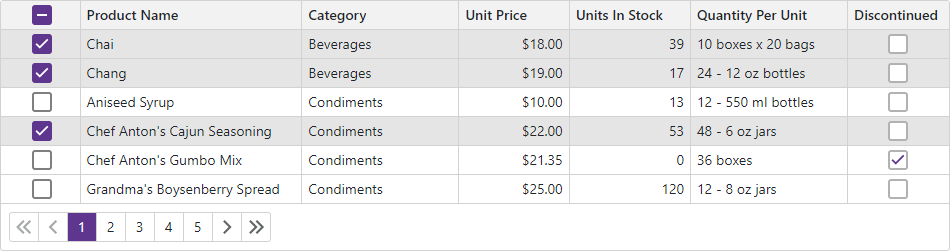
Selection
The DevExpress Blazor Grid supports single and multiple row selection. Users can click rows or use a specially-designed column to select/deselect records. You can also manage selection in code.
Focus
The DevExpress Blazor Grid supports a focused row that highlights a row when a user clicks it.
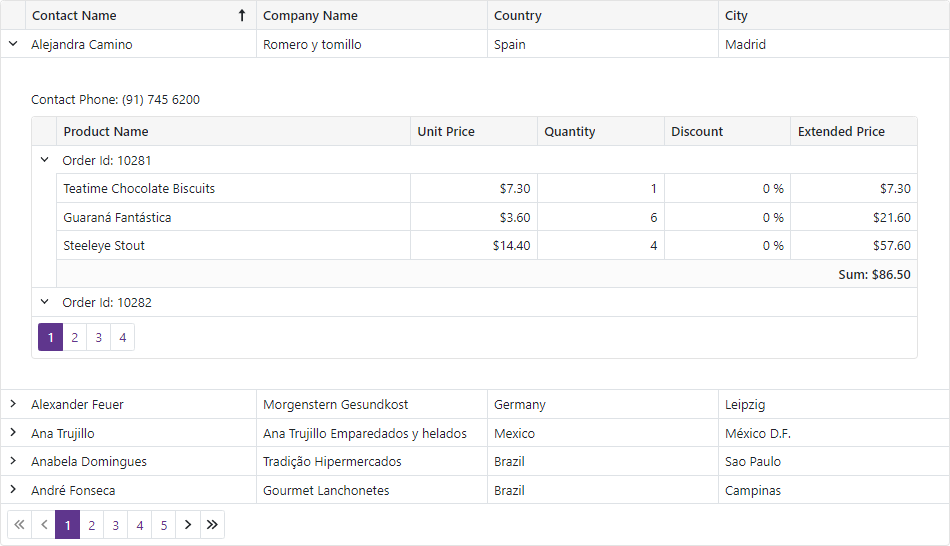
Master-Detail Views
Row Preview
The grid can display preview sections under each data row across all columns. These sections can display any content, including tables, values from data source fields, custom text, etc.

Nested Grid
The DevExpress Blazor Grid allows you to build hierarchical layouts of any complexity and depth.
Templates
The Grid implements a number of template properties that allow you to customize content and appearance of different Grid elements.
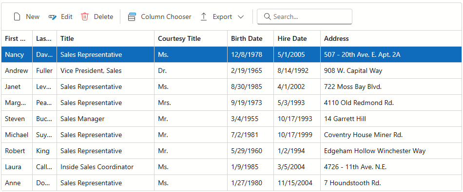
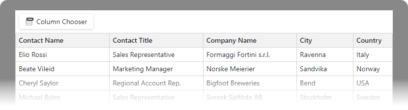
Columns
The DevExpress Blazor Grid includes different column types:
- Data column
- You can supply values from the bound data source or implement a custom value calculation logic.
- Command column
- Displays CRUD-related buttons (New, Edit, and Delete) and the Clear button that resets values in the filter row.
- Selection column
- Allows users to select and deselect rows. Displays checkboxes in multiple selection mode and radio buttons in single selection mode.
- Band Column
- You can combine columns into logical groups called bands. Each group has its own header.
All column types support various customization options. Refer to the following section for additional information: Column Settings.
Toolbar
You can add a toolbar at the top edge of a Grid component and implement data shaping operations to perform in the UI.
Context Menu
The DevExpress Blazor Grid allows you to display context menus with predefined and custom commands.
Save and Restore Layout
You can save and restore the Grid layout automatically or on demand. Layout information includes the current page, column sort order and direction, column position, filter values, and grouped columns.
Export Data
The Grid allows you to export data to XLS, XLSX, CSV, and PDF. The output file reflects the current filter, sort order, and group settings.
Appearance
Specify the size mode to display Grid elements (for instance, text size and row height) and built-in components (for instance, pager and buttons) in small, medium, or large predefined sizes.
You can customize the appearance of most Grid UI elements based on custom conditions.
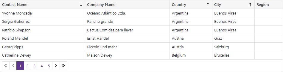
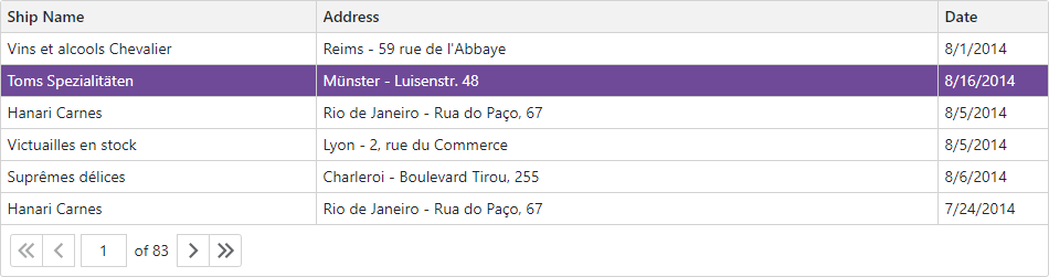
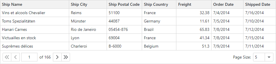
Paging
The DevExpress Blazor Grid splits data rows across multiple pages and displays a pager to enable data navigation. The pager can include a page size selector that allows users to change the page size at runtime.
Scrolling
The DevExpress Blazor Grid component supports regular and virtual scrolling modes. You can specify these modes separately for rows or columns. You can also combine scrolling with paging. For instance, you can use regular horizontal scrolling with virtual vertical scrolling, or combine paging with column virtualization.
Keyboard Support
Users can access every UI element in the Grid with a keyboard. Keyboard navigation is implemented on the client and works seamlessly even in Blazor Server apps with a slow connection.
Note
Keyboard support allows users to interact with application content in cases they cannot use a mouse or they rely on assistive technologies (like screen readers or switch devices). Refer to the Accessibility help topic for information on other accessibility areas that we address.
Responsive Layout
The DevExpress Layout Breakpoint component allows you to adapt page layouts to different screen sizes. You can modify the grid layout (for instance, add and hide columns) when a screen size breakpoint is activated.
Drag and Drop Rows
The DevExpress Blazor Grid supports drag-and-drop operations. You can reorder rows and move them between components.

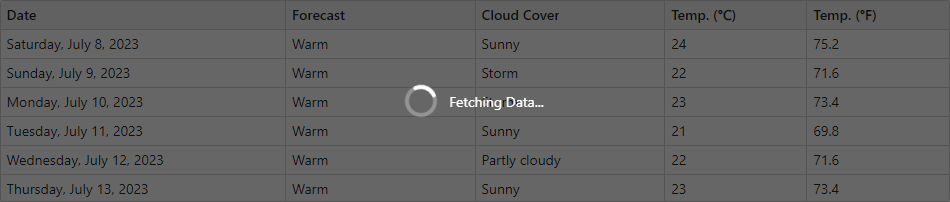
Loading Animation
Blazor Grid automatically displays a loading panel when you open a filter menu with many unique items or execute a time-consuming export operation.
In other cases, you can use our DevExpress Loading Panel component to display a loading indicator (for example, when Grid fetches data from server).
Localization
The Grid component’s UI elements such as labels, context menus, and error messages are displayed in English. Localization automatically adapts the component to the user’s preferred language.
DevExpress components include predefined satellite resource assemblies for German, Spanish, and Japanese. Use the DevExpress Localization Service to create and download a custom set of satellite assemblies, and modify resources.