Appearance Customization in Blazor Grid
- 2 minutes to read
Our DevExpress Grid for Blazor allows you to customize cell content and UI element appearance. This topic lists available options.
Styles and Attributes
Like other Blazor components, the Grid supports custom CSS classes. For some Grid elements, you can assign classes directly:
| Grid Element | Property |
|---|---|
| DxGrid | CssClass |
| PopupEditForm | PopupEditFormCssClass |
| DxEditSettings | CssClass |
| DxEditorButton | CssClass |
| DxDropDownEditSettings | DropDownCssClass |
| DxDropDownEditSettings | DropDownBodyCssClass |
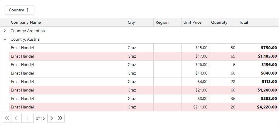
To customize other elements, handle the CustomizeElement event. In the event handler, you can implement any conditions of how custom styles are applied to specific components.

You can also handle the CustomizeElement event to show a context menu or implement drag and drop functionality. Refer to the following example for implementation details and sample code: Show the Context Menu and Customize its Appearance.
Command Display Mode
The Grid component displays command column actions as icons. Specify DisplayMode to replace icons with captions or display both.

Templates
Grid templates are RenderFragment<TValue> properties. They replace default content area rendering and allow you to arrange custom content in various Grid elements.

For additional information, see the following topic: Templates in Blazor Grid.
Display Text
The Grid component creates element content based on the specified data source. You can customize how the component displays text content in data cells, column headers, group rows, and summaries. The display text can affect element appearance and data shaping operations.

For additional information, see the following topic: Display Text in Blazor Grid.