Paging in Blazor Grid
- 7 minutes to read
The DevExpress Blazor Grid splits data rows across multiple pages and displays a pager to enable data navigation. The pager can contain a page size selector that allows users to change the page size at runtime. You can also navigate between pages in code.
Page Size
Use the PageSize property to specify the maximum number of rows displayed on a page. You can display the page size selector that allows users to change the page size at runtime. Once a user selects a new value in this selector, the PageSize property value is updated and the PageSizeChanged event fires.
<DxGrid Data="@Data" PageSize="4" >
    <Columns> ... </Columns>
</DxGrid>

The PageSize property is not in effect if the ShowAllRows or VirtualScrollingEnabled property is set to true.
If a cell value does not fit into a cell as a single line, the cell displays multiple lines of text. Set the TextWrapEnabled property to false to display every row in one line, trim extra words, and display an ellipsis instead.
Display All Data Rows on a Page
Set the ShowAllRows property to true to display all data rows on one page. If content height exceeds the size of the component itself, DxGrid displays a vertical scrollbar. If the size of the component is not limited, DxGrid enlarges to fit all rows.
.my-class {
    height: 200px;
}
<DxGrid Data="@Data" CssClass="my-class" ShowAllRows="true" >
    <Columns> ... </Columns>
</DxGrid>

This mode can cause performance issues if the grid component is bound to a large data source. In this case, use the VirtualScrollingEnabled property instead, to enable virtual scrolling. In this mode, the grid component renders rows that are in the viewport and several rows above and below the viewport.
Pager UI
DxGrid displays a pager below data rows. You can use the PagerPosition property to show the pager at the top of the grid or both at the top and bottom.
<DxGrid Data="@Data" PageSize="4" PagerPosition="GridPagerPosition.TopAndBottom" >
    <Columns> ... </Columns>
</DxGrid>

Use the PagerNavigationMode property to specify how users navigate among pages. The following values are available:
InputBoxThe pager displays an input box. Users can enter the desired page number within it.

NumericButtonsThe pager displays numeric buttons.

You can use the following properties to customize this mode:
- PagerVisibleNumericButtonCount
- Specifies the maximum number of numeric buttons displayed in the pager.
- PagerAutoHideNavButtons
- Specifies whether arrow navigation buttons are hidden when all numeric buttons are displayed in the pager.
<DxGrid Data="@Data"
        PagerNavigationMode="PagerNavigationMode.NumericButtons"
        PagerVisibleNumericButtonCount="15"
        PagerAutoHideNavButtons="true" >
    <Columns> ... </Columns>
</DxGrid>
Auto- (Default value). If the number of pages is greater than or equal to the PagerSwitchToInputBoxButtonCount value or the Grid is displayed on small devices, the pager displays an input box. Otherwise, numeric buttons are displayed.
The Grid component includes built-in keyboard shortcuts that allow you to navigate between pages. Refer to the following help topic for additional information: Keyboard Support in Blazor Grid.
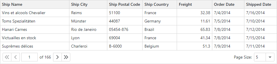
Page Size Selector
The Grid allows users to change the page size dynamically at runtime. To display the page size selector, enable the PageSizeSelectorVisible option. Use the PageSizeSelectorItems property to specify predefined page sizes available in a drop-down list. You can also enable the PageSizeSelectorAllRowsItemVisible option to display all grid rows on one page (the All dropdown item).
<DxGrid Data="@Data" PagerPosition="GridPagerPosition.Top"
        PageSizeSelectorVisible="true"
        PageSizeSelectorItems="@(new int[] { 5, 10, 15 })"
        PageSizeSelectorAllRowsItemVisible="true" >
    <Columns> ... </Columns>
</DxGrid>

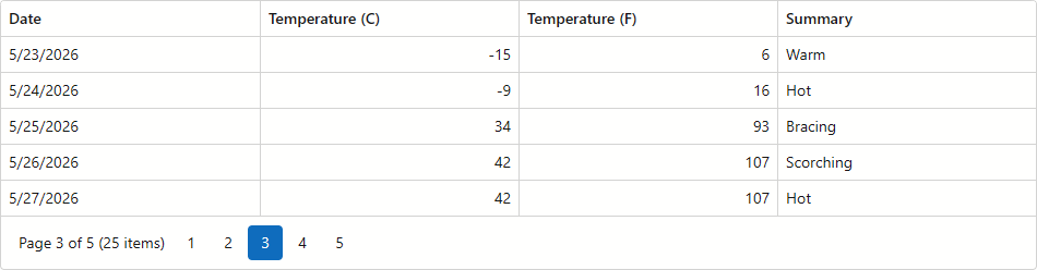
Pager Summary
Activate the PagerSummaryVisible property to add a summary item to the Grid pager. The summary displays the current page number, page count, and data row count.
<DxGrid Data="@Data" PageSize="5" PagerSummaryVisible="true">
    <Columns> ... </Columns>
</DxGrid>
Navigation in Code
The PageIndex property identifies the active page. Use this property to switch between pages in code. When the active page changes, the PageIndexChanged event fires. To get the total number of grid pages, call the GetPageCount() method.
<DxGrid Data="@Data" PageIndex="@GridPageIndex" PageIndexChanged="OnPageIndexChanged">
    <Columns> ... </Columns>
</DxGrid>

@code {
    // ...
    int GridPageIndex { get; set; }

    void OnPageIndexChanged(int newPageIndex) {
        GridPageIndex = newPageIndex;
        // ...
    }
}
You can call the following methods to navigate to a specific row:
- MakeRowVisible(Int32)
- Makes the row with the specified visible index visible on screen.
- MakeDataItemVisibleAsync(Object)
- Makes the row bound to the specified data item visible on screen.
- SetFocusedRowIndex(Int32)
- Moves focus to the row with the specified visible index.
- SetFocusedDataItemAsync(Object)
- Moves focus to the row bound to the specified data item.
If the specified row is on another page, the grid component navigates to that page and updates the PageIndex property. Otherwise, the component scrolls data up or down until the row appears.
void ScrollToLastRow() {
    Grid.MakeRowVisible(Grid.GetVisibleRowCount() - 1);
}
Save and Restore Paging Settings
The Grid allows you to save its layout between application work sessions. The saved information includes paging settings that users can change: current page number and page size. Refer to the following topic for additional information: GridPersistentLayout.
Hide the Pager
Set the PagerVisible property to false to hide the built-in pager. Note that DxGrid hides the pager when the ShowAllRows or VirtualScrollingEnabled property is set to true.
Related API
This section contains a comprehensive paging-related API reference.
| DxGrid API member | Type | Description |
|---|---|---|
| PageIndex | Property | Specifies the active page index. |
| PagerAutoHideNavButtons | Property | Specifies whether arrow navigation buttons are hidden when all numeric buttons are displayed in the pager. |
| PagerNavigationMode | Property | Specifies how users navigate between Grid pages. |
| PagerPosition | Property | Specifies the pager position. |
| PagerSummaryVisible | Property | Specifies whether the pager displays a summary item. |
| PagerSwitchToInputBoxButtonCount | Property | Specifies the number of pages when the pager switches from numeric buttons to the input box in Auto mode. |
| PagerVisible | Property | Specifies whether the Grid displays the pager. |
| PagerVisibleNumericButtonCount | Property | Specifies the maximum number of numeric buttons displayed in the pager. |
| PageSize | Property | Specifies the maximum number of rows displayed on a page. |
| PageSizeSelectorAllRowsItemVisible | Property | Specifies whether the page size selector contains the All item. |
| PageSizeSelectorItems | Property | Specifies items available in the page size selector. |
| PageSizeSelectorVisible | Property | Specifies whether the Grid displays the page size selector in the pager. |
| ShowAllRows | Property | Specifies whether the Grid displays all rows on one page. To avoid performance issues when the Grid is bound to a large data source, use the VirtualScrollingEnabled property instead. |
| GetPageCount() | Method | Returns the total number of pages in the Grid. |
| GetVisibleRowCount() | Method | Gets the total number of visible rows in the grid. |
| PageIndexChanged | Event | Fires when the grid’s active page index changes. |
| PageSizeChanged | Event | Fires when the page size changes. |
Task-Based Examples
This section contains code samples that demonstrate data paging functionality.
Activate the Page With the Selected Data Item
Pass a SelectedDataItem object as a MakeDataItemVisibleAsync(Object) method parameter to open the page that contains the row bound to the specified data item.
Grid.MakeDataItemVisibleAsync(Grid.SelectedDataItem);
Implement a Custom Pager
Grid does not support a template for the pager. If you want to display custom content in the pager area, set the PagerVisible property to false to hide the default pager and organize your own components for navigation in an external container.
In the following code snippet, an external <div> displays the total number of records next to a custom DxPager component:
.grid-container {
    width: 950px;
}
.pager-container {
    display: flex;
    justify-content: space-between;
    padding: 8px;
    border: 1px solid #d2d2d2;
    border-top: none;
}
<div class="grid-container">
    <DxGrid @ref="Grid"
            Data="Data"
            @bind-PageIndex="@ActivePageIndex"
            PagerVisible="false"
            PageSize="@PageSize"
            FooterDisplayMode="GridFooterDisplayMode.Never">
        <Columns>
            <DxGridDataColumn FieldName="ContactName" />
            <DxGridDataColumn FieldName="CompanyName" />
            <DxGridDataColumn FieldName="Country" />
            <DxGridDataColumn FieldName="City" />
        </Columns>
        <TotalSummary>
            <DxGridSummaryItem SummaryType="GridSummaryItemType.Count"
                               FieldName="@RowCountField"
                               Visible="false" />
        </TotalSummary>
    </DxGrid>
    <div class="pager-container">
        <DxPager PageCount="@PageCount" @bind-ActivePageIndex="@ActivePageIndex" />
        <div>
            Total: @TotalRecords records
        </div>
    </div>
</div>

@code {
    IGrid Grid { get; set; }
    IEnumerable<object> Data { get; set; }
    int PageCount { get; set; }
    int TotalRecords { get; set; }
    int PageSize { get; set; } = 6;
    int ActivePageIndex { get; set; } = 0;
    string RowCountField { get; set; } = "Country";

    protected override async Task OnInitializedAsync() {
        Data = await NwindDataService.GetCustomersAsync();
    }

    protected override void OnAfterRender(bool firstRender) {
        TotalRecords = (int)(Grid.GetTotalSummaryValue(Grid?.GetTotalSummaryItems().First()));
        PageCount = (int)Math.Ceiling((decimal)TotalRecords / PageSize);
        StateHasChanged();
        base.OnAfterRender(firstRender);
    }
}
