HatchFillStyle.DXHatchStyle Property
Gets or sets the pattern used to hatch treemap items. Use this property in non-Windows environments.
Namespace: DevExpress.XtraTreeMap
Assembly: DevExpress.XtraTreeMap.v25.2.dll
NuGet Package: DevExpress.TreeMap
Declaration
Property Value
| Type | Description |
|---|---|
| DXHatchStyle | A pattern that applies to items. |
Available values:
| Name | Description |
|---|---|
| Horizontal | A pattern of horizontal lines. |
| Vertical | A pattern of vertical lines. |
| ForwardDiagonal | A pattern of lines on a diagonal from upper left to lower right. |
| BackwardDiagonal | A pattern of lines on a diagonal from upper right to lower left edges. |
| Cross | Cross lines. |
| DiagonalCross | Crisscross diagonal lines. |
| Percent05 | A 5-percent hatch. The ratio of foreground color to background color is 5:95. |
| Percent10 | A 10-percent hatch. The ratio of foreground color to background color is 10:90 |
| Percent20 | A 20-percent hatch. The ratio of foreground color to background color is 20:80. |
| Percent25 | A 25-percent hatch. The ratio of foreground color to background color is 25:75. |
| Percent30 | A 30-percent hatch. The ratio of foreground color to background color is 30:70. |
| Percent40 | A 40-percent hatch. The ratio of foreground color to background color is 40:60. |
| Percent50 | A 50-percent hatch. The ratio of foreground color to background color is 50:50. |
| Percent60 | A 60-percent hatch. The ratio of foreground color to background color is 60:40. |
| Percent70 | A 70-percent hatch. The ratio of foreground color to background color is 70:30. |
| Percent75 | A 75-percent hatch. The ratio of foreground color to background color is 75:25. |
| Percent80 | A 80-percent hatch. The ratio of foreground color to background color is 80:100. |
| Percent90 | A 90-percent hatch. The ratio of foreground color to background color is 90:10. |
| LightDownwardDiagonal | Diagonal lines that slant to the right from top points to bottom points and are spaced 50 percent closer together than |
| LightUpwardDiagonal | Diagonal lines that slant to the left from top points to bottom points and are spaced 50 percent closer together than |
| DarkDownwardDiagonal | Diagonal lines that slant to the right from top points to bottom points are spaced 50 percent closer and twice the width of |
| DarkUpwardDiagonal | Diagonal lines that slant to the left from top points to bottom points are spaced 50 percent closer and twice the width of |
| WideDownwardDiagonal | Diagonal lines that slant to the right from top points to bottom points, have the same spacing as hatch style |
| WideUpwardDiagonal | Diagonal lines that slant to the left from top points to bottom points, have the same spacing as hatch style |
| LightVertical | Vertical lines that are spaced 50 percent closer together than |
| LightHorizontal | Horizontal lines that are spaced 50 percent closer together than |
| NarrowVertical | Vertical lines that are spaced 75 percent closer together than hatch style |
| NarrowHorizontal | Horizontal lines that are spaced 75 percent closer together than hatch style |
| DarkVertical | Vertical lines that are spaced 50 percent closer than |
| DarkHorizontal | Horizontal lines that are spaced 50 percent closer than |
| DashedDownwardDiagonal | Dashed diagonal lines that slant to the right from top points to bottom points. |
| DashedUpwardDiagonal | Dashed diagonal lines that slant to the left from top points to bottom points. |
| DashedHorizontal | Dashed horizontal lines. |
| DashedVertical | Dashed vertical lines. |
| SmallConfetti | A confetti pattern. |
| LargeConfetti | A confetti composed of larger pieces than |
| ZigZag | Horizontal lines that are composed of zigzags. |
| Wave | Horizontal lines that are composed of tildes. |
| DiagonalBrick | Layered bricks that slant to the left from top points to bottom points. |
| HorizontalBrick | Horizontally layered bricks. |
| Weave | A woven material pattern. |
| Plaid | A plaid material pattern. |
| Divot | Divot pattern. |
| DottedGrid | Horizontal and vertical crossed lines, each of which is composed of dots. |
| DottedDiamond | Forward diagonal and backward diagonal crosses lines, each of which is composed of dots. |
| Shingle | Diagonally layered shingles that slant to the right from top points to bottom points. |
| Trellis | Trellis pattern. |
| Sphere | Spheres laid adjacent to one another. |
| SmallGrid | Horizontal and vertical lines that cross and are spaced 50 percent closer together than hatch style Cross. |
| SmallCheckerBoard | A checkerboard pattern. |
| LargeCheckerBoard | A checkerboard with squares that are twice the size of |
| OutlinedDiamond | Forward diagonal and backward diagonal lines that cross but are not antialiased. |
| SolidDiamond | A diagonally placed checkerboard. |
| LargeGrid | Crosses lines pattern. |
| Min | Specifies the |
| Max | Specifies the |
Example
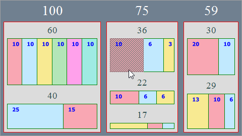
This example demonstrates how to customize a treemap’s appearance.

The TreeMapControl.Appearance property provides access to the treemap’s appearance options.
- To customize the group style, use the TreeMapAppearance.GroupStyle property.
- The TreeMapAppearance.LeafStyle property stores appearance settings for treemap leaves.
- To define the appearance of highlighted treemap items, use the TreeMapAppearance.HighlightedLeafStyle property.
treeMapControl1.Appearance.GroupStyle.BorderColor = Color.Red;
treeMapControl1.GroupBorderVisible = DevExpress.Utils.DefaultBoolean.True;
treeMapControl1.Appearance.GroupStyle.Fill = Color.SlateGray;
treeMapControl1.Appearance.GroupStyle.Padding = new Padding(4);
treeMapControl1.Appearance.GroupStyle.DXLabelAlignment = DXStringAlignment.Center;
treeMapControl1.Appearance.GroupStyle.Font = new Font(FontFamily.GenericSerif, 20);
treeMapControl1.Appearance.GroupStyle.TextColor = Color.White;
treeMapControl1.Appearance.GroupStyle.SubGroupFont = new Font(FontFamily.GenericSerif, 14);
treeMapControl1.Appearance.GroupStyle.SubGroupTextColor = Color.DarkSlateGray;

treeMapControl1.Appearance.LeafStyle.BorderColor = Color.Green;
treeMapControl1.Appearance.LeafStyle.DXLabelAlignment = DXStringAlignment.Near;
treeMapControl1.Appearance.LeafStyle.TextGlowColor = Color.Transparent;
treeMapControl1.Appearance.LeafStyle.TextColor = Color.Blue;

treeMapControl1.Appearance.HighlightedLeafStyle.FillStyle = new HatchFillStyle {
    DXHatchStyle = DevExpress.Drawing.DXHatchStyle.Percent50,
    Color2 = Color.Transparent
};