TreeMapAppearance.HighlightedLeafStyle Property
Returns a style used to specify the appearance of highlighted treemap leaves.
Namespace: DevExpress.XtraTreeMap
Assembly: DevExpress.XtraTreeMap.v26.1.dll
Declaration
Property Value
| Type | Description |
|---|---|
| TreeMapItemLeafStyle | A treemap item style. |
Example
This example demonstrates how to customize a treemap’s appearance.
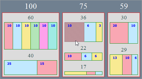
The TreeMapControl.Appearance property provides access to the treemap’s appearance options.
- To customize the group style, use the TreeMapAppearance.GroupStyle property.
- The TreeMapAppearance.LeafStyle property stores appearance settings for treemap leaves.
- To define the appearance of highlighted treemap items, use the
TreeMapAppearance.HighlightedLeafStyleproperty.
treeMapControl1.Appearance.GroupStyle.BorderColor = Color.Red;
treeMapControl1.GroupBorderVisible = DevExpress.Utils.DefaultBoolean.True;
treeMapControl1.Appearance.GroupStyle.Fill = Color.SlateGray;
treeMapControl1.Appearance.GroupStyle.Padding = new Padding(4);
treeMapControl1.Appearance.GroupStyle.DXLabelAlignment = DXStringAlignment.Center;
treeMapControl1.Appearance.GroupStyle.Font = new Font(FontFamily.GenericSerif, 20);
treeMapControl1.Appearance.GroupStyle.TextColor = Color.White;
treeMapControl1.Appearance.GroupStyle.SubGroupFont = new Font(FontFamily.GenericSerif, 14);
treeMapControl1.Appearance.GroupStyle.SubGroupTextColor = Color.DarkSlateGray;

treeMapControl1.Appearance.LeafStyle.BorderColor = Color.Green;
treeMapControl1.Appearance.LeafStyle.DXLabelAlignment = DXStringAlignment.Near;
treeMapControl1.Appearance.LeafStyle.TextGlowColor = Color.Transparent;
treeMapControl1.Appearance.LeafStyle.TextColor = Color.Blue;

treeMapControl1.Appearance.HighlightedLeafStyle.FillStyle = new HatchFillStyle {
    DXHatchStyle = DevExpress.Drawing.DXHatchStyle.Percent50,
    Color2 = Color.Transparent
};
See Also