Gallery Controls
- 5 minutes to read
Several DevExpress controls can display image galleries. Some of these controls are designed to display solely image galleries, while in other controls, image galleries are only a part of the control functionality. This topic lists the available gallery controls, describes the structure of galleries, and explains common gallery features.
On this page:
- RibbonControl
- GalleryControl
- PopupGalleryEdit
- GalleryDropDown
- Gallery Elements
- Common Gallery Features
Online Video
Ribbon Control
The Ribbon Control implements the Ribbon UI introduced in MS Office products. Beside editors, menus, and regular and check buttons, the Ribbon Control can display inline and drop-down image galleries.
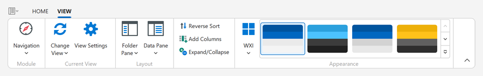
Use the RibbonGalleryBarItem object to create Galleries in the Ribbon control.
Read the following help topic for details: In-Ribbon Galleries.
Gallery Control
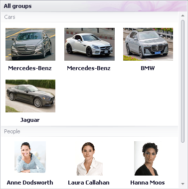
GalleryControl is a standalone image gallery control.
Use the GalleryControl.Gallery property to access and customize the gallery. See the GalleryControl class description for detailed information.
Popup Gallery Edit
PopupGalleryEdit is an editor that supports a drop-down image gallery. This control can be used as an in-place editor within cells in container controls and components (e.g., GridControl, TreeList, BarManager, etc.).
The editor’s value and display text are formed from the selected gallery item(s).
The gallery in this control is referred to by the RepositoryItemPopupGalleryEdit.Gallery property, which is of the PopupGalleryEditGallery type.
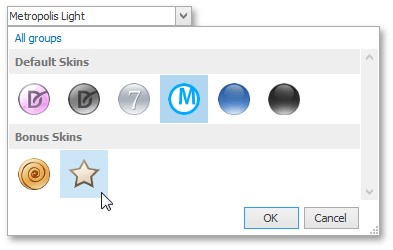
Gallery DropDown
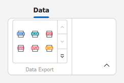
GalleryDropDown is a popup gallery control that can be displayed as a context menu. This control is also used to implement drop-down galleries in the Ribbon Control.
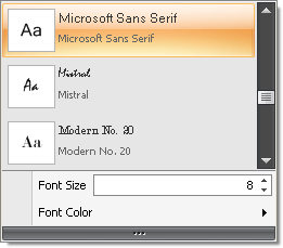
The GalleryDropDown allows custom menu items (bar items) to be displayed below the embedded gallery. In the image above, Font Size and Font Color are custom menu items.
The gallery in this control is accessed using the GalleryDropDown.Gallery property, which is of the InDropDownGallery type.
Gallery UI Elements
All galleries in DevExpress controls are derived from one ancestor – the BaseGallery class – and they have some common features. To learn about additional features of specific gallery controls, see the descriptions of these controls.
Structurally and visually, each gallery consists of gallery items (GalleryItem) combined into gallery item groups (GalleryItemGroup).
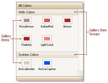
Gallery items display images and text, while gallery item groups are tailored to separate sets of items. In some controls, gallery item group captions (GalleryItemGroup.Caption) are initially hidden. To toggle group caption visibility, use the BaseGallery.ShowGroupCaption property. To show text for gallery items, use BaseGallery.ShowItemText. See Gallery Items to learn about basic item features.
Gallery controls allow you to create their elements at design time. See the following topic to learn more.
To create gallery items at runtime, first add a gallery item group (GalleryItemGroup) to the BaseGallery.Groups collection. Then, use the GalleryItemGroup.Items collection to add gallery items (GalleryItem) to this group. This approach is demonstrated in the following example.
Note
All images assigned to gallery items are loaded into memory simultaneously. As such, if the number of loaded images is too large, you may experience out-of-memory issues. If you have large images, resize them to a smaller size before assigning them to gallery items.
Common Gallery Features
The following table shows common gallery features and corresponding members, grouped by functionality.
Gallery Item View Features | Member(s) |
|---|---|
Ability to control item image display size | BaseGallery.ImageSize, BaseGallery.FixedImageSize, BaseGallery.UseMaxImageSize |
Ability to display captions and descriptions. | |
Customizable positions of item text relative to their images | |
Stretching, zooming or clipping item images | |
Tooltips | |
Hover images | |
Layout | |
Customizing item layout options. Some options are only applicable to the GalleryControl. | BaseGallery.ColumnCount, BaseGallery.FirstItemVertAlignment, BaseGallery.LastItemVertAlignment, BaseGallery.DistanceBetweenItems, BaseGallery.DistanceItemCaptionToDescription, BaseGallery.DistanceItemImageToText GalleryControlGallery.AutoFitColumns, GalleryControlGallery.ContentHorzAlignment |
Changing the orientation from vertical to horizontal. Supported only by the GalleryControl. | |
Custom commands shown below the gallery. Supported only by the GalleryDropDown. | |
Gallery Item Group Features | |
Ability to display group captions | |
Custom controls within group captions Supported only by the GalleryControl. | |
Filtering groups using a context menu. Not supported by In-Ribbon Galleries. | |
Customizing the group filter context menu. Not supported by In-Ribbon Galleries. | |
Behavior | |
Multiple item checking/selection modes | BaseGallery.ItemCheckMode, BaseGallery.AllowMarqueeSelection, BaseGallery.GetCheckedItems, BaseGallery.ClearSelectionOnClickEmptySpace, |
Standard and smooth scrolling | BaseGallery.ScrollMode and StandaloneGallery.UseOptimizedScrolling |
Responding to item clicking, checking and double-clicking | BaseGallery.ItemClick, BaseGallery.ItemCheckedChanged and BaseGallery.ItemDoubleClick |
Appearance | |
Ability to specify a background image and appearance settings for the control | BaseGallery.Appearance and GalleryControlGallery.BackgroundImage |
Custom drawing of gallery item images | |
Custom drawing of gallery item captions | |
Custom drawing of a gallery |
Examples
Display Gallery Items in 2x3 Layout
ribbonGalleryBarItem1.Gallery.RowCount = 2;
ribbonGalleryBarItem1.Gallery.ColumnCount = 3;
ribbonGalleryBarItem1.Gallery.ShowItemText = false;
Display Gallery Items in a Column

using DevExpress.Utils;

ribbonGalleryBarItem1.Gallery.ColumnCount = 1;
ribbonGalleryBarItem1.Gallery.RowCount = 2;
ribbonGalleryBarItem1.Gallery.ShowItemText = true;
ribbonGalleryBarItem1.Gallery.ItemImageLocation = Locations.Left;