How to: Manually Insert a Scale Break into an Axis
- 3 minutes to read
This tutorial demonstrates how an axis range can be manually split by scale breaks at design time. For the runtime example, refer to How to: Manually Insert a Scale Break into an Axis (Runtime Sample). For a general information, refer to Scale Breaks. To learn about an alternative approach - automatic scale breaks creation, refer to How to: Enable Automatic Scale Breaks for an Axis.
This tutorial consists of the following sections.
Steps 1-5. Creating a New Chart and Adding Data
- Start Microsoft Visual Studio, and create a new Windows Forms Application, or open an existing one.
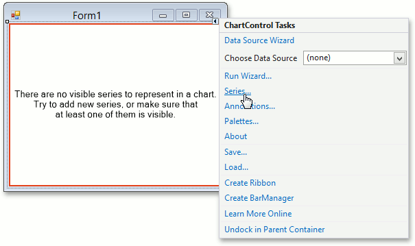
Drop the ChartControl onto the form. Note that in this instance, the Chart Wizard may be invoked (if its “Show wizard every time a new chart is added” option is enabled). In this example, we don’t need to use the wizard, so click Cancel to close the wizard’s window and manually customize the ChartControl.
Dock the control to fill the form by clicking Dock in parent container in the Chart’s actions list.
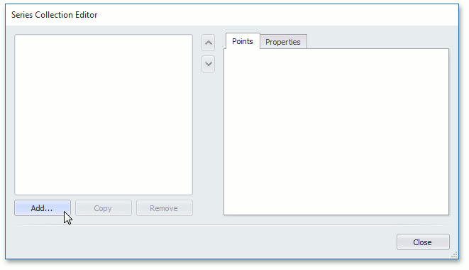
To add a new series to the chart, select the ChartControl, open its smart tag and choose the Series… item in the tasks list. Then, the Series Collection Editor will be invoked.
This dialog allows you to add new series to a chart, and maintain their properties. Click Add… and select Bar from the list of view types.
To populate the created series with data points in this example, we’ll use the following arguments and values for the series. These values have a significant spread, and simultaneously represent decimals, hundreds, and thousands.
Argument Value A 5 B 104 C 2006 D 3 E 108 F 2007 G 4 H 105 I 2009
Steps 6-7. Insert and Adjust Scale Breaks
Now, the chart has the following look.

As the image above demonstrates, the default look isn’t very informative, since the points that represent thousands occupy the most of the diagram, and the specifics of lesser values are obscured.
To improve that, we’ll insert scale breaks into the axis of values (Y-axis) as a replacement for two sparsely used regions (decimals - hundreds, and hundreds - thousands) with special strips, and the axis range will be adjusted appropriately.
To do this, select the Y-axis, and in the Properties window, locate the Axis.ScaleBreaks property, and click its ellipsis button, to invoke the Scale Break Collection Editor.
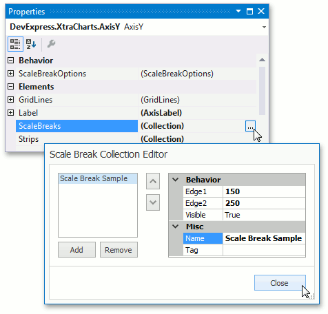
In this dialog, use the Add button to create two scale breaks. For the first scale break, set its ScaleBreak.Edge1 and ScaleBreak.Edge2 properties to 10 and 100, correspondingly. And, for the second scale break, set these properties to 110 and 2000.
Click Close, to quit the dialog, and apply the changes.
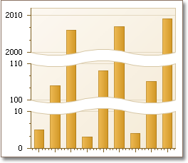
Our goal is achieved - the scale breaks are added to the axis. The result is shown in the following image.
Now, if required, you can customize the appearance of scale breaks, via the Axis.ScaleBreakOptions property. It provides access to the following appearance settings (note that these settings affect all scale breaks at one time, and don’t allow you to individually access a scale break entry).
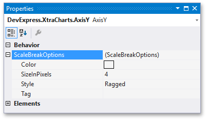
These options are described below:
- The ScaleBreakOptions.Color property determines the color of the scale breaks’ edges;
- The ScaleBreakOptions.SizeInPixels property determines the width of scale breaks, in pixels;
- The ScaleBreakOptions.Style property allows you to choose whether scale break edges should be ragged, wavy or straight.