Card Field
- 2 minutes to read
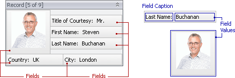
Represents a single data source field in a card. Card fields can be arranged using multiple layouts. Each card field displays a value region and can optionally display a caption.
Two objects are created in a LayoutView for each data source field:
- LayoutViewField object that contains layout settings, such as size constraints, indents, alignment settings, visibility and location.
- LayoutViewColumn object (derived from the GridColumn class) that provides a field’s various display and behavior settings (the field caption text, in-place editor type, display format, whether the field is editable, whether sorting and filtering is enabled, etc.).
LayoutViewColumn objects are stored in the ColumnView.Columns collection. To get a LayoutViewField object that corresponds to a LayoutViewColumn object, see the LayoutViewColumn.LayoutViewField property.
The following table lists the main properties affecting element appearance.
Appearance | Styles can be customized separately for card field captions and value cells. See these topics for more information. |
Field Layout | |
In-place Editor | |
Image | |
Field Caption Text | |
Field Border | |
Field Hot-Tracking | |
Hints | |
Size | The Size and EditorPreferredWidth properties of LayoutViewField objects. |
Size Constraints | The MinSize and MaxSize properties of LayoutViewField objects. |
Field Outer and Inner Indents | The Spacing and Padding properties of LayoutViewField objects specify the outer and inner indents respectively. |
Field Caption Visibility and Location | The TextVisible and TextLocation properties of LayoutViewField objects. |
Field Caption Alignment Settings | The TextAlignMode property of LayoutViewField objects. |
Field Caption Indent | The OptionsItemText.TextToControlDistance property of the LayoutView.TemplateCard object specifies the default caption indent for all fields. The TextToControlDistance property of individual LayoutViewField objects allows you to specify caption indents for specific fields. |