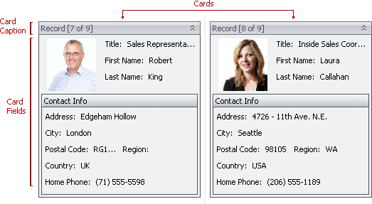
Card
In a LayoutView data records are represented as cards. A card consists of card fields arranged using a specific layout. A card can have a caption that by default displays a card’s ordinal number.
The following table lists the main properties which affect element appearance.
Appearance | The BorderColor properties of the LayoutViewAppearances.CardCaption and LayoutViewAppearances.FocusedCardCaption objects specify the colors of a card’s borders. These appearance settings are not applied in skinning paint schemes. Also, see the Card Caption, Card Field Caption and Card Field Value topics. |
Border Visibility | |
Size | The LayoutView.CardMinSize property specifies a card’s minimum size. A card can have a larger size if individual field sizes are not fixed and are therefore variable in size, depending on their contents. |
Field Layout |