Kanban Board
- 9 minutes to read
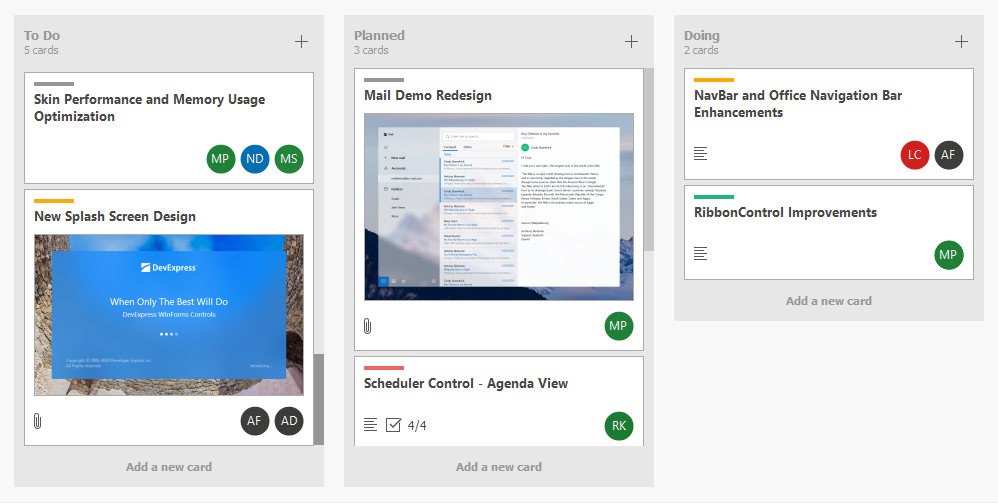
A Kanban board displays cards (tiles) grouped into columns or rows, where each group is a workflow stage (status). Cards are individual work items and can be dragged within or across groups to update their status and reorder them.
This help topic explains how to get started with the TileView to build a Kanban board:
Note
In this help topic, the term “tile” refers to a Kanban board item (card).
Create Data Source and Bind It to Data Grid
The following code snippet binds the Data Grid to a list of TaskRecord objects:
using DevExpress.Utils.Svg;
using DevExpress.XtraGrid.Views.Tile;
using System.ComponentModel;

namespace DXKanbanBoard {
    public partial class Form1 : DevExpress.XtraEditors.XtraForm {
        TileView tileView;
        public Form1() {
            InitializeComponent();
            // Create a new TileView instance and assign it to the grid control.
            tileView = new TileView(gridControl1);
            gridControl1.MainView = tileView;

            // Bind the grid control to a task list.
            gridControl1.DataSource = LoadTasks();
        }

        // Creates a collection of task records and returns it as a binding list.
        public BindingList<TaskRecord> LoadTasks() {
            return new BindingList<TaskRecord>() {
                new TaskRecord {
                    Caption = "Task 1",
                    Description = "Description for Task 1",
                    Status = TaskStatus.ToDo,
                    // svgImageCollection1 is created in the designer and contains SVG images.
                    AttachedImage = svgImageCollection1[0]
                },
                new TaskRecord {
                    Caption = "Task 2",
                    Description = "Description for Task 2",
                    Status = TaskStatus.Planned,
                    AttachedImage = svgImageCollection1[1]
                },
                new TaskRecord {
                    Caption = "Task 3",
                    Description = "Description for Task 3",
                    Status = TaskStatus.Testing,
                    AttachedImage = svgImageCollection1[2]
                }
            };
        }

    }
    // Defines task status options.
    public enum TaskStatus { ToDo, Planned, Doing, Testing, Done }
    public class TaskRecord {
        public string Caption { get; set; } // Task title.
        public string Description { get; set; } // Task description.
        public SvgImage AttachedImage { get; set; } // Associated SVG icon.
        public TaskStatus Status { get; set; } // Task status.
    }
}
Enable Kanban Layout Mode
Set the TileView.OptionsTiles.LayoutMode property to TileViewLayoutMode.Kanban to enable Kanban layout mode:
Create Tile Template
The TileView renders tiles based on a template. To create a tile template at design time, open the Data Grid’s Designer and switch to the Tile Template page:

Use the TileView.TileTemplate property to create a tile template in code.
See the following help topic for more information and code samples: Create Tile Template.
Group Tiles
Use the TileView.ColumnSet.GroupColumn property to specify the group column.
The following code snippet groups tiles based on the Status field:
Create Kanban Groups
Auto Generate Groups
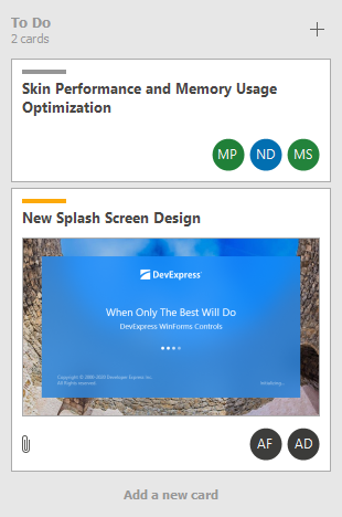
The TileView automatically generates groups for all unique values in the group column (TileView.ColumnSet.GroupColumn).
The TileView automatically deletes empty groups.
Create Groups Manually
Create KanbanGroup objects, customize group settings, and add groups to the TileView.OptionsKanban.Groups collection. The TileView does not automatically delete empty groups created manually as illustrated in the following animation:
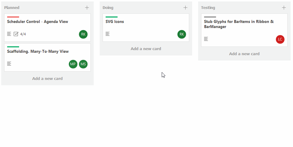
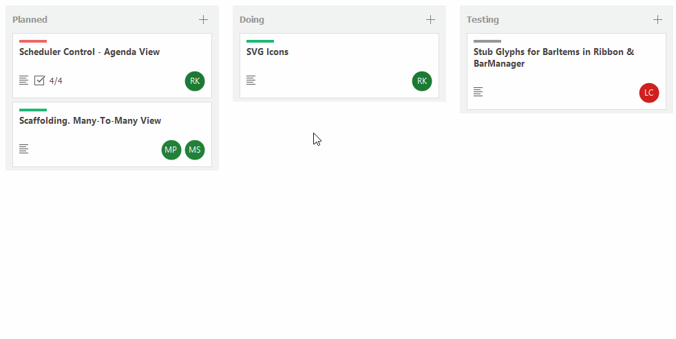
Enable Drag-and-Drop
Activate the TileView.OptionsDragDrop.AllowDrag options to allow users to drag tiles within or across groups:
The TileView allows a user to drag-and-drop a tile to a different position, which updates the corresponding data record in the underlying data source.
Use the following properties and events to manage drag-and-drop operations:
| API Name | Description |
|---|---|
| TileView.BeforeItemDrag | Fires when a tile drag operation is about to be started. Allows you to provide a drag image, or to cancel the operation. This event does not fire when you enable drag-and-drop using Drag And Drop Behavior. |
| TileView.BeforeItemDrop | Fires when a tile drop operation is initiated. This event does not fire when you enable drag-and-drop using Drag And Drop Behavior. |
| TileView.ItemDrag | Fires repeatedly when a user drags a tile. Allows you to prevent a tile from being dropped at a specific position. This event does not fire when you enable drag-and-drop using Drag And Drop Behavior. |
| TileView.ItemDrop | Fires after a tile drop operation has been completed. This event does not fire when you enable drag-and-drop using Drag And Drop Behavior. |
| KanbanGroup.AllowItemDrag | Gets or sets whether to disable tile drag-and-drop operations within and from the current group. |
| KanbanGroup.DropTargetGroups | The collection of groups that can accept tiles from the current group during drag-and-drop operations. |
Activate Tile Editing
Set the TileView.OptionsBehavior.EditingMode property to TileViewEditingMode.EditForm to allow users to edit tile values in the Edit Form:
See the following help topic for more information: Tile Editing.
Additional Customizations
Event-Based Tile Customization
Handle the TileView.ItemCustomize event to dynamically customize tile elements. The ItemCustomize event fires for each tile when it is about to be displayed. The following code snippet displays images in tiles:
using System.IO;
using System.Collections.Generic;
using DevExpress.XtraGrid.Views.Tile;

Dictionary<string, Image> imageCache = new Dictionary<string, Image>();
private void TileView1_ItemCustomize(object sender, TileViewItemCustomizeEventArgs e) {
    TileView view = sender as TileView;
    object cellValue = view.GetRowCellValue(e.RowHandle, "ImagePath");
    string imagePath = cellValue != null ? cellValue.ToString() : string.Empty;
    e.Item.Elements[2].Text = "";
    e.Item.Elements[2].ImageOptions.ImageSize = new Size(16, 16);
    e.Item.Elements[2].ImageOptions.Image = LoadImage(imagePath);
}
Image LoadImage(string path) {
    Image img;
    if(!imageCache.TryGetValue(path, out img)) {
        if(File.Exists(path))
            img = Image.FromFile(path);
        imageCache.Add(path, img);
    }
    return img;
}
Tile Auto Height
Enable auto height mode for a template row to adjust tile height based on content.
To activate this mode, set the TableRowDefinition.AutoHeight property to true for a specific row in the tile template. This setting forces the layout engine to calculate the row’s height dynamically, depending on the content of bound elements (for example, text labels or images).
Custom Group Header Text
The text displayed in group headers is specified by the GridColumn.Caption property. Handle the ColumnView.CustomColumnDisplayText event to display custom text in group headers:

The following code snippet displays the number of tiles in group headers:
void TileView_CustomColumnDisplayText(object sender, Views.Base.CustomColumnDisplayTextEventArgs e) {
    if(e.IsForGroupRow) {
        var kanbanGroup = tileView.GetKanbanGroupByValue(e.Value);
        int count = tileView.GetChildRowCount(kanbanGroup);
        string cards = count == 1 ? " card" : " cards";
        e.DisplayText += "<br><size=-2><r>" + count.ToString() + cards;
    }
}
Display Custom Buttons in Group Headers
Group headers can display custom buttons. Custom buttons can be always visible or visible only when the user hovers the mouse pointer over a group header.

Add custom buttons (ContextItem) to the TileView.OptionsKanban.GroupHeaderContextButtons collection. Handle the TileView.GroupHeaderContextButtonClick event to process button clicks.
Display a Group Footer Button
Use the TileView.OptionsKanban.GroupFooterButton property to display a footer button in Kanban groups. The KanbanGroup.FooterButton property allows you to customize a footer button for individual Kanban groups.

// Display the button in the group footer.
tileView.OptionsKanban.GroupFooterButton.Visible = DevExpress.Utils.DefaultBoolean.True;
// Set the text for the group footer button.
tileView.OptionsKanban.GroupFooterButton.Text = "Add Task";
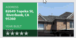
Display Context Buttons in Tiles
Use the TileView.ContextButtons property to create context buttons. Context buttons appear when the user hovers the mouse pointer over a tile:
tileView.ContextButtonOptions.TopPanelColor = Color.FromArgb(160, 0, 0, 0);
tileView.ContextButtonOptions.BottomPanelColor = Color.FromArgb(160, 0, 0, 0);

ContextButton cb_delete = new ContextButton();
cb_delete.AlignmentOptions.Panel = ContextItemPanel.Center;
cb_delete.AlignmentOptions.Position = ContextItemPosition.Center;
cb_delete.ImageOptionsCollection.ItemNormal.Image = Image.FromFile(".\\cross.png");
cb_delete.Click += (o, e) =>
{
    if (XtraMessageBox.Show("Delete the item?", "Warning", MessageBoxButtons.YesNo) == DialogResult.Yes)
        tileView.DeleteSelectedRows();
};
tileView.ContextButtons.Add(cb_delete);

TrackBarContextButton cb_track = new TrackBarContextButton();
cb_track.AlignmentOptions.Panel = ContextItemPanel.Top;
tileView.ContextButtons.Add(cb_track);

RatingContextButton cb_rate = new RatingContextButton();
cb_rate.ImageOptionsCollection.ItemNormal.Image = Image.FromFile(".\\Stars3_1.png");
cb_rate.ImageOptionsCollection.ItemChecked.Image = Image.FromFile(".\\Stars3_3.png");
cb_rate.Visibility = ContextItemVisibility.Visible;
cb_rate.AlignmentOptions.Panel = ContextItemPanel.Bottom;
tileView.ContextButtons.Add(cb_rate);
Tile Orientation
Use the TileView.OptionsTiles.Orientation property to align Kanban groups horizontally or vertically. The TileView arranges tiles in columns in horizontal mode, and in rows in vertical mode.
using System.Windows.Forms;

// Set the orientation of tiles to vertical.
tileView.OptionsTiles.Orientation = Orientation.Vertical;
Specific Notes
The TileView does not support Infinite Scrolling in Kanban mode.