WinExplorer View
- 12 minutes to read
The WinExplorer View (WinExplorerView) can emulate seven view styles supported by Microsoft Windows Explorer — Small, Medium, Large, Extra Large, List, Tiles, and Content.
You can use HTML-CSS templates to override the default data presentation of items in these styles. HTML-CSS templates allow you to create custom layouts of data fields, and display any number of data fields in WinExplorerView items.
Default Data Presentation
The following image gallery shows the default data presentations of the WinExplorerView’s visual styles:
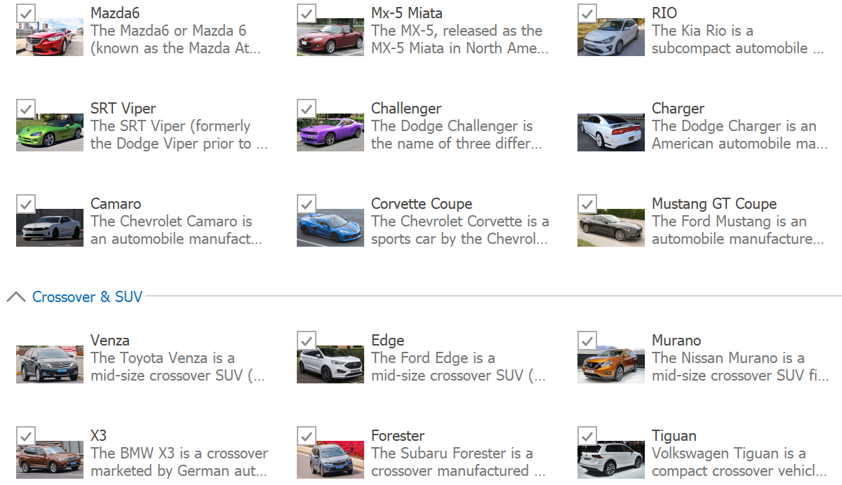
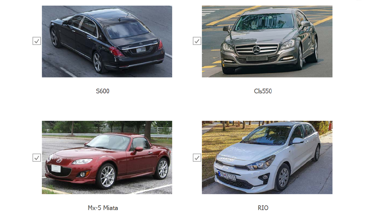
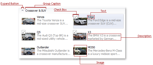
WinExplorerView - Tiles Style
Records display medium images with text captions, descriptions, and optional check boxes painted at the image’s top-left corner. Check boxes are visible only when checked or hovered.
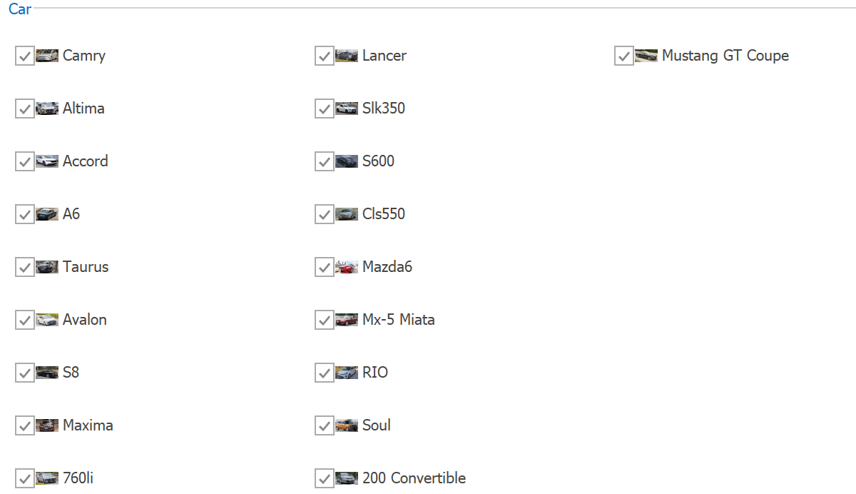
WinExplorerView - Small Style
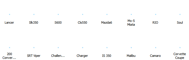
Records display small images with text captions to the right and optional check boxes to the left. Records are arranged horizontally. Groups are placed one under another.
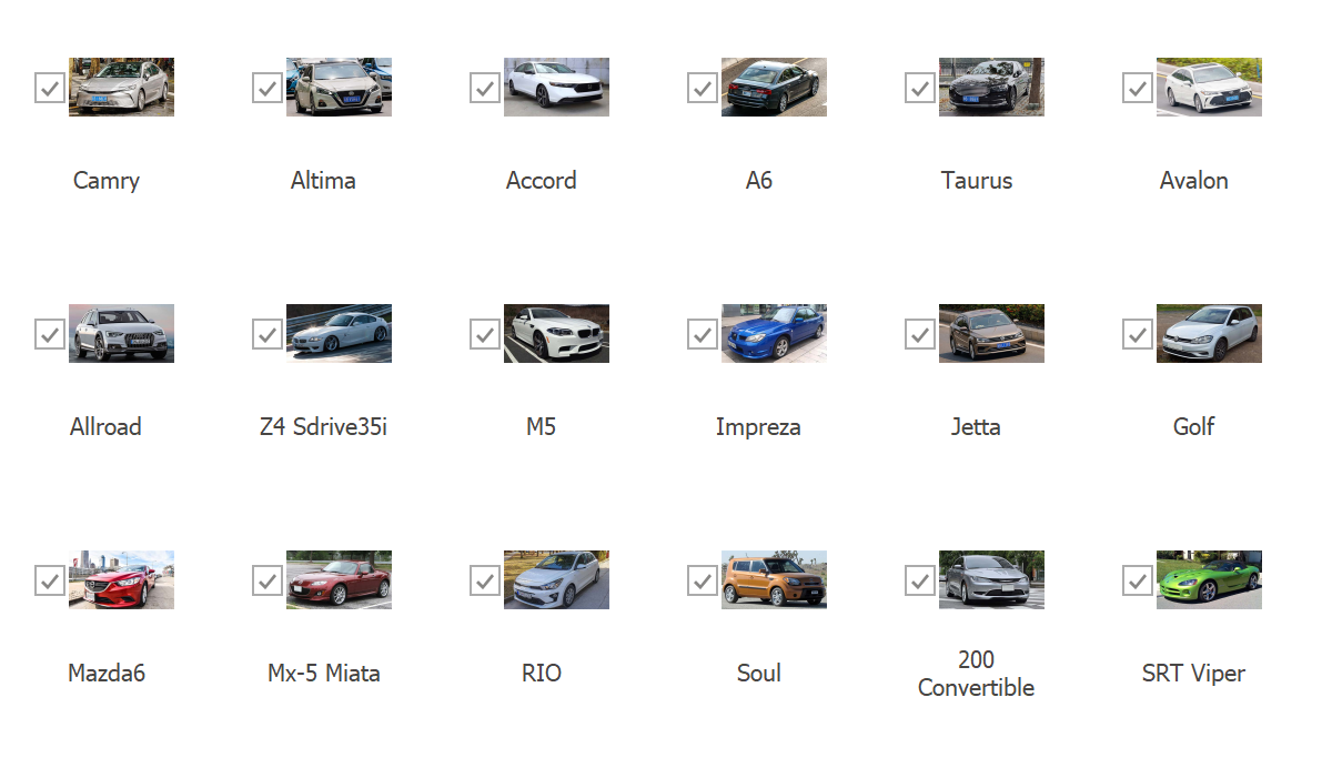
WinExplorerView - Medium Style
Records display medium images with text captions below and optional check boxes to the left.
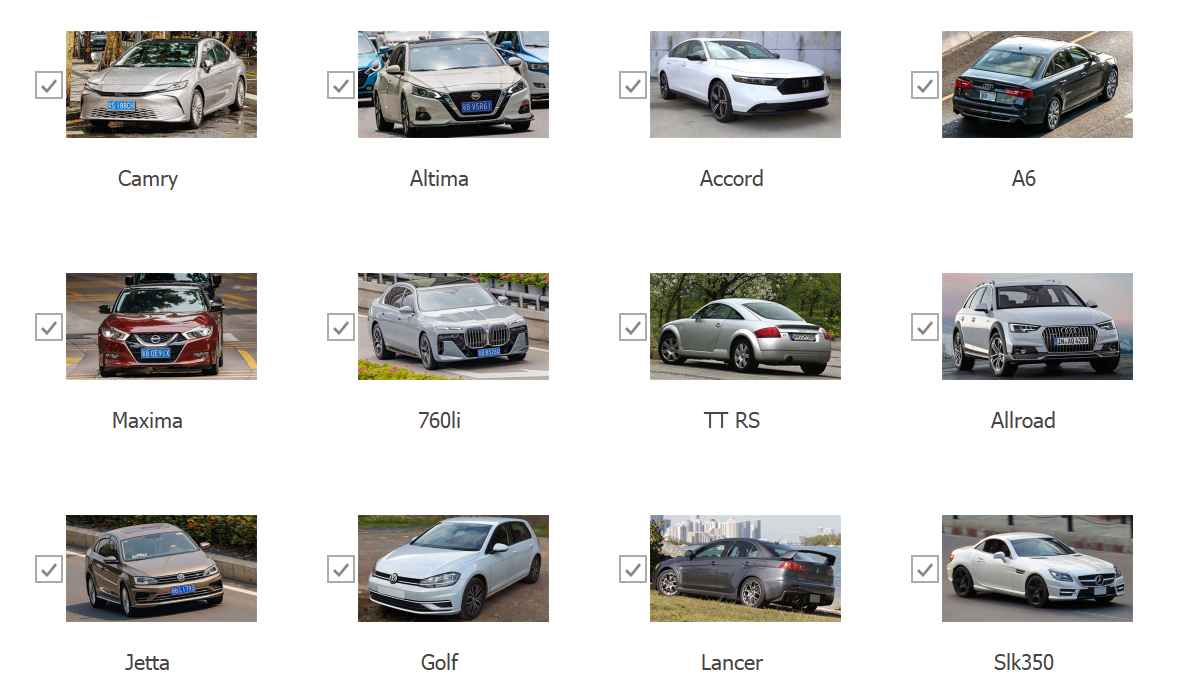
WinExplorerView - Large Style
Records display large images with text captions below and optional check boxes to the left.
WinExplorerView - ExtraLarge Style
Records display extra-large images with text captions below and optional check boxes to the left.
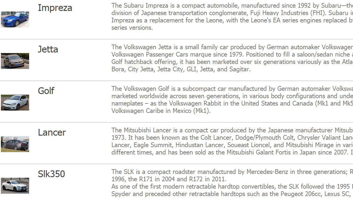
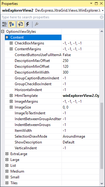
WinExplorerView - Content Style
Records display medium images, bold text captions, and descriptions in a row. Records are arranged one under another and separated by horizontal lines. You can optionally display a check box to the left of the image.
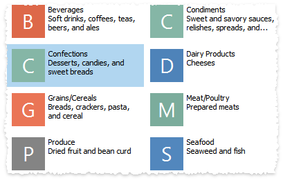
WinExplorerView - List Style
Records display small images with text captions to the right and optional check boxes to the left. Records are arranged vertically while groups are placed horizontally, side-by-side. Groups display no collapse buttons.
Select View Style
The OptionsView.Style property allows you to apply one of the supported view styles:
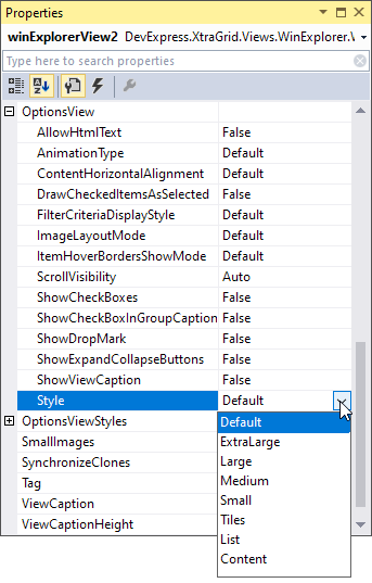
View styles have fixed UIs that cannot be changed, unless you use HTML-CSS templates.
Specify Fields That Contain Item Data
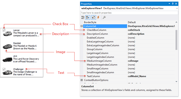
Each view style renders its items using a unique layout of data fields. The default item presentation in these styles is limited to a maximum of four data fields. These fields specify an item’s Text, Image, Description, and Check Box value. The following figure illustrates the field layout in the Tiles visual style:
Note
Only the Tiles and Content view styles can display item descriptions.
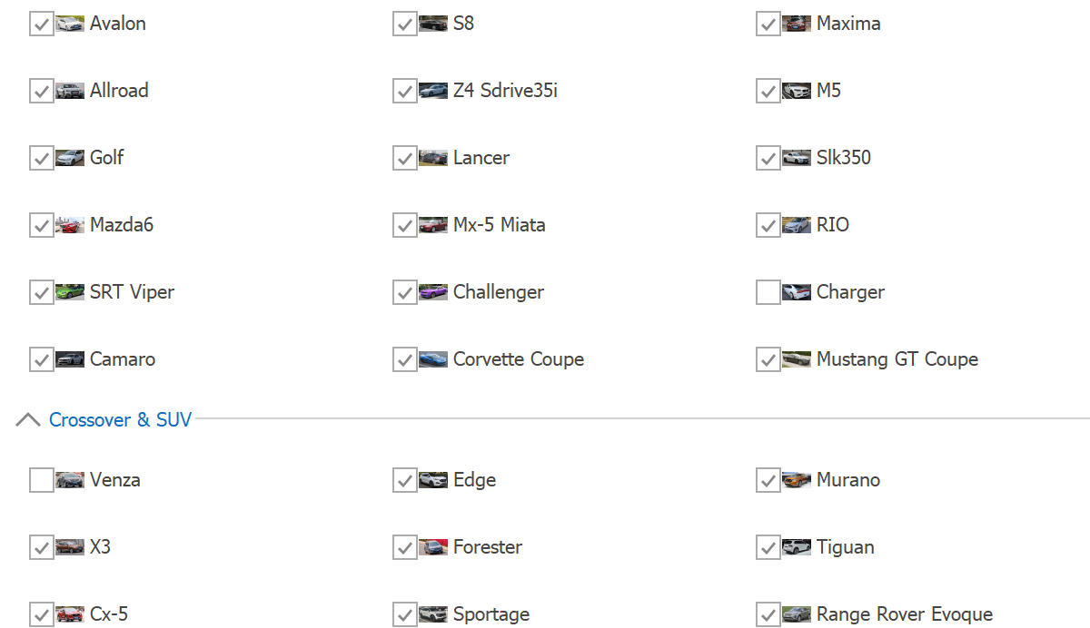
Use the WinExplorerView.ColumnSet property to specify fields (columns) that contain data for WinExplorerView items. The following image shows the columns used by the Tiles view style:
Images
The WinExplorerView.ColumnSet property allows you to specify image columns that store images for your view styles.
View styles | Image Columns | Image Type and Default Size |
|---|---|---|
Small, List | Small 16x16 | |
Medium, Content, Tiles | Medium 48x48 | |
Large | Large 96x96 | |
ExtraLarge | Extra Large 256x256 |
You do not need to assign image columns to all four …ImageColumn properties. If you do not specify images for a specific view style, the WinExplorerView automatically retrieves images from other view styles, and scales these images to the required size.
Use the ImageSize property to change the default image size for a specific view style.
You can also specify images by indexes in corresponding image collections. See the following topics for more information: SmallImageIndexColumn, MediumImageIndexColumn, LargeImageIndexColumn, and ExtraLargeImageIndexColumn.
Stub Glyphs
Instead of regular images, the WinExplorer View can display auto-generated images called stub glyphs. A stub glyph is a colored square or circle with one or two initial letters of the item’s text.
Related API
StubGlyphOptions.AllowStubGlyphs — Specifies whether stub glyphs are enabled.
WinExplorerView.OptionsStubGlyphs — Provides access to advanced stub glyph options, such as font settings, color scheme, glyph shapes, etc. Refer to the “Customize Stub Glyphs” section of the following topic for details: Stub Glyphs.
Customize Common Display Settings
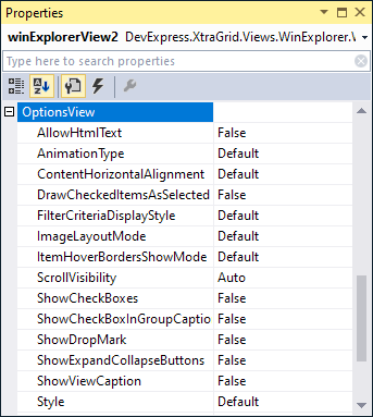
The WinExplorerView.OptionsView object allows you to modify settings shared by all view styles:
Customize Additional Settings
Each view style has its own display settings. You can access them as follows:
|
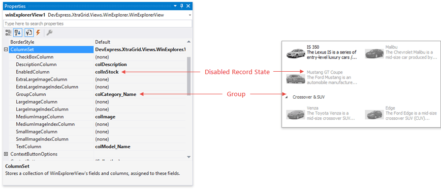
Group and Disable Items
Two additional properties of the WinExplorerView.ColumnSet object allow you to group data and display specific records as disabled.
- Set the ColumnSet.GroupColumn property to group all records by a specific column.
- Set the WinExplorerViewColumns.EnabledColumn property to a Boolean column whose values specify the ‘enable’ state of records. If a record’s ‘enable’ state is false, the WinExplorerView paints the corresponding item as disabled. Users cannot interact with disabled items.
Online Videos
Item Customization
Shows how to customize records in specific view styles.
Context Buttons
Shows how to add clickable buttons to your data records. It is recommended that you add context buttons only to items displayed in the ExtraLarge style.
HTML-CSS Templates
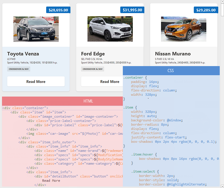
HTML-CSS templates allow you to override the default data presentation in all seven view styles — Small, Medium, Large, Extra Large, List, Tiles, and Content. You can create your own layout of data fields, and display an unlimited number of data fields in each item.
Use HTML markup to specify content for WinExplorerView items, and use CSS code to customize the appearance settings, size, padding, and layout options of UI elements.
Specify HTML-CSS Templates
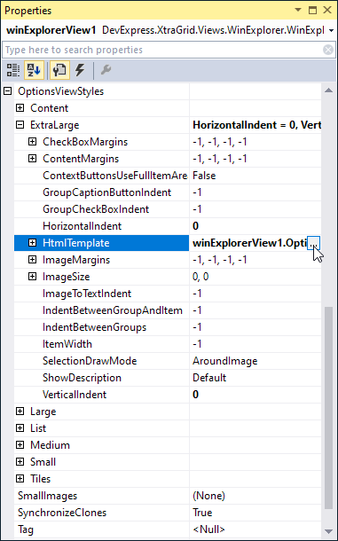
Use the following HtmlTemplate properties to specify HTML-CSS templates for the view styles supported by the WinExplorerView:
|
Each HtmlTemplate object exposes two nested properties:
- HtmlTemplate.Template — Specifies HTML code that defines an item’s content (UI elements).
- HtmlTemplate.Styles — Specifies CSS styles applied to the UI elements.
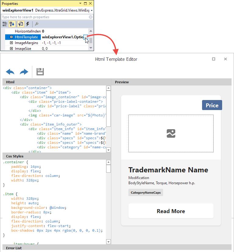
At design time, click the ellipsis button (…) for any HtmlTemplate property to open the Html Template Editor, and specify HTML and CSS code.
Main Features of HTML and CSS Templates
- Data binding
- The
${FieldName}syntax in HTML markup inserts values of fields from the control’s data source. See Data Binding. - Images
- The
<img>HTML tag allows you to add images. - Buttons
- The HTML-CSS markup allows you to add elements to emulate buttons.
- Inplace Editors
- The
<input>tag allows you to embed in-place editors (Repository Items) into WinExplorer View items to display and edit data source fields.
<input name="repositoryItemButtonEdit1" value="${Price}" class="editor"/>
In-place editors are activated at runtime when a user clicks them if the View’s OptionsBehavior.Editable option is set to true.
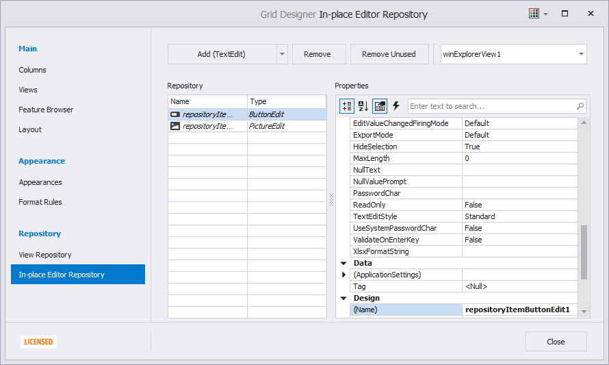
At design time, you can use the “In-place Editor Repository” page in the Data Grid’s Designer to create and customize in-place editors:
See the following topic for more information: HTML Tags - Input.
- Mouse actions
The WinExplorerView contains events to respond to mouse actions on HTML elements: HtmlElementMouseClick, HtmlElementMouseDown, HtmlElementMouseMove, HtmlElementMouseOut, HtmlElementMouseOver, and HtmlElementMouseUp.
You can also subscribe to mouse events for elements in HTML markup, and when using Fluent API.
See the following topic for more information: HTML-CSS-based Desktop UI.
Specify Different Templates for Different Items
Handle the WinExplorerView.QueryItemTemplate event to assign custom templates to individual items. This event fires repeatedly for each item.
Customize Items Dynamically
When a specific item is about to be displayed onscreen, the WinExplorerView raises the WinExplorerView.CustomizeItem event. You can handle this event to customize the style and visibility of the item’s HTML elements dynamically.
Asynchronous Image Load
Activating the Asynchronous Image Load mode allows you to do the following:
- Force the view to load images dynamically, on-demand, rather than all images at once.
- Retrieve images from the data source and manually transform them.
- Assign your own images from an external source.
- Display images with animation effects and show animated indicators for those images that are not yet ready.
Context Buttons
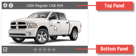
The WinExplorer records can display context buttons along their top and bottom sides. You can choose whether these buttons are constantly visible, or only when a user hovers over an item.
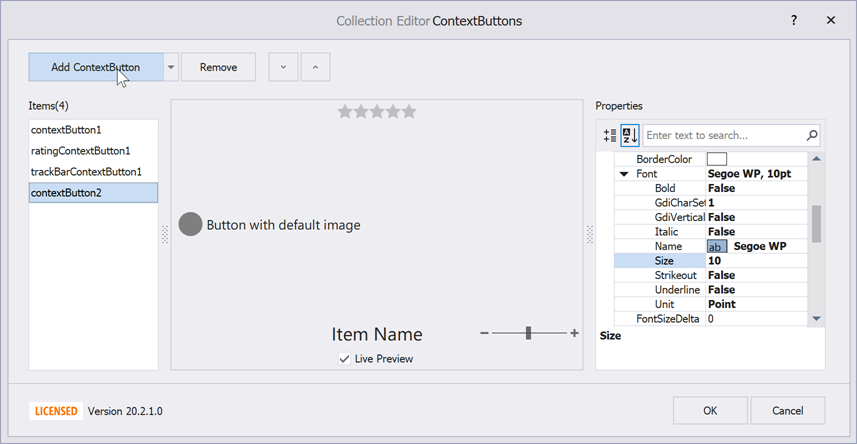
To add context buttons, click the ellipsis button next to the WinExplorerView.ContextButtons property. The combo-box editor of the Collection Editor dialog allows you to add items of three types:
- ContextButton — A regular push button that performs actions when clicked. With no glyph assigned, such buttons serve as labels.
- CheckContextButton — Check buttons that toggle their checked/unchecked states when clicked.
- RatingContextButton — Items that allow end users to rate an item based on a default five-star grade.
Related API
ContextItem.AlignmentOptions — Allow you to choose whether a button should be displayed above the item, below it, or in the middle.
WinExplorerViewStyleOptions.ContextButtonsUseFullItemArea — Context buttons are drawn within the bounds of an item image. If your items have no images, or you want to draw buttons inside bounds of an entire item, set this property to true. You can also increase WinExplorerViewStyleOptions.ContentMargins to increase the distance between item images and top (bottom) context buttons.
TopPanelColor, BottomPanelColor — These properties, accessed through the WinExplorerView.ContextButtonOptions group, specify colors for top and bottom panels that host context buttons. Use 4-digit ARGB values to assign semi-transparent colors.
ContextItem.Visibility — Specifies whether this button is always visible or only when the parent record is hovered (default behavior). If a button is constantly visible, its underlying button panel is shown as well. With this feature, you can clear the WinExplorerViewColumns.TextColumn property to replace default record titles with context buttons. The following image demonstrates a WinExplorer View record with a caption inside the record itself. You can find a code sample for this task later in this section.

WinExplorerView.ContextButtonClick — Occurs when end users click context buttons.
WinExplorerView.ContextButtonCustomize — Handle this event to modify context buttons for individual records.
The code below illustrates how to turn a regular context button into a label that shows a model name and a trademark for car records.
using DevExpress.XtraGrid.Views.WinExplorer;
// ...
private void winExplorerView1_ContextButtonCustomize(object sender, Views.WinExplorer.WinExplorerViewContextButtonCustomizeEventArgs e) {
    WinExplorerView view = sender as WinExplorerView;
    if(view == null) return;
    if(e.Item.Name == "itemText") {
        ((ContextButton)e.Item).Caption = GetContextButtonCaption(e.RowHandle, view.Columns["model.Name"], view.Columns["trademark.Name"]);
    }
}

string GetContextButtonCaption(int rowHandle, GridColumn model, GridColumn trademark) {
    string caption = string.Empty;
    if(model != null)
        caption = (string)this.winExplorerView1.GetRowCellValue(rowHandle, model);
    if(caption != null && trademark != null && caption.Length < 20)
        caption = string.Format("{0} {1}", this.winExplorerView1.GetRowCellValue(rowHandle, trademark), caption);
    return caption;
}
Example - How to Implement Add to Favorites Option

using System;
using System.Data;
using DevExpress.Data;
using DevExpress.Utils;
using DevExpress.XtraEditors;
using DevExpress.XtraGrid.Views.Base;
using DevExpress.XtraGrid.Views.WinExplorer;

namespace dxSample {
    public partial class Form1 : XtraForm {
        DataTable masterTable;
        public DataTable CreateDataTable() {
            masterTable = new DataTable();
            masterTable.Columns.Add("Id", typeof(int));
            masterTable.Columns.Add("Name");
            masterTable.Columns.Add("Favorites", typeof(bool));
            masterTable.Columns.Add("OrderCount", typeof(int));
            masterTable.Columns.Add("RegistrationDate", typeof(DateTime));
            masterTable.Columns.Add("SvgImageIndex", typeof(int));
            for (int i = 0; i < 6; i++) {
                masterTable.Rows.Add(i, "Items group " + i, i % 2 == 0, i * 10, DateTime.Now.AddDays(i), i);
            }
            return masterTable;
        }
        public Form1() {
            InitializeComponent();
            winExplorerView.OptionsView.Style = WinExplorerViewStyle.Large;
            winExplorerView.OptionsViewStyles.Large.ItemWidth = 360;
            winExplorerView.CustomUnboundColumnData += WinExplorerView_CustomUnboundColumnData;
            var column = winExplorerView.Columns.AddVisible("NameOrFavorite");
            column.UnboundType = UnboundColumnType.String;
            winExplorerView.ColumnSet.GroupColumn = column;
            winExplorerView.ContextButtonCustomize += WinExplorerView_ContextButtonCustomize;

            ContextButton btn = new ContextButton();
            btn.Caption = "Add to Favorites";
            btn.ImageOptionsCollection.ItemNormal.SvgImage = svgImageCollection2[0];
            btn.Width = 250;
            btn.AlignmentOptions.Panel = ContextItemPanel.Bottom;
            winExplorerView.ContextButtonClick += (o, ee) => {
                if (ee.DataItem == null)
                    return;
                int rowHandle = (int)ee.DataItem;
                bool isFavorite = (bool)winExplorerView.GetRowCellValue(rowHandle, "Favorites");
                winExplorerView.SetRowCellValue(rowHandle, "Favorites", !isFavorite);
                winExplorerView.RefreshData();
            };
            winExplorerView.ContextButtons.Add(btn);
            gridControl1.DataSource = CreateDataTable();
        }

        private void WinExplorerView_ContextButtonCustomize(object sender, WinExplorerViewContextButtonCustomizeEventArgs e) {
            WinExplorerView view = sender as WinExplorerView;
            if (!view.IsValidRowHandle(e.RowHandle) || view.IsGroupRow(e.RowHandle))
                return;
            bool isFavorite = (bool)winExplorerView.GetRowCellValue(e.RowHandle, "Favorites");
            if (isFavorite)
                (e.Item as ContextButton).Caption = "Remove from Favorites";
        }

        private void WinExplorerView_CustomUnboundColumnData(object sender, CustomColumnDataEventArgs e) {
            WinExplorerView view = sender as WinExplorerView;
            bool favorite = (bool)view.GetListSourceRowCellValue(e.ListSourceRowIndex, "Favorites");
            if (e.IsGetData) {
                e.Value = favorite ? "Favorites" : view.GetListSourceRowCellValue(e.ListSourceRowIndex, "Name");
            }
        }
    }
}