SunburstControl Class
Displays an interactive Sunburst chart.
Namespace: DevExpress.Xpf.TreeMap
Assembly: DevExpress.Xpf.TreeMap.v26.1.dll
Declaration
public class SunburstControl :
    HierarchicalChartControlBase,
    IWeakEventListener,
INotifyPropertyChangedRelated API Members
The following members return SunburstControl objects:
Remarks
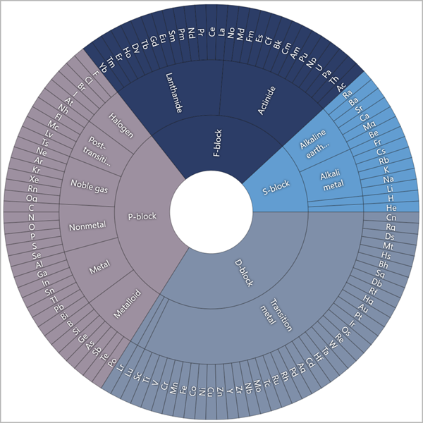
The Sunburst control combines a treemap and pie chart to display different levels of the data hierarchy in a circular layout. The Sunburst’s innermost ring is the top level.
Add to the Project
Drag the SunburstControl component from the Toolbox onto the form to add a Sunburst chart to the project.

This adds references to the following assemblies to the project:
- DevExpress.Data.v26.1.dll
- DevExpress.DataVisualization.v26.1.Core.dll
- DevExpress.Mvvm.v26.1.dll
- DevExpress.TreeMap.v26.1.Core.dll
- DevExpress.Xpf.Core.v26.1.dll
- DevExpress.Xpf.TreeMap.v26.1.dll
Load Data
The Sunburst control uses data adapters to load data from flat data tables and hierarchical data sources. Data adapters are derived from the SunburstDataAdapterBase class and allow you to generate items based on data source fields. Use the DataAdapter property to assign an adapter to the Sunburst control. The following adapters are available:
- SunburstFlatDataAdapter - Loads data from flat-file databases (or data sources).
- SunburstHierarchicalDataAdapter - Loads data from hierarchical data structures.
Specify Center Content
Use the HoleContent property to specify the content that is displayed in a Sunburst chart’s center:
<dxtm:SunburstControl>
<dxtm:SunburstControl.HoleContent>
<Viewbox>
<TextBlock
Padding="10"
HorizontalAlignment="Center"
VerticalAlignment="Center"
Text="Periodic
Table"
TextAlignment="Center">
</TextBlock>
</Viewbox>
</dxtm:SunburstControl.HoleContent>
<!--...-->
</dxtm:SunburstControl>
Add Titles
You can add multiple titles to a sunburst. To do this, populate the sunburst’s Titles collection with Title objects:
<dxtm:SunburstControl.Titles>
    <dxtm:Title Content="DevAV Sales"/>
    <!-- Other titles here. -->
</dxtm:SunburstControl.Titles>
Show a Legend
Assign a Legend object to the sunburst’s Legend property to show a legend. Note that legend visibility depends on the sunburst colorizer settings. Refer to the following section for more information: Colorizer Specifics.
<dxtm:SunburstControl.Legend>
    <dxtm:Legend VerticalPosition="Top"
                 HorizontalPosition="Right"/>
</dxtm:SunburstControl.Legend>
Customize Sector Label Appearance and Layout
Initialize the LabelStyle property with a Style object to configure the appearance for sector labels. Use the LabelDisplayMode property to specify label alignment.
<dxtm:SunburstControl LabelDisplayMode="Tangent">
    <dxtm:SunburstControl.LabelStyle>
        <Style
            TargetType="{x:Type dxtm:SunburstLabelPresentation}">
            <Setter Property="FontSize"
                    Value="10"/>
        </Style>
    </dxtm:SunburstControl.LabelStyle>
    <!--...-->
</dxtm:SunburstControl>
Customize Sector Style
Initialize the SectorStyle property with a Style object to configure sector appearance.
<dxtm:SunburstControl>
    <dxtm:SunburstControl.SectorStyle>
        <Style TargetType="dxtm:SunburstSectorPresentation">
            <Setter Property="Stroke"
                    Value="Yellow" />
            <Setter Property="StrokeThickness"
                    Value="2" />
        </Style>
    </dxtm:SunburstControl.SectorStyle>
</dxtm:SunburstControl>
Paint Sunburst
The Sunburst control uses colorizers to paint Sunburst sectors based on conditions. To apply a colorizer to a Sunburst chart, initialize the Colorizer property with an object of one of the following classes:
Customize Tooltips
Tooltips show additional information about Sunburst sectors. To enable tooltips, set the ToolTipEnabled property to true. Use the ToolTipOptions property to configure tooltip settings such as OpenMode and InitialDelay.
<dxtm:SunburstControl ToolTipEnabled="True">
    <dxtm:SunburstControl.ToolTipOptions>
        <dxtm:ToolTipOptions OpenMode="OnHover"
                             InitialDelay="0:0:0:0.1"/>
    </dxtm:SunburstControl.ToolTipOptions>
    <!--...-->
<dxtm:SunburstControl
Format Tooltip Text
Tooltip text patterns can contain plain text, special placeholders, and format specifiers. The following table lists the different placeholders:
| Placeholder | Description |
|---|---|
| {L} | Shows the sunburst item label. |
| {V} | Shows the sunburst item value. |
To specify a pattern for tooltips, define the ToolTipPattern and ToolTipGroupPattern properties for the outer ring and inner rings, respectively.
For example, you can use the “Value: {V:F2}” format string to show a value with two signs after a comma in a sector tooltip.
<dxtm:SunburstControl ToolTipEnabled="True" ToolTipPattern="Value: {V:F2}">
    <!--...-->
</dxtm:SunburstControl>
Configure Tooltip Appearance and Layout
Initialize the ToolTipContentTemplate and ToolTipGroupContentTemplate properties with a DataTemplate object to specify the tooltip’s content layout and appearance for the outer ring and inner rings, respectively.
The following code customizes tooltips for an outer Sunburst ring:
<Window ...
        xmlns:dxtmt="http://schemas.devexpress.com/winfx/2008/xaml/treemap/themekeys">
    <Grid>
        <dxtm:SunburstControl ToolTipEnabled="True">
            <dxtm:SunburstControl.ToolTipContentTemplate>
                <DataTemplate>
                    <Grid Margin="5">
                        <Grid.Resources>
                            <Style TargetType="TextBlock">
                                <Setter Property="Foreground"
                                        Value="{DynamicResource {dxtmt:TreeMapBrushesThemeKey ResourceKey=ToolTipForeground}}" />
                            </Style>
                        </Grid.Resources>
                        <Grid.RowDefinitions>
                            <RowDefinition Height="Auto"/>
                            <RowDefinition Height="Auto"/>
                            <RowDefinition Height="Auto"/>
                            <!--...-->
                        </Grid.RowDefinitions>
                        <Grid.ColumnDefinitions>
                            <ColumnDefinition Width="Auto" />
                            <ColumnDefinition Width="5" />
                            <ColumnDefinition Width="Auto" />
                        </Grid.ColumnDefinitions>
                        <TextBlock Text="{Binding Item.Name}"
                                   Grid.ColumnSpan="2"
                                   FontSize="{DynamicResource {dxtmt:TreeMapBrushesThemeKey ResourceKey=ToolTipFontSize}}"
                                   FontWeight="{DynamicResource {dxtmt:TreeMapBrushesThemeKey ResourceKey=ToolTipFontWeight}}" />
                        <TextBlock Text="Atomic Number:"
                                   Grid.Row="1"/>
                        <TextBlock Text="{Binding Item.AtomicNumber }"
                                   Grid.Row="1"
                                   Grid.Column="2" />
                        <!--...-->
                    </Grid>
                </DataTemplate>
            </dxtm:SunburstControl.ToolTipContentTemplate>
        </dxtm:SunburstControl>
    </Grid>
</Window>
Select Sectors
A user can select Sunburst sectors when the SelectionMode property is set to Single, Multiple, or Extended.
You can handle the SelectionChanged event to track whether the collection of Sunburst sectors was changed.
The following code example uses the selected Sunburst sectors as a chart’s data source:
<Window ...>
    <Grid>
        <dxtm:SunburstControl SelectionMode="Single"
                              SelectionChanged="SunburstControl_SelectionChanged">

        </dxtm:SunburstControl>
        <dxc:ChartControl Grid.Column="1" x:Name="chart">
            <dxc:XYDiagram2D>
                <dxc:BarSideBySideSeries2D x:Name="series"/>
            </dxc:XYDiagram2D>
        </dxc:ChartControl>
    </Grid>
</Window>
private void SunburstControl_SelectionChanged(object sender, DevExpress.Xpf.TreeMap.TreeMapSelectionChangedEventArgs e) {
    chart.DataSource = e.Selection;
    series.ArgumentDataMember = "Symbol";
    series.ValueDataMember = "Value";
}
You can also use the SelectedItems property to access the collection of selected sectors.
If the Sunburst control is bound to data, the SelectedItems property returns the data source objects that are used to create the selected sunburst sectors.
Highlight Sectors
Use the HighlightMode property to set the mode that specifies how a user highlights Sunburst sectors:
<dxtm:SunburstControl HighlightMode="PathFromRoot">
    <!--...-->
</dxtm:SunburstControl>