RibbonControl.PageHeaderItemLinks Property
Gets a collection of bar item links displayed at the right edge of the Ribbon Control in the same row with tab headers.
Namespace: DevExpress.Xpf.Ribbon
Assembly: DevExpress.Xpf.Ribbon.v26.1.dll
Declaration
Property Value
| Type | Description |
|---|---|
| BarItemLinkCollection | A BarItemLinkCollection object representing the collection of bar item links. |
Remarks
Use the RibbonControl.PageHeaderItems collection to display elements at the right edge of the Ribbon Control in the same row with tab headers.
Example
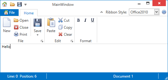
This example shows how to display items on the right edge of the RibbonControl. The items are added via the RibbonControl.PageHeaderItems collection.
The following image shows the result:
<dxr:RibbonControl.PageHeaderItems>
    <dxb:BarEditItem x:Name="eRibbonStyle" Content="Ribbon Style:"
        EditWidth="100"
        ClosePopupOnChangingEditValue="True"
        EditValue="{Binding RibbonStyle, ElementName=RibbonControl}">
        <dxb:BarEditItem.EditSettings>
            <dxe:ComboBoxEditSettings IsTextEditable="False" PopupMaxHeight="250"
                                      ItemsSource="{dxe:EnumItemsSource EnumType={x:Type dxr:RibbonStyle}}"/>
        </dxb:BarEditItem.EditSettings>
    </dxb:BarEditItem>
    <dxb:BarButtonItem Name="bAbout" Content="About"
                   Glyph="{dxc:DXImage Image=Info_16x16.png}"
                   LargeGlyph="{dxc:DXImage Image=Info_32x32.png}"
                   ItemClick="bAbout_ItemClick" />
</dxr:RibbonControl.PageHeaderItems>
See Also