Views Overview
The tab control’s layout, style and behavior settings are defined by View objects that are represented by the TabControlViewBase descendant classes. Each View has its own layout and behavior.
Common Functionality
The TabControlViewBase class provides basic functionality that is common for all views.
Customizing Header Location
The DevExpress.Xpf.Core.DXTabControl uses the Header Panel as a container to display tab header items.

The position of the Header Panel can be specified using the TabControlViewBase.HeaderLocation property.
Header Menu
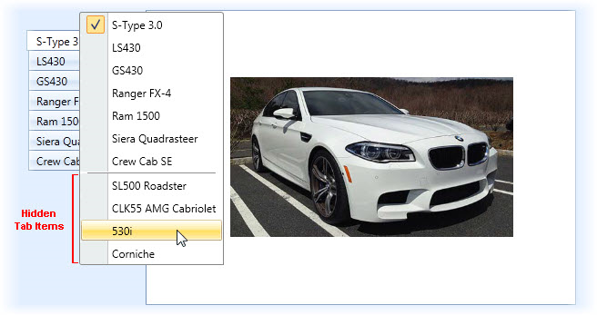
Use the Header Menu to navigate through tab header items (including hidden or disabled items). To learn more, see Header Menu.
Hide and New Buttons

End-users can also manage tab items by using the Hide and New Buttons. To learn more, see Adding and Removing Tab Items.
TabControlViewBase descendants
There are three types of TabControlViewBase descendant classes.
- MultiLine View displays tab headers in multiple lines.
- Scroll View displays tab headers within scroll buttons.
- Stretch View displays tab headers stretched.
View Applying
To apply a view to the tab control, use the DXTabControl.View property. See the example below.
<dx:DXTabControl>
    <dx:DXTabControl.View>
        <dx:TabControlMultiLineView/>
    </dx:DXTabControl.View>
</dx:DXTabControl>