Scroll View
- 2 minutes to read
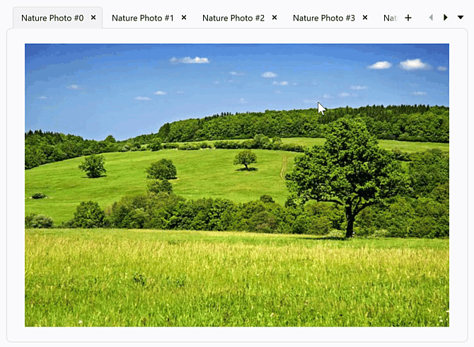
In Scroll View (TabControlScrollView), the tab control arranges tab headers in a single line. If the number of headers exceeds the available space in the Header Panel, the tab control displays scroll buttons to navigate through tab headers.
Scroll Tab Headers
Scroll Buttons
Use the TabControlScrollView.ScrollButtonShowMode property to specify scroll button visibility.
The following table lists available modes:
| Mode | Description |
|---|---|
Always |
Scroll buttons are always visible. |
Never |
Scroll buttons are hidden (even if tabs overflow). |
AutoHideBothButtons |
Both scroll buttons appear or disappear together, based on necessity. |
AutoHideEachButton |
Scroll buttons appear or disappear independently, based on necessity. |
The following code snippet displays scroll buttons in a tab control based on necessity:
<dx:DXTabControl>
    <dx:DXTabControl.View>
        <dx:TabControlScrollView ScrollButtonShowMode="AutoHideBothButtons"/>
    </dx:DXTabControl.View>
    <dx:DXTabItem Header="Tab A"/>
    <dx:DXTabItem Header="Tab B"/>
    <dx:DXTabItem Header="Tab C"/>
</dx:DXTabControl>
Mouse Wheel
The AllowScrollOnMouseWheel property specifies whether users can scroll tab headers using the mouse wheel.
Scroll Animation
Set the AllowAnimation property to true to enable smooth scrolling animation.
<dx:DXTabControl>
    <dx:DXTabControl.View>
        <dx:TabControlScrollView AllowAnimation="True"/>
    </dx:DXTabControl.View>
</dx:DXTabControl>
Stretch Tab Headers
Enable the HeaderAutoFill option to stretch tab headers so that they fill the available space evenly within the header panel.
<dx:DXTabControl>
    <dx:DXTabControl.View>
        <dx:TabControlScrollView HeaderAutoFill="True"/>
    </dx:DXTabControl.View>
</dx:DXTabControl>

Tab Header Orientation
Use the HeaderOrientation property to specify the orientation of tab headers (horizontal or vertical):
<dx:DXTabControl>
    <dx:DXTabControl.View>
        <dx:TabControlScrollView HeaderOrientation="Vertical"/>
    </dx:DXTabControl.View>
</dx:DXTabControl>

Related API
| Name | Description |
|---|---|
| ScrollNext() | Scrolls the header panel forward by one tab. |
| ScrollPrev() | Scrolls the header panel backward by one tab. |
| ScrollFirst() | Scrolls the header panel to the first tab. |
| ScrollLast() | Scrolls the header panel to the last tab. |
| ScrollToSelectedTabItem | Scrolls the header panel to display the specified tab. |
| CanScroll | Indicates whether the header panel can scroll in any direction. |
| CanScrollNext | Indicates whether the header panel can scroll forward to display additional tabs. |
| CanScrollPrev | Indicates whether the header panel can scroll backward to display previously hidden tabs. |
| CanScrollToSelectedTabItem | Indicates whether the header panel can scroll to display the specified tab. |
Tip
Read the following help topic to learn more: Tab Control Views.