TdxCustomRibbon.Layout Property
Specifies the active layout type of the Ribbon UI if a supported Ribbon UI Style is active.
#Declaration
property Layout: TdxRibbonLayout read; write; default TdxRibbonLayout.Default;#Property Value
| Type | Default | Description |
|---|---|---|
| Tdx |
Default | The active layout type of the Ribbon UI. |
#Remarks
You can use the Layout property to switch between layout types for the current Ribbon UI Style if it supports multiple layout types.
#Property Value Examples
Refer to the TdxRibbonLayout type description for detailed information on all available options.
#Supported Ribbon Styles
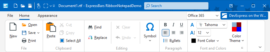
In v24.2, only the Office 365 Ribbon UI Style allows you to switch between Classic and Simplified styles. The Layout property has no effect on all other Ribbon UI styles.
#UI Element Visibility in a Simplified Ribbon Layout
The Ribbon control has a compact (simplified) layout when one of the following conditions is met:
- The Style property is set to rs2016Tablet.
- The Style and
Layoutproperties are set to rsOffice365 and TdxRibbonLayout.Simplified, respectively.
A compact Ribbon layout contains only one row of buttons and does not include multi-level drop-down menus. If a user activates a submenu, it appears in the same drop-down container.
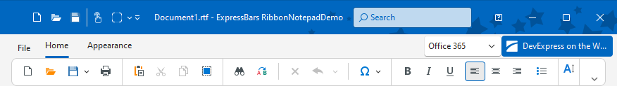
A compact Ribbon layout displays only those UI elements whose corresponding item links include ivlSmallIconWithText and ivlSmallIcon flags in the ViewLevels property value.
Tip
You can use a bar item’s Glyph property to load an icon to mark the bar item in a compact Ribbon layout.
#Default Value
The Layout property’s default value is TdxRibbonLayout.Default.