Expression Editor
- 5 minutes to read
The Expression Editor dialog allows you to construct an expression from available elements and operands or enter the expression formula directly into the input box.
Open the Expression Editor
You can open the Expression Editor dialog from:
- Report fields
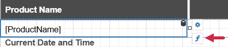
Select a report band and click the function (f) button next to the selection.
- Report properties
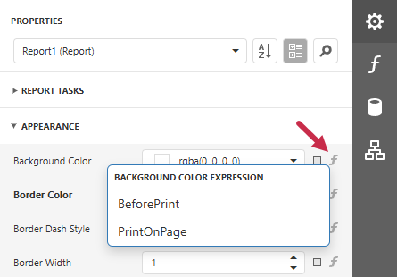
Click the function (f) button and select the report lifecycle stage from the context menu.
- Report expressions
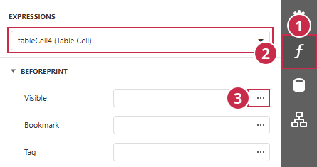
In the EXPRESSIONS panel (1), select a report element (2) and click the ellipsis button (3).
- Calculated fields
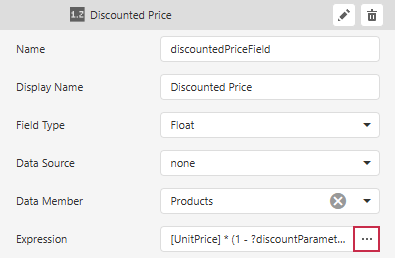
Click the ellipsis button in the Expression field of the calculated field editor.
- Report parameters
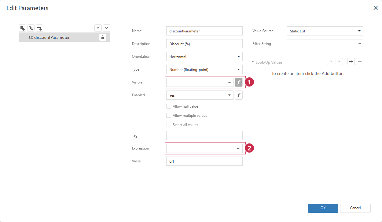
- Click the function (f) button to switch the field to expression mode and click the ellipsis button.
- In Expression and Filter String fields, click the ellipsis button.
- Query parameters
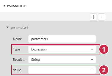
Switch the parameter type to Expression (1) and click the ellipsis button in the Value field (2).
- JSON connection parameters
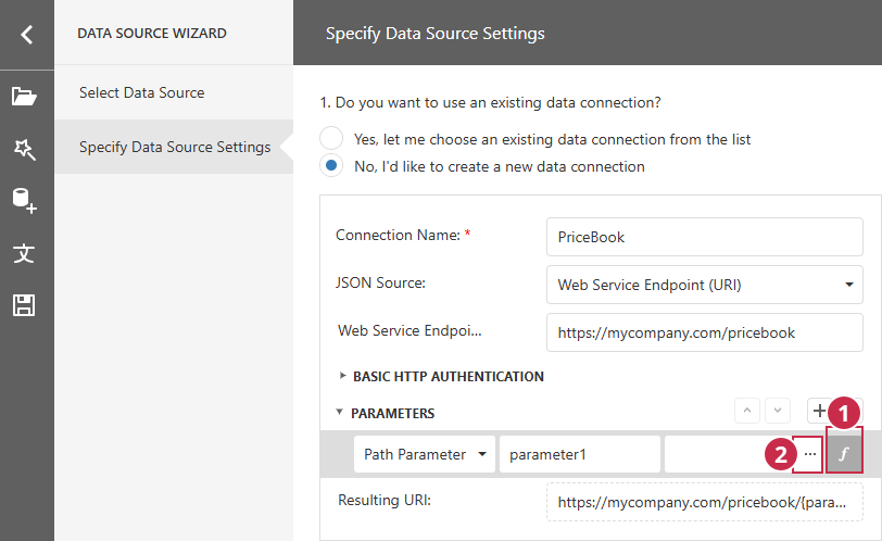
Click the function (f) button (1) to switch the parameter value to expression mode and click the ellipsis button (2).
Expression Editor Dialog
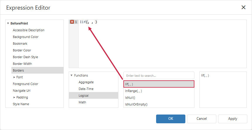
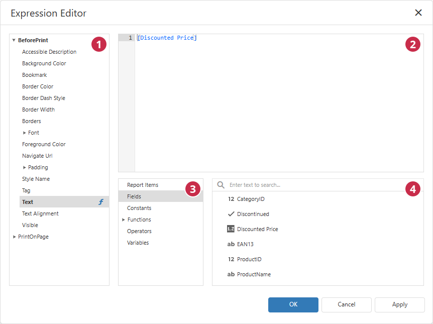
The Expression Editor dialog is divided into the following areas:
- Bindable properties (optional)
- Expression box
- Element categories
- Expression elements (category-specific)
Bindable Properties
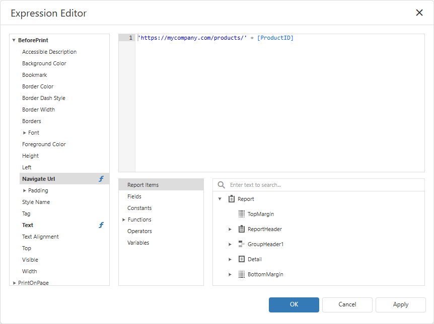
This panel lists properties of the currently selected report element. Select a property to view or edit the associated expression in the Expression Box. A property bound to a custom expression appears in bold and is marked with a function (f) icon.
Note
The Bindable Properties panel is displayed only when you open the Expression Editor for a report element. This panel is hidden when you open the Expression Editor for a parameter or a calculated field.
The panel groups properties under the following report lifecycle stages:
- BeforePrint
- An expression is calculated and applied when the report element is rendered on screen.
- PrintOnPage
- An expression is calculated and applied when the report is sent to the printer or exported.
Both groups expose overlapping but not identical property sets:
Content & Behavior
| Property | Type | BeforePrint | PrintOnPage | Description |
|---|---|---|---|---|
| Text | String | ✅ | ✅ | Text displayed in the report band. |
| Visible | Boolean | ✅ | ✅ | Specifies whether the element appears in the report. |
| Bookmark | String | ✅ | ✅ | Bookmark that points to the element. |
| Navigate Url | String | ✅ | ❌ | URL opened when a user clicks the element. |
| Tag | String | ✅ | ❌ | Custom element data for use in your application code. This value is not rendered in the document. |
Appearance
| Property | Type | BeforePrint | PrintOnPage | Description |
|---|---|---|---|---|
| Background Color | String | ✅ | ✅ | Element background (fill) color. |
| Foreground Color | String | ✅ | ✅ | Element text color. |
| Borders | String | ✅ | ✅ | Border visibility. Use 'All' to display all borders.To display borders only on specified sides, combine the following values into a comma-separated string literal: 'Top', 'Bottom', 'Left', 'Right'. For example: 'Left, Right'. |
| Border Color | String | ✅ | ✅ | Element border color. |
| Border Dash Style | String | ✅ | ✅ | Element border line style (Solid, Dash, Dot, DashDot, DashDotDot). |
| Border Width | Number | ✅ | ✅ | Element border thickness in pixels. |
| Style Name | String | ✅ | ❌ | Name of a predefined style applied to the element. |
Layout & Typography
| Property | Type | BeforePrint | PrintOnPage | Description |
|---|---|---|---|---|
| Font | Composite | ✅ | ✅ | Font settings for element text. Expand this node to configure individual settings, such as Size or Bold. |
| Padding | Composite | ✅ | ✅ | Spacing between the element border and content, in report’ measure units (inches, hundredths of an inch, millimeters, tenths of a millimeter, or pixels). Expand this node to set padding for each side (left, top, etc.). |
| Text Alignment | String | ✅ | ✅ | Horizontal and vertical text alignment within the element. |
Accessibility
| Property | Type | BeforePrint | PrintOnPage | Description |
|---|---|---|---|---|
| Accessible Description | String | ✅ | ✅ | Element description exposed to screen readers and other assistive technologies. |
Expression Box
A text editor that displays a syntax-highlighted expression formula. You can:
- Type an expression directly.
- Insert fields, functions, and other expression elements from the panels below.
- Insert elements using the UI and input operators/literals directly in any combination.
Expression Elements
These panels allow you to browse and insert operands, functions, and other expression elements.
The Element Categories panel groups available elements into the following categories:
- Report Items
- Report bands and elements. Use this category to reference values from other parts of the report.
- Fields
- Report data fields, calculated fields, and parameters.
- Constants
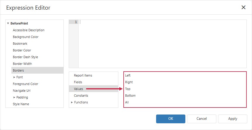
- Predefined values that depend on the property selected in the Bindable Properties panel.
- Functions
- Built-in functions.
- Operators
- Arithmetic, comparison, and logical operators (for example,
+,=,And). - Variables
- Data source variables, such as the current row index or the total row count.
Note
Available categories can vary depending on where you open the Expression Editor from.
Select a category to display related expression building blocks in the Expression Elements panel.
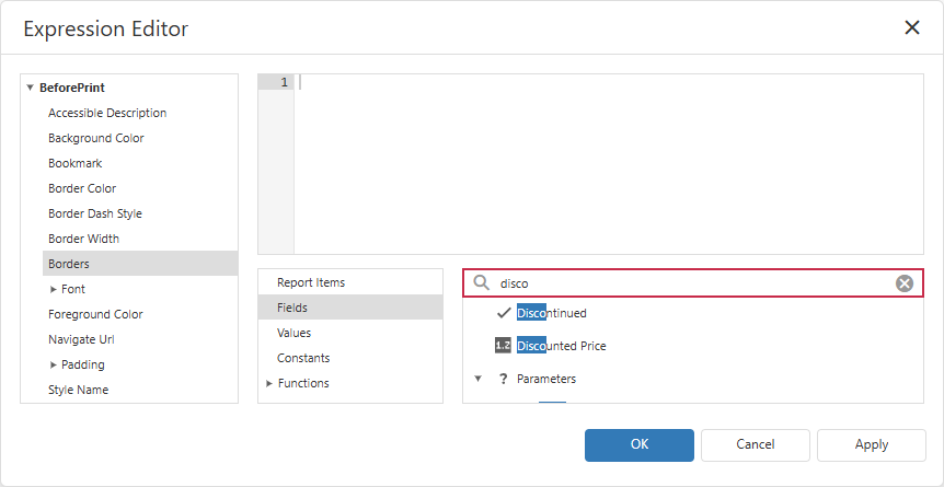
Use the search box above the list to filter elements by name.
Double-click an element to insert it into the Expression Box at the current caret position.