AlertControl.Buttons Property
Provides access to the collection of custom buttons that can be displayed in alert windows.
Namespace: DevExpress.XtraBars.Alerter
Assembly: DevExpress.XtraBars.v26.1.dll
NuGet Package: DevExpress.Win.Navigation
Declaration
Property Value
| Type | Description |
|---|---|
| AlertButtonCollection | An AlertButtonCollection object that contains custom buttons. |
Remarks
You can display custom buttons at the bottom of alert windows. To add buttons to the windows, add them to the Buttons collection. When created, an alert window displays all the buttons from the Buttons collection.
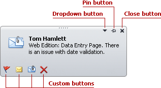
Changing the Buttons collection doesn’t affect the existing alert windows. The changes will be applied to newly created alert windows.
A custom button is represented by an AlertButton object. It can function as a regular or check button, dependant on the AlertButton.Style property. By default, an AlertButton object functions as a regular button. Clicking it produces the AlertControl.ButtonClick event.
If the AlertButton.Style property is set to CheckButton, the button functions as a check button, having two states. When a check button is clicked, its check state is toggled and the AlertControl.ButtonDownChanged event fires.
Handle the AlertControl.ButtonClick and AlertControl.ButtonDownChanged events to respond to button clicks. To identify buttons while handling these events, you can use button names, specified by the AlertButton.Name property.
Example
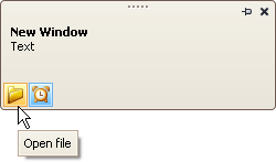
The following example adds two custom buttons to an AlertControl and handles events to process clicks on these buttons.
The first button is a regular button. A click on this button triggers the AlertControl.ButtonClick event.
The second button has checked and unchecked states (AlertButton.Style = AlertButtonStyle.CheckButton). A click on this button triggers the AlertControl.ButtonDownChanged event.
Note
alertControl1 and svgImageCollection1 were added to the form at design time.
The following image shows the resulting alert window:
using DevExpress.XtraEditors;
using DevExpress.XtraBars.Alerter;

namespace DXApplication2 {
    public partial class Form1 : XtraForm {
        public Form1() {
            InitializeComponent();
            CreateCustomButtons();
            // Subscribe to button click events
            alertControl1.ButtonClick += AlertControl1_ButtonClick;
            alertControl1.ButtonDownChanged += AlertControl1_ButtonDownChanged;

            this.Load += Form1_Load;
        }

        private void Form1_Load(object? sender, EventArgs e) {
            // Show an alert window (for demonstration purposes)
            alertControl1.Show(this, "Hello!", "You have 1 unread message.");
        }

        private void CreateCustomButtons() {
            // Create a custom regular button
            AlertButton btn1 = new AlertButton();
            btn1.Hint = "Open file";
            btn1.Name = "buttonOpen";
            btn1.ImageOptions.SvgImage = svgImageCollection1["open"];
            btn1.ImageOptions.SvgImageSize = new Size(16, 16);
            // Create a custom check button
            AlertButton btn2 = new AlertButton();
            btn2.Style = AlertButtonStyle.CheckButton;
            btn2.Down = true;
            btn2.Hint = "Alert On";
            btn2.Name = "buttonAlert";
            btn2.ImageOptions.SvgImage = svgImageCollection1["time"];
            btn2.ImageOptions.SvgImageSize = new Size(16, 16);
            // Add buttons to the AlertControl
            alertControl1.Buttons.Add(btn1);
            alertControl1.Buttons.Add(btn2);
        }

        private void AlertControl1_ButtonDownChanged(object sender, AlertButtonDownChangedEventArgs e) {
            if (e.Button.Name == "buttonAlert")
                MessageBox.Show($"The Alert button is {(e.Button.Down ? "up" : "down")}");
        }

        private void AlertControl1_ButtonClick(object sender, AlertButtonClickEventArgs e) {
            if (e.Button.Name == "buttonOpen")
                MessageBox.Show("The Open button was clicked");
        }
    }
}