TransitionManager Class
Allows you to implement animated transitions between control states.
Namespace: DevExpress.Utils.Animation
Assembly: DevExpress.Utils.v25.1.dll
NuGet Packages: DevExpress.Utils, DevExpress.Wpf.Core
Declaration
Related API Members
The following members return TransitionManager objects:
Remarks
If a control has multiple states, you can use the TransitionManager component to animate the transition between the start and end control states. One TransitionManager can manage state transitions for multiple controls.
The component supports the following:
- Multiple transition types (Fade, Dissolve, Push, Shape, Clock, and more)
- Easing functions.
- A wait/load indicator.
Tip
The Remote Connection Optimization disables Transition Manager animations. See this property for details: WindowsFormsSettings.OptimizeRemoteConnectionPerformance.
To get started, place the TransitionManager component onto the form. Add a Transition object to the TransitionManager.Transitions collection, and customize its properties. The main transition properties are listed below:
- Control - Specifies the control whose state transition needs to be animated.
- TransitionType - Allows you to specify the animation mode and parameters.
- EasingMode - Allows you to specify an easing function.
- ShowWaitingIndicator - Allows you to display a wait/load indicator during slow state transitions.
- WaitingIndicatorProperties - Specifies wait indicator customization settings.
Right before a control’s state transition starts, call the TransitionManager.StartTransition method and pass the control as a parameter. The TransitionManager.Transitions collection must contain a Transition whose Control property references the control.
After the control’s state has been changed, call the TransitionManager.EndTransition method to hide the wait indicator (if visible) and perform an animated transition between the start and end control states.
The StartTransition and EndTransition methods do not affect the control itself - they operate on screenshots of it. The StartTransition method creates a screenshot of the control using the Control.DrawToBitmap method and displays it above the control. This screenshot conceals the control and all subsequent changes made to its state. The EndTransition method generates a new screenshot of the control and executes an animated transition between the two control snapshots. For limitations, see the DrawToBitmap method.
The TransitionManager.CustomTransition event allows you to dynamically customize the transition parameters. For instance, you can specify a custom easing function and clip the animation region.
To execute custom actions before a transition starts, handle the TransitionManager.BeforeTransitionStarts event. For instance, you can handle it to prevent the animated transition in certain cases. The TransitionManager.AfterTransitionEnds event will notify that an animated transition is completed.
Demo: Transition Manager module in the ApplicationUI MainDemo
Example
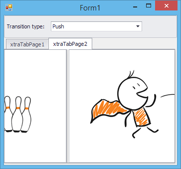
This example contains an XtraTabControl with two tabs. The TransitionManager component is used to animate switching between these tabs, using a certain animation effect (specified by the Transition Type combobox). Animated tab switching is initiated in the XtraTabControl.SelectedPageChanging event handler and is finished in the XtraTabControl.SelectedPageChanged event handler.Before the transition starts, it is created in the SelectedIndexChanged event of the combobox control. By default, the entire area occupied by the control is animated by the TransitionManager. In the example, the CustomTransition event is handled to exclude the tab region from animation.
The following image shows the state transition in progress:

using System;
using System.Collections.Generic;
using System.ComponentModel;
using System.Data;
using System.Drawing;
using System.Linq;
using System.Text;
using System.Windows.Forms;
using DevExpress.Utils.Animation;
using DevExpress.XtraEditors;
using DevExpress.XtraEditors.Controls;

namespace TransitionManagerSample {
    public partial class Form1 : Form {
        public Form1() {
            InitializeComponent();
        }

        Control animatedControl;

        private void xtraTabControl1_SelectedPageChanging(object sender, DevExpress.XtraTab.TabPageChangingEventArgs e) {
            // Start the state transition when a page is about to be switched.
            if (animatedControl == null) return;
            transitionManager1.StartTransition(animatedControl);
        }

        private void xtraTabControl1_SelectedPageChanged(object sender, DevExpress.XtraTab.TabPageChangedEventArgs e) {
            // Finish the transition after a page has been selected.
            transitionManager1.EndTransition();
        }

        private void Form1_Load(object sender, EventArgs e) {
            animatedControl = xtraTabControl1;

            // Populate the ImageComboBox with available transition types.
            imageComboBoxEdit1.Properties.Items.AddEnum(typeof(DevExpress.Utils.Animation.Transitions));
            imageComboBoxEdit1.SelectedIndexChanged += imageComboBoxEdit1_SelectedIndexChanged;
            imageComboBoxEdit1.SelectedIndex = 0;
        }

        BaseTransition CreateTransitionInstance(Transitions transitionType) {
            switch (transitionType) {
                case Transitions.Dissolve: return new DissolveTransition();
                case Transitions.Fade: return new FadeTransition();
                case Transitions.Shape: return new ShapeTransition();
                case Transitions.Clock: return new ClockTransition();
                case Transitions.SlideFade: return new SlideFadeTransition();
                case Transitions.Cover: return new CoverTransition();
                case Transitions.Comb: return new CombTransition();
                default: return new PushTransition();
            }
        }

        void imageComboBoxEdit1_SelectedIndexChanged(object sender, EventArgs e) {
            ImageComboBoxEdit imComboBox = sender as ImageComboBoxEdit;

            if (transitionManager1.Transitions[animatedControl] == null) {
                // Add a transition, associated with the xtraTabControl1, to the TransitionManager.
                Transition transition1 = new Transition();
                transition1.Control = animatedControl;
                transitionManager1.Transitions.Add(transition1);
            }
            // Specify the transition type.
            DevExpress.Utils.Animation.Transitions trType = (DevExpress.Utils.Animation.Transitions)imComboBox.EditValue;
            transitionManager1.Transitions[animatedControl].TransitionType = CreateTransitionInstance(trType);
        }

        // A custom easing function.
        DevExpress.Data.Utils.IEasingFunction myEasingFunc = new DevExpress.Data.Utils.BackEase();

        private void transitionManager1_CustomTransition(DevExpress.Utils.Animation.ITransition transition, DevExpress.Utils.Animation.CustomTransitionEventArgs e) {
            // Set a clip region for the state transition.
            e.Regions = new Rectangle[] { xtraTabPage1.Bounds };
            // Specify a custom easing function.
            e.EasingFunction = myEasingFunc;
        }


    }
}