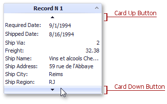
Card Up And Down Buttons
Buttons enable an end-user to vertically scroll cards when the View’s height is insufficient to display all card fields simultaneously. The up button is displayed above the first shown card field and the down button is after the last card field. If scrolling is not possible in both directions, one of the buttons will be disabled.

The following table lists the main properties affecting element appearance.
look and feel | |
Appearance | |
Availability |
See Also