v25.2 Release Notes
- 14 minutes to read
Tip
Visit our website to explore new features/capabilities available across the entire DevExpress product line: What’s New in our Latest Update.
.NET 10 and Visual Studio 2026 Support
DevExpress WinForms component libraries now support .NET 10 and Visual Studio 2026.
JetBrains Rider Support
You can now visually configure and customize major DevExpress UI components directly within Rider’s designer.
The ability to use DevExpress components within Rider was developed in collaboration with the JetBrains team.
Project Templates for JetBrains Rider
The DevExpress Template Kit is fully integrated into JetBrains Rider. You can create new projects using the same rich set of DevExpress templates available in Visual Studio and VS Code.
DateOnly & TimeOnly Support in Charts
The DevExpress WinForms Chart Control supports .NET DateOnly and TimeOnly data types. You can use these types to specify arguments, values, workday/work time options, strips, constant lines, and scale breaks, as well as to apply data filters, sorting, and summaries.
Accessibility Enhancements
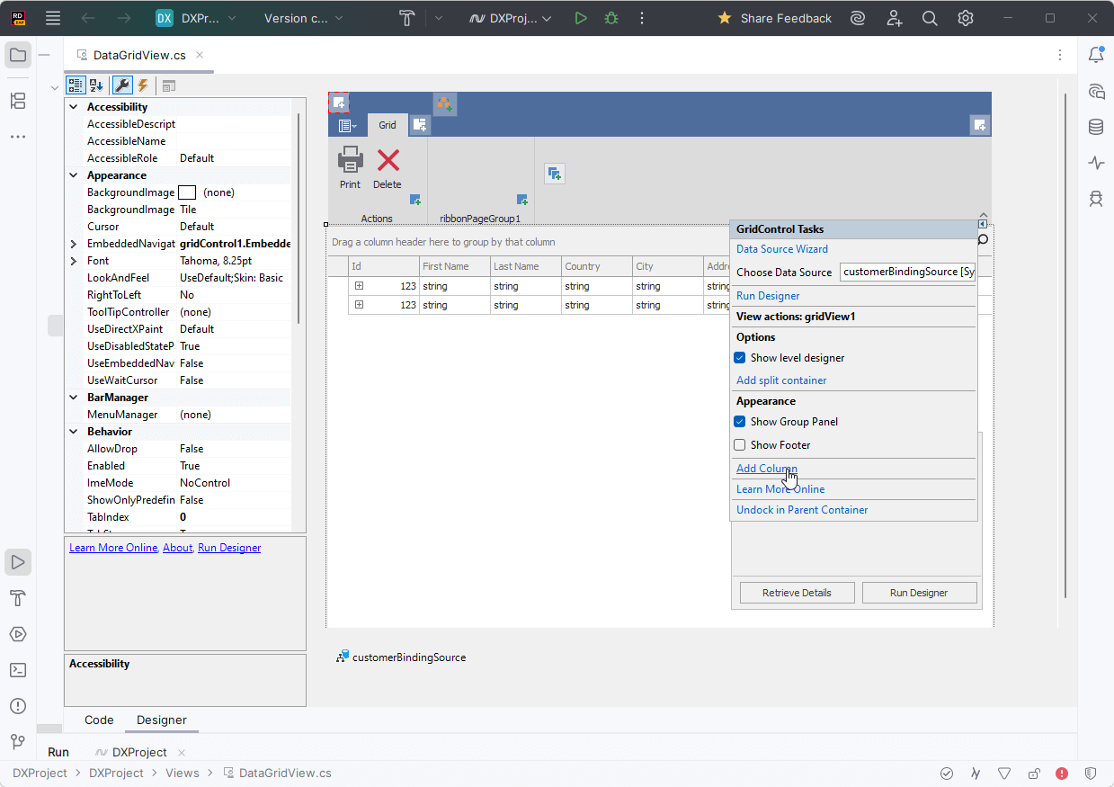
Accessible Column and Band Operations Through Keyboard Input
The DevExpress WinForms Data Grid includes full keyboard access to column headers and bands. Users can execute the following operations using the keyboard:
| Action | Keyboard Shortcut | Notes |
|---|---|---|
| Focus a column header | Ctrl+Shift+TAB | Focus moves from any row to header row. |
| Unfocus a column header | ↓ | Focus returns to the grid’s top row. |
| Unfocus a column header | Ctrl+TAB | Focus returns to the previously selected data row. |
| Focus a band | ↑ (from column headers) | Moves focus from the column header area to bands. |
| Navigate between column headers/bands | ←, →, TAB, HOME, END | Moves focus across column headers/bands. |
| Resize column/band width | Shift+← / Shift+→ | Decreases/increases column/band width. |
| Reorder columns/bands | Ctrl+←, Ctrl+→, Ctrl+↑, Ctrl+↓ | Moves a column header/band horizontally or vertically based on layout. |
| Sort by the focused column | Space, Enter | Applies sorting in ascending order or reverses sort order. Fires StartSorting / EndSorting. |
| Add/remove a column to/from multi-column sorting | Shift+Space, Ctrl+Space | Adds to or removes from existing sort sequence. |
| Open a column filter popup | Alt+↓, F4 | Fires FilterPopup-related events. |
| Open a column/band context menu | Shift+F10, ≣ (Context Menu) | Fires PopupMenuShowing, GridMenuItemClick. |
You can activate column/band keyboard navigation for all Data Grids used in your application or for individual Views.
| Property Name | Description |
|---|---|
| WindowsFormsSettings.KeyboardNavigationExtensions | Activates column/band keyboard navigation for all Data Grids used in an application. |
| GridOptionsNavigation.AllowHeaderNavigation | Activates column/band keyboard navigation for an individual View. |
The new BandedGridView.FocusedBand property specifies the currently focused band and allows you to set focus programmatically.
Screen Reader Enhancements for Data Editors
DevExpress WinForms Data Editors ship with improved screen reader support for text-based editors. Users can navigate and select text more effectively within the range read by the screen reader.
Enhancements include:
- Select text within the screen reader’s reading range.
- Move the cursor to the previous or next character or word.
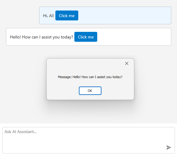
AI Chat Control Enhancements
Manage Multiple Chat Clients
The DevExpress WinForms AI Chat Control supports use of multiple AI services within a single application.
Use cases include:
- Compare responses from different AI providers side by side.
- Run independent sessions with separate histories.
- Allow users to select or switch AI providers at runtime.

Use the AddKeyedChatClient method to register AI chat clients in the service collection with unique keys at application startup. The following code snippet registers Azure OpenAI and Ollama clients:
// Create an Azure OpenAI client.
var azureOpenAiClient = new Azure.AI.OpenAI.AzureOpenAIClient(AzureOpenAIEndpoint, AzureOpenAIKey);

// Create an Ollama API client.
IChatClient ollamaClient = new OllamaApiClient(new Uri("http://localhost:11434/"), "MODEL_NAME");

// Create a service collection to register AI chat clients.
var serviceCollection = new ServiceCollection();

// Register the Azure OpenAI client with a unique key.
serviceCollection.AddKeyedChatClient("azureOpenAIClient", azureOpenAiClient.GetChatClient(ModelId).AsIChatClient());

// Register the Ollama client with a different key.
serviceCollection.AddKeyedChatClient("ollamaClient", ollamaClient);

// Add DevExpress AI Desktop services (required for AIChatControl).
serviceCollection.AddDevExpressAIDesktop();
You can place multiple AI Chat Controls on the same form (for example, to test model quality or host specialized agents) or use a single AI Chat Control and switch between AI providers at runtime.
Set the AIChatControl.ChatClientServiceKey property to select the service:
// Create and configure an Azure OpenAI chat control.
AIChatControl azureChat = new AIChatControl() {
    ChatClientServiceKey = "azureOpenAIClient",
    Dock = DockStyle.Right
};

// Create and configure an Ollama chat control.
AIChatControl ollamaChat = new AIChatControl() {
    ChatClientServiceKey = "ollamaClient",
    Dock = DockStyle.Left
};
Resources
Our WinForms AI Chat Control can now access external data sources (such as MCP (Model Context Protocol) servers) or dynamically generated content through resources. Resources extend the chat context with additional input (for example, local documents, logs, or images). The AI model uses this data to generate more accurate and context-aware responses.
After you assign resources the AI Chat Control displays the Attach Context (+) button. Users can select one or more resources to include in the chat request. A built-in search box helps users quickly locate desired items when the resource list is long.

Supported resource content types:
- Plain Text
- Image
You can also customize resource appearance. Use the new SetResourceItemTemplate method to supply a Razor-based template for resource items displayed in the chat’s Attach Context dropdown:

Tool Calling API
AI Tool Calling connects your Windows Forms application logic with natural language input. The WinForms AI Chat Control can invoke methods annotated with metadata that describes purpose, input parameters, and optional target objects.

The DevExpress implementation extends standard function calling with the following enhancements:
- Target-Aware Tools
- Tools can operate on specific object instances (UI controls, forms, data services, business objects). AI resolves targets from context.
- Flexible Tool Contexts
- Group tools into contexts. You can add, remove, or disable contexts at runtime.
- Seamless Integration with the AI Chat Control
- The WinForms AI Chat Control discovers and merges tools from all registered contexts and manages tool selection, target resolution, parameter binding, and invocation.
Display Tool Information
You can display information about invoked tools in chat responses. Enable the AI Chat Control’s IncludeFunctionCallInfo option to include metadata about invoked tools/functions (function names and arguments) in response messages.

A new ResponseReceived event is triggered when the AI Chat Control receives a response from an AI service. Handle this event to inspect or modify metadata about invoked tools/functions before they are displayed in the chat UI.
The following code snippet removes internal function calls and arguments that are not intended for user display:
void AiChatControl1_ResponseReceived(object sender, AIChatControlResponseReceivedEventArgs e) {
    if (e.Message.FunctionCalls.Count > 0) {
        // Remove information about the GetToolTargets function used internally by the LLM to select a tool target.
        if (e.Message.FunctionCalls.RemoveAll(fcall => fcall.Request.Name == "GetToolTargets") > 0) {
            e.Message.FunctionCalls.ForEach(fcall => {
                foreach (var argument in fcall.Request.Arguments.Keys.ToList())
                    // Remove internal '*_identifier' arguments from function calls.
                    // These arguments specify target selection information and are not intended for user display.
                    if (argument.EndsWith("_identifier"))
                        fcall.Request.Arguments.Remove(argument);
            });
        }
    }
}
Message Templates — Customize Chat UI and Appearance
You can create Razor-based templates for messages, prompt suggestions, and empty chat area to customize the DevExpress WinForms Chat UI.
Title and Clear Chat Button
AIChatControl can display a header. The header contains a customizable chat title and a Clear Chat button (removes all messages from the conversation history except system messages).

To display the chat header, enable the AIChatControl.ShowHeader option. The AIChatControl.HeaderText property specifies the chat title.
Resize Input Area
Enable the new AIChatControl.AllowResizeInput option to allow users resize the input area. Users can drag the top edge to enlarge the input area or down to display a more detailed chat history.
Send Prompt Suggestion on Click
The AI Chat Control automatically inserts the selected prompt suggestion into the chat prompt box so users can edit it before sending. Activate the new PromptSuggestion.SendOnClick option to send a prompt suggestion to an AI service immediately after it is clicked and accelerate conversation flows.
Chat Project Templates — DevExpress Template Kit
The DevExpress Template Kit includes new chat-based project templates for apps targeting .NET 8+.
- AI Chat Application
- Creates a WinForms chat app that integrates the AI Chat Control. Optionally integrates the DevExpress MCP Server for DevExpress-specific technical guidance (adds an mcp.json configuration file to the application).
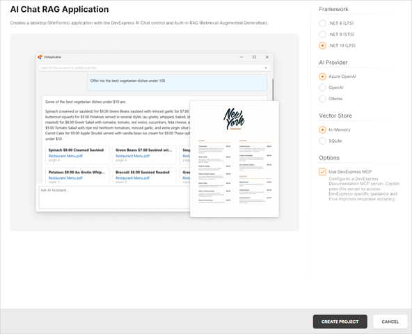
- AI Chat (RAG) Application
Creates a desktop WinForms application with the AI Chat Control and built-in Retrieval-Augmented Generation (RAG) for document-grounded conversations:
- Uses local document data for context-aware answers.
- Scans the user’s Documents folder and indexes PDF, DOCX, TXT, RTF, and HTML files.
- Extracts, embeds, and semantically searches document text.
- Stores vectors in In-Memory (rebuilds each run) or SQLite (persistent database).
- Merges retrieved content with user prompts to improve accuracy.
- Optionally integrates the DevExpress MCP Server for DevExpress-specific technical guidance.
AI-powered Extensions
Prompt to Expression
We added AI-powered expression generation to our WinForms controls to help users create filter and unbound column expressions for data-aware WinForms controls using natural language prompts. Instead of writing complex expressions, users describe the desired logic in plain text.
The system sends the prompt to the configured AI service, which generates an expression for the control. The DevExpress Expression Editor or Filter Editor displays and validates the result immediately.

Play the following animation to see how Prompt to Expression works:

Supported controls:
GridControlTreeListVGridControl
SmartPaste in WinForms Scheduler Control
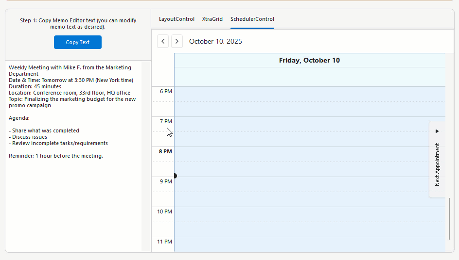
The DevExpress WinForms Scheduler Control supports AI-powered SmartPaste. Users can create appointments by pasting text or images from the clipboard. SmartPaste identifies the subject, date, time, location, agenda, and fills appointment fields.
SmartPaste can also detect:
- Recurrence (for example, every Monday at 10 AM until December)
- Time Zone
- Label
- Status
- Resources
Activation steps:
- Install AI-related NuGet packages and register a service
Attach SmartPasteSchedulerBehavior to the WinForms Scheduler Control:
public partial class Form1 : RibbonForm {
    public Form1() {
        InitializeComponent();

        behaviorManager1.Attach<SmartPasteSchedulerBehavior>(schedulerControl, behavior => {
            behavior.Properties.Temperature = 0.3f;
        });
    }
}
SmartPaste — AI-powered Image Processing
v25.2 extends SmartPaste to process clipboard images. Enable the ProcessClipboardImage option to extract structured data from images:
behaviorManager1.Attach<SmartPasteBehavior>(gridView, behavior => {
    behavior.Properties.ItemDescriptions.AddRange(new List<AIItemDescription>() {
        new AIItemDescription(gridView.Columns["ProductName"], "Official name or product name."),
        new AIItemDescription(gridView.Columns["Warranty"], "Information related to the product warranty (in years or months).")
    });
    behavior.Properties.ProcessClipboardImage = DevExpress.Utils.DefaultBoolean.True;
});
Prompt Augmentation
DevExpress AI Assistant and SmartPaste extensions support Prompt Augmentation. Use the AI-powered behavior’s PromptAugmentation property to supply additional instructions that modify the default prompt (for example, always translate results into English):
behaviorManager1.Attach<ChangeStyleBehavior>(memoEdit1, behavior => {
    behavior.Properties.Temperature = 0.6f;
    behavior.Properties.PromptAugmentation = "Always translate the result into English.";
});
Flexible Text Selection for AI-powered Features
AI-powered text processing features rely on relevant and contextually complete input to generate high-quality results. In earlier versions, users could only send explicitly selected text to the AI service, which limited flexibility and often required extra manual steps.
The new Flexible Text Selection option in MemoEdit, RichEditControl, and SpreadsheetControl offers configurable text retrieval settings.
Use the TextRetrievalMode property to specify the portion of text that is transmitted to an AI service: selected text, current paragraph, entire document, or entire document if nothing is selected.
Outlook-inspired Side Panel
The DevExpress WinForms Ribbon Form can display a side navigation or status panel (Microsoft Outlook inspired).
You can use the following DevExpress WinForms controls as a side panel to create intuitive, organized interfaces similar to Microsoft Outlook:
Use the RibbonForm.SidePane property to display a control on the right side of the Ribbon UI:
using DevExpress.XtraBars.Ribbon;
using DevExpress.XtraEditors;

public partial class MainForm : RibbonForm {
    PanelControl panel;

    public MainForm() {
        InitializeComponent();

        // Create the panel.
        panel = new PanelControl();
        this.Controls.Add(panel);

        // Assign the panel to the 'RibbonForm.SidePane' property.
        this.SidePane = panel;
    }
}
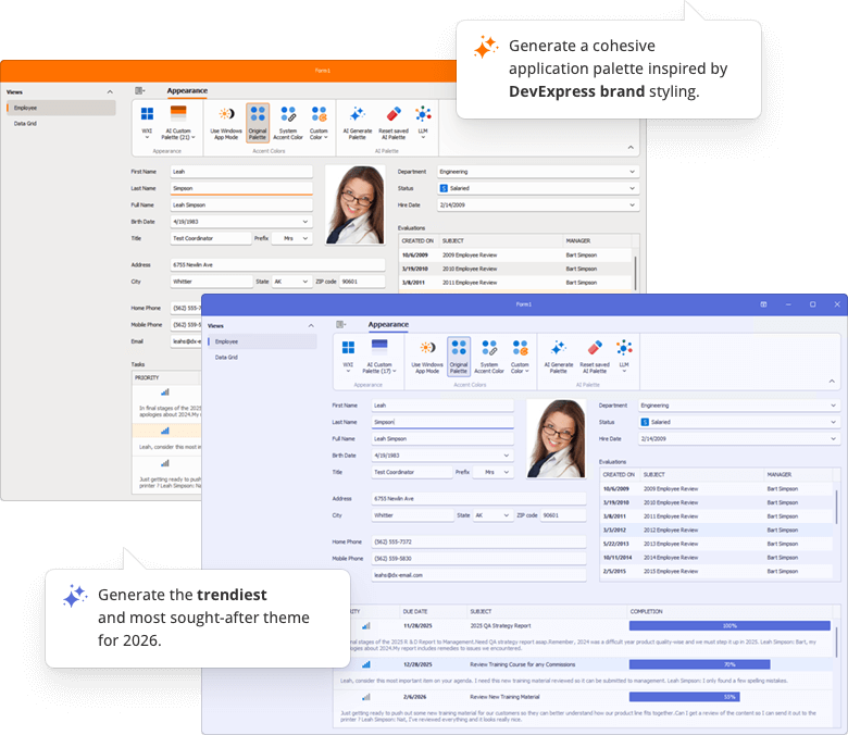
Generate Skin Palettes with AI
Our new demo application leverages AI to create custom skin palettes to personalize an application’s appearance on the fly. Users can generate, save, and delete AI-created palettes between application sessions.
Multi-Cell Editing — Data Grid & TreeList
Our WinForms Data Grid and TreeList controls ship with multi-cell editing support (users can apply identical values to multiple cells simultaneously). This capability will be useful when working with large datasets or when applying the same change (for example, updating a status, category, or date) across multiple rows.

Activation steps:
- Set the
OptionsSelection.MultiSelectproperty totrue. - Attach MultiCellEditBehavior to the target control.
using DevExpress.XtraEditors;
public class Form1 : XtraForm {
    public Form1() {
        InitializeComponent();
        // Activate multi-cell selection.
        gridView1.OptionsSelection.MultiSelect = true;
        // Create and attach a MultiCellEditBehavior.
        BehaviorManager bm = new BehaviorManager(this.components);
        bm.Attach<MultiCellEditBehavior>(gridView1);
    }
}
Search with a Delay in Accordion Control
You can filter WinForms Accordion Control items with a delay. Use the FilterDelay property to specify the delay in milliseconds.
CSS Variables — SVG Icon Colorization
You can now dynamically align SVG icon colors with the current application skin. Use the following CSS variables to colorize custom SVG icons:
var(--dxds-icon-color-red),var(--dxds-icon-color-alt-red)var(--dxds-icon-color-green),var(--dxds-icon-color-alt-green)var(--dxds-icon-color-blue),var(--dxds-icon-color-alt-blue)var(--dxds-icon-color-yellow),var(--dxds-icon-color-alt-yellow)var(--dxds-icon-color-black),var(--dxds-icon-color-alt-black)var(--dxds-icon-color-white),var(--dxds-icon-color-alt-white)var(--dxds-icon-color-purple),var(--dxds-icon-color-alt-purple)
<?xml version="1.0" encoding="utf-8"?>
<svg version="1.1" id="New" xmlns="http://www.w3.org/2000/svg"
     xmlns:xlink="http://www.w3.org/1999/xlink" x="0px" y="0px"
     viewBox="0 0 32 32" style="enable-background:new 0 0 32 32;" xml:space="preserve">
<g id="Add">
    <circle cx="16" cy="16" r="14"
         style="fill: var(--dxds-icon-color-green)"/>
    <polygon points="24,14 18,14 18,8 14,8 14,14 8,14 8,18 14,18 14,24 18,24 18,18 24,18"
         style="fill: var(--dxds-icon-color-white)"/>
</g>
</svg>
Rich Text Editor
Mail Merge Enhancements - Merge Data with Detail Regions
The mail merge engine used within the DevExpress WinForms Rich Text Editor supports nested regions. You can merge data with any number of hierarchical levels (master–detail–subdetail and beyond) within a single template. Existing MailMerge methods work for both single-level and multi-level documents, no additional settings/toggles required.
Use TableStart:RegionName and TableEnd:RegionName merge fields to mark regions that contain data from a single record (master or detail). Merge regions can be defined within paragraphs or tables. Regions placed in tables automatically expand the table with source data during the merge.
Additional Mail Merge and Field API enhancements:
- Support for major data source types: IList, IList<T>, ArrayList, DataTable, DataSet.
- Added options to define and process custom region tags (instead of default TableStart / TableEnd).
- Added a new GetRegionHierarchy method to get document region hierarchy. Use it to determine parent and nested regions, obtain region names and ranges, retrieve region fields.
- Added the IsMergeField flag determining Merge Fields.
- Introduced the MergeField interface to obtain merge field name and settings.
- Enhanced mail merge-related events with region information arguments.
The following code snippet merges data and handles the MailMergeRecordStarted event to log the merge process:
// Read JSON data to a database object
string dataPath = Path.Combine(AppDomain.CurrentDomain.BaseDirectory, "nwind_data.json");
string json = File.ReadAllText(dataPath);
NWind? nwind;
nwind = JsonSerializer.Deserialize<NWind>(json);

// Load the template into the RichEdiControl instance.
var templatePath = Path.Combine(AppDomain.CurrentDomain.BaseDirectory, "template.docx");
richEditControl.LoadDocument(templatePath);

// Create mail merge options.
MailMergeOptions myMergeOptions = richEditControl.Document.CreateMailMergeOptions();

// Assign the data source.
myMergeOptions.DataSource = nwind?.Customers;

// Register event handlers to customize merge behavior (progress output and dynamic variables).
richEditControl.MailMergeRecordStarted += RichEditControl_OnMailMergeRecordStarted;

// Execute the mail merge.
richEditControl.MailMerge(myMergeOptions, "result.docx", DocumentFormat.Docx);


// Event handler outputs diagnostic info for each mail merge region
// and its sub‑regions when a record merge starts.
void RichEditControl_OnMailMergeRecordStarted(object sender, MailMergeRecordStartedEventArgs e)
{
    var region = e.MailMergeRegionInfo;
    if (region != null)
    {
        Console.WriteLine($"Merging region: {region.Name}\r\n Merge Fields: {region.MergeFields.Count}");
        if (region.Regions != null && region.Regions.Count > 0)
        {

            foreach (var subRegion in region.Regions)
            {
                Console.WriteLine($" Sub-region: {subRegion.Name}\r\n Merge Fields: {subRegion.MergeFields.Count}");
            }
            Console.ReadKey();
        }
    }
}
Spreadsheet Control
Extended OLE Object Support
DevExpress WinForms Spreadsheet allows you to import/export linked and embedded OLE Objects in binary Excel formats (XLS and XLSB). You can create, edit, or remove OLE objects in Excel documents and save these document to binary formats without content loss.
Download 30-Day Trial
With numerous new products and dozens of high-impact features, DevExpress UI components allow you to build your best, without limits or compromise. Download our fully-functional 30-day trial today and experience the DevExpress difference today.
Tip
Your Feedback Matters! Take part in the survey on our website: WinForms Survey.