ToolboxControl Class
Displays multiple sets of items and automatically initiates drag-and-drop operations when an end-user starts dragging these items.
Namespace: DevExpress.XtraToolbox
Assembly: DevExpress.XtraBars.v24.2.dll
NuGet Package: DevExpress.Win.Navigation
#Declaration
public class ToolboxControl :
BaseStyleControl,
IToolboxControl,
IMouseWheelSupport,
IGestureClient,
IDisposable,
IEditorBackgroundProvider
#Remarks
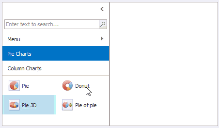
The ToolboxControl provides built-in support for drag-and-drop operations of its items to external controls. The following image demonstrates a sample ToolboxControl that contains two groups (Pie Charts and Column Charts), each providing a set of items. Each time an item is dropped, the ToolboxControl.DragItemDrop event fires, which allows you to implement certain actions.
When an end-user starts dragging a toolbox item, a drag-and-drop operation is automatically initiated. To customize the drag-and-drop operation’s settings and complete the operation (e.g. drop the dragged item onto an external surface), handle these events:
- ToolboxControl.DragItemStart - Fires when an item’s drag operation starts. Allows you to replace the cursor icon and cancel the drag operation.
- ToolboxControl.DragItemMove - Fires during item dragging. Allows you to specify the drop effect in the current position.
- ToolboxControl.DragItemCancel - Fires when a drag operation is canceled.
- ToolboxControl.DragItemDrop - Fires after an item has been dropped. Allows you to perform custom actions on item dropping.
To perform actions on a double-click, handle the ToolboxControl.ItemDoubleClick event.
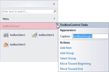
Items in the ToolboxControl are combined into groups. Thus, to add items, you first need to add a group(s) to the ToolboxControl.Groups collection, and then add items to this group using the ToolboxGroup.Items collection. At design time, you can populate the ToolboxControl with groups and items using smart tags.
The control’s additional features include:
- Embedded search box - This editor allows end-users to quickly locate items by their captions (see ToolboxOptionsView.ShowSearchPanel).
- Control’s minimization feature - Allows end-users to collapse the control to a small bar (see ToolboxControl.OptionsMinimizing).
- Quick access to item groups with the built-in menu (see ToolboxOptionsView.ShowMenuButton).
- Multiple item selection feature (see ToolboxOptionsBehavior.ItemSelectMode)
#Tooltips
DevExpress controls support regular and super tooltips. Enable the ShowToolTips option to display tooltips when the mouse pointer hovers over the control.
Customize Regular Tooltip Text
Use the following properties of the target control to specify regular tooltip text and title:
API | Description |
---|---|
Specifies tooltip text. You can use line breaks in regular tooltips. | |
Specifies whether to parse HTML tags in text. | |
Specifies the tooltip title. If you do not specify tooltip text, the tooltip is not displayed even if you specify the title. |
The following code snippet specifies tooltip text and title for a TextEdit
editor:
public Form1() {
InitializeComponent();
textEdit1.ShowToolTips = true;
textEdit1.ToolTipTitle = "Name";
textEdit1.ToolTip = "Please enter your name";
}
Assign an Image to Regular Tooltips
Use the control’s ToolTipIconType property to assign a predefined icon. The ToolTipController.IconSize property specifies icon size.
Assign a custom image as follows:
- Create a ToolTipController and assign it to the control’s ToolTipController property.
- Create an image collection and assign it to the ToolTipController.ImageList property.
- Handle the ToolTipController.BeforeShow event. Use the e.ImageOptions parameter to assign a raster or vector image to the tooltip.
Note
The Tool
property has priority over e.
. If you assign a custom image, set Tool
to None
.
The following code snippet assigns a custom image to the TextEdit
tooltip:
Note
text
, tool
, and svg
were created at runtime.
public Form1() {
InitializeComponent();
textEdit1.ShowToolTips = true;
textEdit1.ToolTipTitle = "Name";
textEdit1.ToolTip = "Please enter your name";
textEdit1.ToolTipController = toolTipController1;
toolTipController1.ImageList = svgImageCollection1;
toolTipController1.BeforeShow += ToolTipController1_BeforeShow;
}
private void ToolTipController1_BeforeShow(object sender, ToolTipControllerShowEventArgs e) {
ToolTipController controller = sender as ToolTipController;
if (e.ToolTip == textEdit1.ToolTip)
e.ImageOptions.SvgImage = (controller.ImageList as SvgImageCollection)["personalCard"];
}
Display a Super Tooltip
Use the control’s SuperTip property to assign a super tooltip. If you wish to use HTML tags in a super tooltip, enable the SuperToolTip.AllowHtmlText property.
Setting the ToolTipController.ToolTipType property to SuperTip converts existing regular tooltips to super tooltips.
Tip
Read the following help topic for information on how to customize super tooltips: Hints and Tooltips.