RibbonControl.ShowPageHeaderButton Property
Gets or sets whether the RibbonControl displays the Page Header Button in the header area. This is a dependency property.
Namespace: DevExpress.Xpf.Ribbon
Assembly: DevExpress.Xpf.Ribbon.v26.1.dll
Declaration
Property Value
| Type | Default | Description |
|---|---|---|
| Boolean | false |
|
Remarks
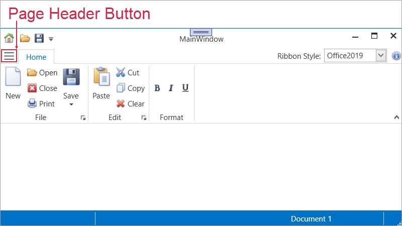
Enable the ShowPageHeaderButton property to add a compact button to the RibbonControl header. The button typically displays/hides a navigation pane or another top-level UI element.
To bind an action to the Page Header Button, use PageHeaderButtonCommand.
Compatibility
The Page Header Button is available for the following styles:
- Office2019
- OfficeSlim
- TabletOffice
Interaction with Application Button
If both ShowApplicationButton and ShowPageHeaderButton properties are set to true, the RibbonControl displays only the Page Header Button.
In Office2007 and Office2010 styles, the Ribbon displays only the Application Button and hides the Page Header Button.
Example
The following code example displays the Page Header Button in the header area:
<dx:ThemedWindow
    x:Class="Demo.MainWindow"
    xmlns="http://schemas.microsoft.com/winfx/2006/xaml/presentation"
    xmlns:x="http://schemas.microsoft.com/winfx/2006/xaml"
    xmlns:dx="http://schemas.devexpress.com/winfx/2008/xaml/core"
    xmlns:dxr="http://schemas.devexpress.com/winfx/2008/xaml/ribbon"
    xmlns:sys="clr-namespace:System;assembly=mscorlib"
    Title="MainWindow" Height="800" Width="800">
    <dx:ThemedWindow.Resources>
        <!-- Custom style for Page Header Button -->
        <Style TargetType="dxr:PageHeaderButton">
            <Setter Property="Margin" Value="5,0"/>
            <Setter Property="Padding" Value="8,4"/>
            <Setter Property="CornerRadius" Value="7"/>
            <Setter Property="GlyphWidth" Value="32"/>
            <Setter Property="GlyphHeight" Value="32"/>
            <Style.Triggers>
                <Trigger Property="IsMouseOver" Value="True">
                    <Setter Property="Background" Value="#E3F2FD"/>
                </Trigger>
            </Style.Triggers>
        </Style>
    </dx:ThemedWindow.Resources>
    <Grid>
        <dxr:RibbonControl
            RibbonStyle="Office2019"
            ShowPageHeaderButton="True"
            PageHeaderButtonToolTip="Show or hide navigation"
            PageHeaderButtonGlyph="pack://application:,,,/Icons/Hamburger.svg"
            PageHeaderButtonCommand="{Binding ToggleNavigationPanelCommand}"
            PageHeaderButtonCommandParameter="{x:Boolean True}" />
    </Grid>
</dx:ThemedWindow>
public sealed class MainViewModel {
    public bool IsNavigationVisible { get; set; } = false;

    public ICommand ToggleNavigationPanelCommand => new DevExpress.Mvvm.DelegateCommand<object>(p => {
        if (p is bool force)
            IsNavigationVisible = force;
        else
            IsNavigationVisible = !IsNavigationVisible; // Hides or displays the button if the parameter is null
    });
}