Appearance Settings
- 6 minutes to read
This topic contains detailed information on application-wide appearance customization options available for DevExpress-powered applications.
Skins and Palettes
TdxSkinController is a non-visual component designed to configure application-wide appearance settings, such as skins, palettes, scrollbar-related options, etc. These look & feel settings are common to all DevExpress controls and forms (except for the majority of Views in the TdxNavBar control).
To manage global appearance settings in an application at runtime, you can add a TdxSkinController component to a form.
Multiple Skin Controllers
Multiple TdxSkinController instances share the same settings.
Warning
We strongly recommend that you use only one TdxSkinController component instance in your project. Do not place this component on child forms and frames.
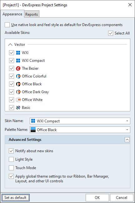
Project Look & Feel Settings
If you do not need to switch between skins and palettes at runtime, you can use the design-time Project Settings dialog to select the required skin and palette application-wide.
Main Skin Controller Settings
The list below outlines key members of the TdxSkinController class that allow you to configure application-wide appearance settings.
- NativeStyle
- Specifies if DevExpress controls and application forms use operating system-dependent draw routines to render all UI elements. If this option is enabled, all skin and color palette settings have no effect.
- ScrollMode | ScrollbarMode
- Allow you to switch between supported scrollbar types and scrolling modes for all controls that support them.
- SkinName | SkinPaletteName
- Specify skin and color palette applied to the application if the NativeStyle property is set to
False. Only vector skins can switch between color palettes. - TouchMode
- Specifies if Touch Mode is enabled.
Refer to the TdxSkinController class description for detailed information on all available options.
DevExpress Controls with Independent Skin Settings
Most DevExpress controls have the LookAndFeel property that allows you to override global appearance settings. This section contains information on controls with different appearance settings.
Toolbar UIs and Bar Manager
The TdxBarManager component automatically synchronizes its look & feel settings with application-wide skin and palette. If you need to apply an individual skin to a toolbar UI in your application, use the bar manager’s LookAndFeel property.
Note
To apply a global or individual skin to a TdxBarManager component, make sure that the Style property is set to bmsUseLookAndFeel (the default value if global appearance settings affect bar manager components).
Ribbon Control
The TdxRibbon control can have individual look & feel settings or automatically synchronize (recommended) with skin and palette settings defined application-wide.
To apply an individual skin and Microsoft Office-inspired color accent, set the Ribbon control’s UseGlobalSkin property to bFalse and use ColorSchemeName and ColorSchemeAccent properties.
Layout Control
The Layout control (and its groups/items) can have individual look & feel settings or synchronize (recommended) with the skin and palette defined using a TdxSkinController component or the Project Settings dialog.
To apply an individual skin to a TdxLayoutControl instance, do the following:
- Add a TdxLayoutSkinLookAndFeel component and assign it to the LayoutLookAndFeel property.
- Use the TdxLayoutSkinLookAndFeel component to configure individual look & feel settings.
Note
If a vector skin is active for an individual layout control, it uses the color palette whose name is assigned to the TdxSkinController.SkinPaletteName property.
State-Specific Editor Appearance Settings
Unlike other DevExpress controls, editors (TcxCustomEdit class descendants) have multiple properties designed to define different appearance settings for individual editor states:
- Style | StyleDisabled | StyleFocused | StyleHot | StyleReadOnly
Provide access to individual editor appearance settings in corresponding states.
You can use the LookAndFeel property accessible through all these properties to override global skin and palette settings for an editor in individual states.
Note
All appearance settings defined at the level of individual editors have priority both over global settings and style controllers.
To re-apply global skin and palette settings to an individual editor state, call the LookAndFeel.Reset procedure for the corresponding state style.
Style Controllers
Style controller components allow you to override global look & feel settings for multiple editors simultaneously. Each style controller has the same state-specific property sets as those available for editors.
- TcxDefaultEditStyleController
- Allows you to override global appearance settings for all editors in one or multiple states.
- TcxEditStyleController
Allows you to override global appearance settings for individual editors in one or multiple states.
Tip
Use an editor’s Style.StyleController property to associate the editor with a TcxEditStyleController component. The associated component overrides editor appearance settings defined at the global level or through a TcxDefaultEditStyleController component.
Refer to the TcxEditStyleController class description for detailed information and a code example.
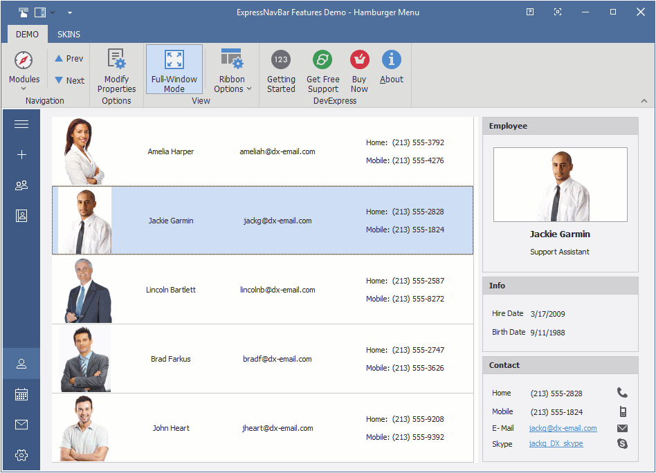
Skin Support in Navigation Bar Views
Only the following TdxNavBar control Views support skins:
- Accordion
- Hamburger
- Skin Explorer Bar
- Skin Navigation Pane
Note
All other Navigation Bar Views rely on their own draw routines.
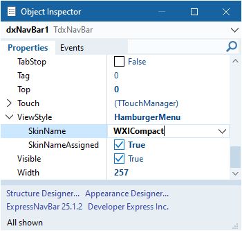
Individual View Skin Settings
If one of the supported Navigation Bar Views is selected using the ViewStyle property, the TdxNavBar control uses global skin and palette settings.
You can expand the ViewStyle node and use the SkinName property to select an individual skin for the TdxNavBar control. If a vector skin is selected, it uses the color palette defined at the global level.
DevExpress Skins and Standard/Third-Party VCL Components
The TdxSkinController component can also apply skins to the following standard VCL controls:
Tip
While the TdxSkinController component supports these standard VCL controls, we recommend that you use their DevExpress counterparts to ensure the best user experience.
Skin Engine Ignore List and Related Events
The DevExpress Skin Engine applies skins both to DevExpress and standard controls from the supported list. The active skin affects even the standard controls used as part of third-party VCL controls and components, which may result in visual inconsistency. The DevExpress Skin Engine allows you to exclude certain forms and controls from active skin and palette effects.
Form-Level Ignored List
The TdxSkinIgnoredFormList class maintains a global ignore list of the DevExpress Skin Engine. The ignore list is prepopulated with a number of form classes shipped with popular third-party VCL components.
You can call TdxSkinIgnoredFormList.Add, TdxSkinIgnoredFormList.Remove, TdxSkinIgnoredFormList.Clear, and other methods to manage the list of ignored form classes.
Refer to the TdxSkinIgnoredFormList class description for detailed information on the ignored form list and related code examples.
Tip
Alternatively, you can handle the TdxSkinController.OnSkinForm event to leave certain forms unskinned.
Control-Level Ignored List
If you need to leave individual standard controls unskinned, handle the TdxSkinController.OnSkinControl event.
Skin Interaction with VCL Styles
The DevExpress Skin Engine and the VCL Styles technology are not compatible because they rely on different UI element rendering mechanisms.
Important
We do not recommend that you use Embarcadero RAD Studio® VCL Styles in any application project that uses DevExpress controls.
We strongly recommend that you use only DevExpress skins to ensure the best possible appearance of DevExpress-powered VCL applications.
Code Example: Apply a Skin and its Palette
The following code example applies the WXICompact skin and its Sharpness palette to an application:
  dxSkinController1.BeginUpdate;
  try
    dxSkinController1.UseSkins := True;
    dxSkinController1.NativeStyle := False;
    dxSkinController1.SkinName := 'WXICompact';
    dxSkinController1.SkinPaletteName := 'Sharpness';
  finally
    dxSkinController1.EndUpdate;
  end;
