TdxLayoutSkinLookAndFeel Class
A layout look & feel component recommended for appearance configuration at the level of individual layout controls, items, and groups.
Declaration
TdxLayoutSkinLookAndFeel = class(
    TdxLayoutCxLookAndFeel
)
Remarks
A Layout control can have individual look & feel settings or automatically synchronize (recommended) with the skin and palette defined using a TdxSkinController component or the Project Settings dialog.
A TdxLayoutSkinLookAndFeel component allows you to specify individual appearance settings for different Layout controls and their groups/items. In addition to general look & feel settings that correspond to global skin and native style options, TdxLayoutSkinLookAndFeel also has appearance settings specific to layout groups and items (offsets, paddings, caption fonts, etc.).
Main API Members
The list below outlines key members of the TdxLayoutSkinLookAndFeel class. These members allow you to configure look & feel settings at the level of individual Layout controls, groups, and items.
Appearance Settings
- DefaultUseSkinOffsets
- Enable or disable skin-determined offsets for layout groups, and items for all layout look & feel components in the application. The UseSkinOffsets property allows you to override this setting at the level of an individual layout look & feel component.
- GroupOptions | ItemOptions
- Provide access to layout group and item-specific settings.
- LookAndFeel
Provides access to look & feel settings (skin name and native style, for example) defined in the layout look & feel component.
Note
If you use the LookAndFeel.SkinName property to select a vector skin at the level of a Layout control, group, or item, the selected skin uses the color palette defined at the global level (TdxSkinController.SkinPaletteName).
- Offsets
- Specifies offsets for layout groups and items. If a skin is applied to the Layout control, UseSkinOffsets and DefaultUseSkinOffsets property values determine if the Offsets property is in effect.
- UseSkinOffsets
- Specifies if the layout look & feel component applies skin-determined offsets for layout groups, and items instead of corresponding values defined using the Offsets property.
How to Use Layout Look & Feel Components
- Use a TdxLayoutLookAndFeelList component to manage look & feel storage components.
- You can associate one
TdxLayoutSkinLookAndFeelcomponent with multiple Layout controls and their groups/items to share settings.
Layout Look & Feel Component Manager
Use the TdxLayoutLookAndFeelList component to manage layout look & feel components. Call the TdxLayoutLookAndFeelList.CreateItem function or use the Designer dialog available at design time.
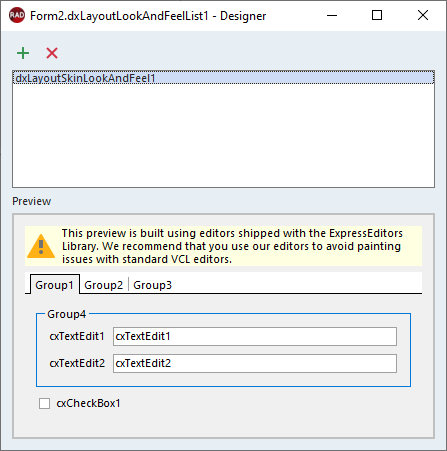
Design-Time Dialog
Double-click a TdxLayoutLookAndFeelList component to display a design-time dialog:
Indirect TdxLayoutSkinLookAndFeel Class References
The following public API members reference the TdxLayoutSkinLookAndFeel class as a TdxCustomLayoutLookAndFeel object:
- TdxCustomLayoutItem.LayoutLookAndFeel
- Associates the layout group or item with a dedicated look & feel storage component.
- TdxCustomLayoutControl.LayoutLookAndFeel
- Associates the Layout control with a dedicated look & feel storage component.
- TdxLayoutLookAndFeelList.CreateItem
- Creates a new layout look & feel component of the specified type.
- TdxLayoutLookAndFeelList.Items
- Provides indexed access to created layout look & feel components.
- TdxCustomLayoutLookAndFeelClass
- A reference to a layout look & feel component class.