Ribbon Gallery Items
A gallery item represents a single command in a gallery. Along with a caption and description, a gallery item is provided with an icon that displays the command execution sample.
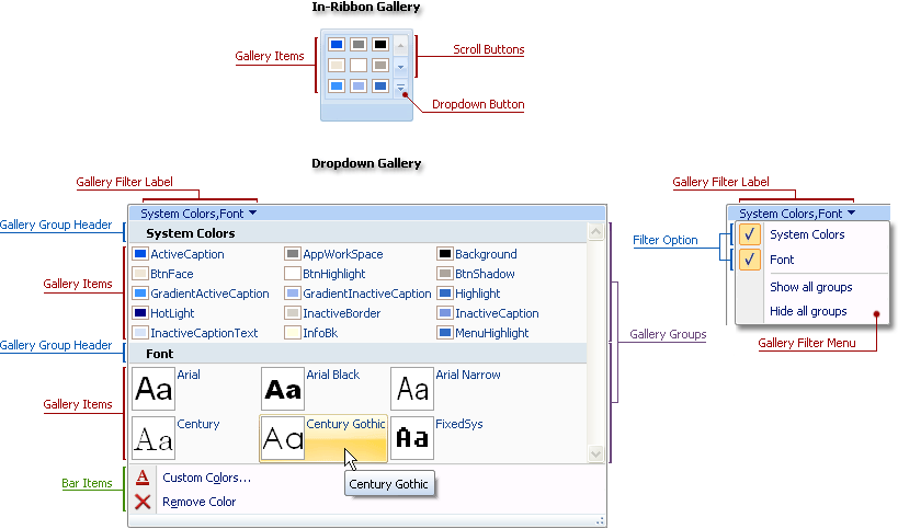
A gallery provides default hints for items. Hovering a mouse pointer over an item displays a hint window containing text specified by the gallery item’s Caption property.
A gallery item is represented by a TdxRibbonGalleryGroupItem object available via the gallery group‘s Items property. This object provides the following interface:
| Member | Description |
|---|---|
| Caption | Specifies a gallery item’s caption. |
| Description | Specifies a descriptive text for the gallery item. |
| Glyph, ImageIndex | Specifies an explanatory image for the gallery item. |
| Selected | Specifies whether a gallery item is selected. |
| OnClick | Provides functionality for a gallery item. |
At design time, you can easily customize the gallery structure and exchange items between groups using the Ribbon gallery designer.
See Also