DateEdit Class
An editor that displays a date in a specific format. Users can select a date within a cross-platform customizable or platform-specific native date picker.
Namespace: DevExpress.Maui.Editors
Assembly: DevExpress.Maui.Editors.dll
NuGet Package: DevExpress.Maui.Editors
Declaration
[DXLicenseMAUI]
public class DateEdit :
    EditBase,
    IDateEditController,
    IEditController,
    IDXViewController,
    IElementController
Related API Members
The following members return DateEdit objects:
Remarks
The DateEdit allows users to enter a date. The image below illustrates an account form that allows a user to enter a birth date.

The editor initially displays a date icon on the right within the box. You can also add the following optional elements:

1. Custom Icon 2. Label 3. Date Icon 4. Help Text 5. Error Message
Date
Use the Date property to set or get the date in the editor. MinDate and MaxDate properties specify the minimum and maximum allowed dates and limit user input to the specified range.
Use DateChangedCommand and DateChangedCommandParameter properties to specify a command executed when the date changes. You can also handle the DateChanged event to respond to date changes.
Use the following properties to change the appearance and alignment of the date in the box:
Property | Description |
|---|---|
Specify the text color for each state of the editor. | |
Specify the font settings of a date displayed in the editor. | |
Gets or sets the horizontal alignment of a date displayed in the editor. |
Date Format
The DisplayFormat property defines the format of a date displayed in the editor.
You can use standard or custom format specifiers (see the MSDN topics Standard date and time format strings and Custom date and time format strings) to create format patterns, for example:
<dxe:DateEdit DisplayFormat="d"/>

<dxe:DateEdit DisplayFormat="ddd d MMM"/>

Date Picker
A date picker appears when a user taps the editor. The default date picker is the same on iOS and Android; this ensures a consistent look and feel for your app on both platforms.

To invoke the picker in code, use the IsPickerShown property. If you want to display the CLEAR button in the picker view, enable the PickerClearButtonVisible property.
Appearance Customization
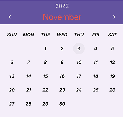
You can customize the appearance of the following visual elements in the calendar: days, months, years, days of the week, and header. You can set a custom style for all such visual elements, as well as for specific days/months/years. Styles allow you to specify fonts, and background and foreground colors. You can also replace the default data template used to render a visual element.

- Month View
- Year View
- Decade View
- Calendar Header
- Day of Week
- Day
- Trailing Day
- Month
- Year
The table below contains options that you can use to apply custom styles and templates to visual elements.
| Style for All Elements | Style for Specific Elements | Template | Description |
|---|---|---|---|
| PickerDayCellAppearance | PickerCustomDayCellAppearance | PickerDayCellTemplate | Allow you to customize days. |
| PickerDayOfWeekCellAppearance | PickerCustomDayOfWeekCellAppearance | PickerDayOfWeekCellTemplate | Allow you to customize days of the week. |
| PickerMonthCellAppearance | PickerCustomMonthCellAppearance | PickerMonthCellTemplate | Allow you to customize months. |
| PickerYearCellAppearance | PickerCustomYearCellAppearance | PickerYearCellTemplate | Allow you to customize years. |
| PickerHeaderAppearance | — | — | Allow you to customize the calendar’s header. |
To obtain or set the view in code, use the PickerActiveViewType property. You can also use the following options to specify the display of the calendar:
| Property | Description |
|---|---|
| PickerCellMinSize | Gets or sets the minimum size of cells in the default picker. This is a bindable property. |
| PickerFirstDayOfWeek | Gets or sets the first day of the week in the default picker. This is a bindable property. |
| PickerHorizontalCellSpacing | Gets or sets the horizontal spacing between cells in the default picker. This is a bindable property. |
| PickerVerticalCellSpacing | Gets or sets the vertical spacing between cells in the default picker. This is a bindable property. |
| PickerShowTrailingDays | Gets or sets whether days related to the previous and next months are displayed in the default picker. This is a bindable property. |
Example 1
The example below describes how to apply custom appearance settings to days, days of week, and the calendar’s header.
<dxe:DateEdit>
    <dxe:DateEdit.PickerHeaderAppearance>
        <dxe:CalendarHeaderAppearance HeaderTitleTextColor="#F44848"/>
    </dxe:DateEdit.PickerHeaderAppearance>
    <dxe:DateEdit.PickerDayCellAppearance>
        <dxe:CalendarDayCellAppearance FontAttributes="Bold,Italic"
                                       TextColor="Black"/>
    </dxe:DateEdit.PickerDayCellAppearance>
    <dxe:DateEdit.PickerDayOfWeekCellAppearance>
        <dxe:CalendarDayOfWeekCellAppearance FontAttributes="Bold,Italic"
                                             TextColor="Black"/>
    </dxe:DateEdit.PickerDayOfWeekCellAppearance>
</dxe:DateEdit>
Example 2
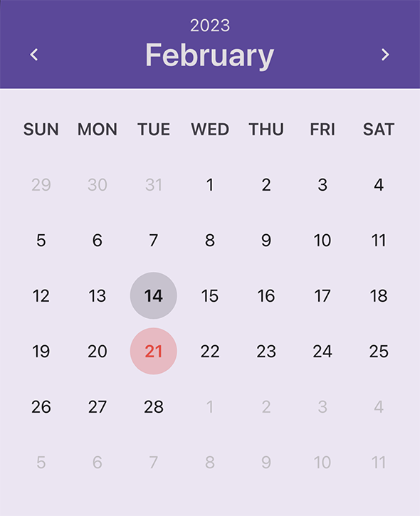
The example below shows how to apply custom appearances to specified days.
using DevExpress.Maui.Editors;

void CustomDayCellAppearance(object sender, CustomSelectableCellAppearanceEventArgs e) {
    if(e.Date.Month == 2 && e.Date.Day == 14) {
        e.FontAttributes = FontAttributes.Bold;
        e.EllipseBackgroundColor = Color.FromRgba(e.TextColor.Red, e.TextColor.Green, e.TextColor.Blue, 0.15);
    }

    if(e.Date.Month == 2 && e.Date.Day == 21) {
        e.FontAttributes = FontAttributes.Bold;
        Color textColor = Color.FromHex("F44848");
        e.EllipseBackgroundColor = Color.FromRgba(textColor.Red, textColor.Green, textColor.Blue, 0.25);
        e.TextColor = textColor;
    }
}
<dxe:DateEdit PickerCustomDayCellAppearance="CustomDayCellAppearance"/>
Example 3
The example below shows how to apply a custom appearance to weekends (days in the calendar and days of the week).

using DevExpress.Maui.Editors;

void CustomDayCellAppearance(object sender, CustomSelectableCellAppearanceEventArgs e) {
    if (e.Date.DayOfWeek == DayOfWeek.Saturday || e.Date.DayOfWeek == DayOfWeek.Sunday) {
        e.TextColor = Color.FromHex("F44848");
        if(e.IsTrailing)
            e.TextColor = Color.FromRgba(e.TextColor.Red, e.TextColor.Green, e.TextColor.Blue, 0.5);
    }
}

private void CustomDayOfWeekCellAppearance(object sender, CustomDayOfWeekCellAppearanceEventArgs e) {
    if(e.DayOfWeek == DayOfWeek.Saturday || e.DayOfWeek == DayOfWeek.Sunday)
        e.TextColor = Color.FromHex("F44848");
}
<dxe:DateEdit PickerCustomDayCellAppearance="CustomDayCellAppearance"
              PickerCustomDayOfWeekCellAppearance="CustomDayOfWeekCellAppearance"/>
Native Picker
The editor can also use a native picker, which varies depending on the platform. Enable the UseNativePicker option to display the platform-specific picker.

Note
Customization options described above are only in effect for the default picker.
Label
The LabelText property specifies the editor’s input prompt string. The label is displayed inside the editor while the editor is not focused. When the editor gets focus, the label moves to the top. If a value is assigned to the editor, the label is always displayed at the top.

To pin the label to the top of the editor, set the IsLabelFloating property to false.
To customize label appearance, use the following properties:
Property | Description |
|---|---|
LabelColor / FocusedLabelColor | Specify the label’s color for each state of the editor. |
Specify label font settings. |
Placeholder
A placeholder (PlaceholderText) is the input prompt string displayed within the edit box when the editor is empty and focused.

To specify the color of the placeholder text, use the PlaceholderColor property.
Help Text and Error Message
You can display the following labels below an editor:
- HelpText - A brief editor description.
- ErrorText - A message shown when an error occurs (HasError is true).

The BottomTextTopIndent property specifies the indent between the editor’s bottom border and the help or error text.
To specify the color and font attributes for the help/error text, use the following properties:
Property | Description |
|---|---|
Specify the help text color for different states of an editor. | |
Specifies the error message text color. | |
BottomTextFontSize | Specify font settings. |
If HelpText is not set, ErrorText appears as an additional line below the edit box and page content shifts down. To prevent this behavior, set the ReserveBottomTextLine property to true.
Autofill
If the editor’s AutofillContentType property is set to AndroidBirthDate or AndroidCreditCardExpirationDate, the user can automatically fill the editor with an appropriate date. Note that the device should have an enabled autofill service that contains required values (names, dates, passwords, and so on).
Icons
The date editor can display icons within its box.
- Date icon - indicates a date editor.
- Clear icon - removes a date selected in the editor.
- Error icon - appears in the error state (HasError is
true). - Custom icons - can be shown on the left or right within the box.
Use the following members to manage editor icons:
Icon | Property | Description |
|---|---|---|
Date Icon | Allows you to replace the default date icon image with a custom icon. | |
Allow you to perform an action when a user taps the date icon. | ||
Gets or sets the date icon’s color. This is a bindable property. | ||
Gets or sets whether the date icon is visible. | ||
Clear Icon | Gets or sets whether the clear icon is displayed. This is a bindable property. | |
Gets or sets the clear icon image. This is a bindable property. | ||
Gets or sets the clear icon’s color. | ||
Allow you to assign an additional action to the clear icon. | ||
Error Icon | Allows you to replace the default error icon image with a custom one. | |
Allow you to perform an action when a user taps the error icon. | ||
Gets or sets error icon color. | ||
Gets or sets whether the error icon is visible. | ||
Custom Icons | Specify custom icons displayed on the left and right within the editor. | |
StartIconClicked / StartIconCommand | Allow you to set actions that occur when a user taps custom icons. | |
Specify icon colors. | ||
Specify whether custom icons are visible. | ||
Common | Specify icon color for each editor state. | |
Gets or sets the distance between an icon and input text (or prefix/suffix, if any). | ||
Gets or sets the distance between icons. | ||
Gets or sets the vertical alignment of icons. |
User Interaction
Editors raise the following events on user interaction:
- Tap - Fires when the user taps the editor.
- DoubleTap - Fires when the user double taps the editor.
- LongPress - Fires when the user presses and holds the editor.
Editor Appearance
The editor appears as follows depending on the current state and specified BoxMode:
Editor State | BoxMode = Outlined (default) | BoxMode = Filled |
|---|---|---|
Inactive |
|
|
Focused |
|
|
Activated |
|
|
Error |
|
|
Disabled |
|
|


Use the following properties to change the appearance of the edit box and its borders:
Property | Description |
|---|---|
Specify the border color for each state of the editor. | |
Specifies the color of the edit box borders, label, and error icon and error message if there is an input error. | |
BorderThickness | Specify the border thickness for each state of the editor. |
Specifies whether edit box corners are rounded or cut. | |
Specifies the radius of the edit box corners. | |
BackgroundColor | Specifies the edit box fill color. |
Specifies the amount of space between edit box borders and content. |
Examples
- Configure a Date Editor
- Configures a
date editorand demonstrates its main settings. - DevExpress Editors for .NET MAUI
- Illustrates some of the features available to you when using our .NET MAUI Editors library. Highlight features include input data validation, along with label and icon customization.
- Create Login and Sign-Up Forms
- Uses multiple editors to create Login and Sign-Up forms. The list of used editors includes TextEdit, PasswordEdit, MultilineEdit, ComboBoxEdit,
DateEdit, InputChipGroup, CheckBoxColor.