DXRangeSlider Class
A component that allows you to select a range of numeric values.
Namespace: DevExpress.Maui.Editors
Assembly: DevExpress.Maui.Editors.dll
NuGet Package: DevExpress.Maui.Editors
Declaration
[DXLicenseMAUI]
public class DXRangeSlider :
    DXSliderBase
Remarks
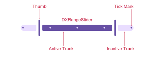
The DXRangeSlider control is an editor that allows users to select a range of numeric values.
You can use StartValue and EndValue properties to specify the initial start and end values. If you want to specify minimum and maximum values, use MinValue and MaxValue properties. To change the start or end value, move the start or end thumb along the scale.

Thumb
Use the following properties to change thumb appearance in DXSlider and DXRangeSlider controls:
- DXSliderThumbAppearance.BackgroundColor
- Gets or sets the background color of the thumb. This is a bindable property.
- DXSliderThumbAppearance.BorderColor
- Gets or sets the border color of the thumb. This is a bindable property.
- DXSliderThumbAppearance.DisabledBackgroundColor
- Gets or sets the background color of the thumb in the disabled state. This is a bindable property.
- DXSliderThumbAppearance.DisabledBorderColor
- Gets or sets the border color of the thumb in the disabled state. This is a bindable property.
- DXSliderThumbAppearance.BorderThickness
- Gets or sets the border thickness of the thumb. This is a bindable property.
- DXSliderThumbAppearance.CornerRadius
- Gets or sets the corner radius of the thumb. This is a bindable property.
- DXSliderThumbAppearance.Height
- Gets or sets the thumb height. This is a bindable property.
- DXSliderThumbAppearance.Width
- Gets or sets the thumb width. This is a bindable property.
- DXSliderThumbAppearance.PressedHeight
- Gets or sets the thumb height in the pressed state. This is a bindable property.
- DXSliderThumbAppearance.PressedWidth
- Gets or sets the thumb width in the pressed state. This is a bindable property.
- DXSliderThumbAppearance.SideMargin
- Gets or sets the margins to the left and right sides of the thumb. This is a bindable property.
Track
You can use the following properties to change track appearance in DXSlider and DXRangeSlider controls:
- DXSliderTrackAppearance.ActiveBackgroundColor
- Gets or sets the background color of the track in the active state. This is a bindable property.
- DXSliderTrackAppearance.BackgroundColor
- Gets or sets the background color of the track. This is a bindable property.
- DXSliderTrackAppearance.DisabledActiveBackgroundColor
- Gets or sets the background color of the track in active and disabled states. This is a bindable property.
- DXSliderTrackAppearance.DisabledBackgroundColor
- Gets or sets the background color of the track in the disabled state. This is a bindable property.
- DXSliderTrackAppearance.CapLength
- Gets or sets the cap length of the track. This is a bindable property.
- DXSliderTrackAppearance.CornerRadius
- Gets or sets the corner radius of the track. This is a bindable property.
- DXSliderTrackAppearance.Thickness
- Gets or sets the track thickness. This is a bindable property.
Tick Mark
If you want to display tick marks on a slider, set the TickmarkStep property to a value equal or grater than 1.
Use the following properties to change tick mark appearance in DXSlider and DXRangeSlider controls:
- DXSliderTickmarkAppearance.ActiveBackgroundColor
- Gets or sets the background color of the tick mark in the active state. This is a bindable property.
- DXSliderTickmarkAppearance.BackgroundColor
- Gets or sets the background color of the tick mark. This is a bindable property.
- DXSliderTickmarkAppearance.DisabledActiveBackgroundColor
- Gets or sets the background color of the tick mark in active and disabled states. This is a bindable property.
- DXSliderTickmarkAppearance.DisabledBackgroundColor
- Gets or sets the background color of the tick mark in the disabled state. This is a bindable property.
- DXSliderTickmarkAppearance.CornerRadius
- Gets or sets the corner radius of the tick mark. This is a bindable property.
- DXSliderTickmarkAppearance.Height
- Gets or sets the tick mark height. This is a bindable property.
- DXSliderTickmarkAppearance.Width
- Gets or sets the tick mark width. This is a bindable property.