EditBase.FocusedBorderThickness Property
Gets or sets the thickness of the editor box borders in a focused state. This is a bindable property.
Namespace: DevExpress.Maui.Editors
Assembly: DevExpress.Maui.Editors.dll
NuGet Package: DevExpress.Maui.Editors
Declaration
public double FocusedBorderThickness { get; set; }Property Value
| Type | Default | Description |
|---|---|---|
| Double | 2 | The editor border thickness, in device-independent units. |
Remarks
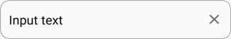
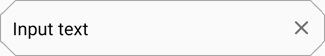
The text editor supports two types of the box (the BoxMode property):
- Outlined - the border is displayed around the entire editor box, corners are rounded.
- Filled - the border is displayed only for the bottom edge of the editor box, the box background is filled with the default color, top corners are rounded.
You can configure the following appearance settings for each type of the editor box:
Outlined:
Filled:
Borders
You can specify the color and thickness of the text editor box. The following table shows default borders of the editor in each state and lists properties that you can use to customize them:
Editor State / Properties | Outlined Editor | Filled Editor |
|---|---|---|
Unfocused: |
|
|
Focused: |
|
|
|
| |
Error: |
|
|


To specify input text color, use the TextColor property.
Background
Use the BackgroundColor and DisabledBackgroundColor properties to set the editor box fill color in the corresponding state.
Property | Outlined Editor | Filled Editor |
|---|---|---|
Default |
|
|
BackgroundColor = PeachPuff |
|
|
DisabledBackgroundColor = PeachPuff |
|
|


Corners
You can adjust edit box corners - all corners of an Outlined text editor, and top corners of a Filled editor (bottom corners are always square). Use the CornerRadius property to change the radius of editor corners:
Pass a single double value to the CornerRadius structure to set the same radius for all editor corners:
Pass four double values (TopLeft, TopRight, BottomLeft and BottomRight, in this order) to specify each corner radius separately:

The CornerMode property specifies whether the editor corners are cut or rounded. In cut corner mode, the parameters above affect corner bevel size.
Property | Outlined Editor | Filled Editor |
|---|---|---|
Default |
|
|
CornerRadius = 15 |
|
|
CornerRadius = 15 |
|
|


Example
This example shows how to customize the editor box borders and background of the TextEdit editor in each state.
State | Default | Custom |
|---|---|---|
Unfocused |
|
|
Focused |
|
|
Disabled |
|
|
Error |
|
|


<dxe:TextEdit BackgroundColor="Linen"
              DisabledBackgroundColor="PapayaWhip"
              BorderColor="Black"
              BorderThickness="2"
              FocusedBorderThickness="4"
              FocusedBorderColor="DarkOrange"
              DisabledBorderColor="PeachPuff"
              DisabledBorderThickness="6"
              ErrorColor="DarkRed"
              CornerRadius="10"
              CornerMode="Cut"/>