FilterChipGroup Class
A chip group that allows users to select multiple chips.
Namespace: DevExpress.Maui.Editors
Assembly: DevExpress.Maui.Editors.dll
NuGet Package: DevExpress.Maui.Editors
Declaration
[DXLicenseMAUI]
public class FilterChipGroup :
    SelectableChipGroup
Remarks
Filter chips allow users to select multiple options from a set. You can use these chips to display filters applied to content or use them to replace toggle buttons/checkboxes.

Item Source
Use the ItemsSource property to bind a chip group to a source of data objects for chips. The DisplayMember and IconMember properties specify data fields that store text and icons for chips.
A chip’s BindingContext property contains the data object from the ItemsSource collection based on which this chip is generated.
<dxe:FilterChipGroup
    ItemsSource="{Binding Items}"
    IsMultiline="True"
    DisplayMember="Text"
    IconMember="Image">
</dxe:FilterChipGroup>
Chips Collection
If you do not bind a chip group to a data source, you can populate the ChipGroup.Chips collection with Chip objects. ChipGroup.Chips is a content property. You can skip property tags in the markup.
The markup below shows how to add chips into a filter group.

<dxe:FilterChipGroup x:Name="filterChipGroup"
                     Margin="15"
                     BackgroundColor="Transparent"
                     IsMultiline="False">
    <dxe:Chip Icon="incoming"
              Text="Incoming"
              BackgroundColor="#3010E010"
              SelectedBackgroundColor="#8010E010"
              IsCheckIconVisible="True"/>
    <dxe:Chip Icon="outgoing"
              Text="Outgoing"
              BackgroundColor="#30FF8000"
              SelectedBackgroundColor="#80FF8000"
              IsCheckIconVisible="True"/>
    <dxe:Chip Icon="missed"
              Text="Missed"
              BackgroundColor="#30F01010"
              SelectedBackgroundColor="#80F01010"
              IsCheckIconVisible="True"/>
</dxe:FilterChipGroup>
Selected Chips
The SelectedChips property allows you to obtain the selected chips. To get the data objects based on which the selected chips are created, use the SelectedItems property. You can also use the SelectedIndexes property to specify the selected chip indices.
The table below contains properties and events that allow you to respond to selection changes.
Action | Property/Event | Description |
|---|---|---|
Selection Changes | Fires when a user (un)selects a chip in this group. | |
Gets or sets a command executed when a user (un)selects a chip in this group. This is a bindable property. |
You can also use the IsSelectedMember property to store selection states in the bound data source.
User Interaction
The table below contains properties and events that allow you to respond to user interaction.
Action | Property/Event | Description |
|---|---|---|
Tap | Fires when a user taps a chip in this group. | |
Gets or sets a command executed when a user taps a chip in this group. This is a bindable property. | ||
Double Tap | Fires when a user double-taps a chip in this group. | |
Gets or sets a command executed when a user double-taps a chip in this group. This is a bindable property. | ||
Long Press | Fires when a user taps and holds a chip in this group. | |
Gets or sets a command executed when a user taps and holds a chip in this group. This is a bindable property. |
If chips are generated based on data objects in the ItemsSource collection, the default parameter passed to a command is the corresponding data object. If chips are created manually, the default parameter is the chip’s BindingContext property value.
Layout
The table below contains properties that allow you to customize the layout of chips in a group.
Aspect | Property | Description |
|---|---|---|
Spacing | Gets or sets the horizontal amount of space between chips in this group. This is a bindable property. | |
Gets or sets the vertical amount of space between chips in this group when they are arranged in multiple rows. This is a bindable property. | ||
Layout Rows | Gets or sets whether chips in this group are displayed in single or multiple lines. This is a bindable property. | |
Scroll Bar | Gets or sets whether the scroll bar is displayed. This is a bindable property. |
Chip Text
The table below lists properties that allow you to specify and customize the text displayed in a chip.
Visual Element | Property | Description |
|---|---|---|
Text Color | Gets or sets the text color for chips in this group. This is a bindable property. | |
Gets or sets the text color for selected chips in this group. This is a bindable property. | ||
Gets or sets the text color for chips in this group when they are disabled. This is a bindable property. | ||
Gets or sets the text color for chips in this group when they are selected and disabled. This is a bindable property. | ||
Gets or sets the text color for chips in this group when they are pressed. This is a bindable property. | ||
Text Font | Gets or sets the font family name for chips in this group. This is a bindable property. | |
Gets or sets the font size for chips in this group. This is a bindable property. | ||
Gets or sets whether the font used to display text is bold, italic, or unmodified. This is a bindable property. |
Chip Icons
A chip can display the following icons:
- Chip Icon—an icon that, along with text, illustrates the purpose of the chip.
- Check Icon—an icon displayed when a chip is selected (usually, a check mark).
The table below contains properties that allow you to customize these icons.
Visual Element | Property | Description |
|---|---|---|
Chip Icon | Gets or sets whether chips in this group display an icon. This is a bindable property. | |
Gets or sets the indent of the icon from text for chips in this group. This is a bindable property. | ||
Gets or sets the icon size. This is a bindable property. | ||
Gets or sets whether chip icons in this group are rounded. This is a bindable property. | ||
Gets or sets the icon color for chips in this group. This is a bindable property. | ||
Gets or sets the icon color for chips in this group when they are disabled. This is a bindable property. | ||
Gets or sets the icon color for chips in this group when they are selected. This is a bindable property. | ||
Gets or sets the icon color for chips in this group when they are selected and disabled. This is a bindable property. | ||
Gets or sets the icon color for chips in this group when they are pressed. This is a bindable property. | ||
Check Icon | Gets or sets the check icon. This is a bindable property. | |
Gets or sets the color of the check icon for chips in this group. This is a bindable property. | ||
Gets or sets the check icon’s color for chips in this group when they are disabled. This is a bindable property. | ||
Gets or sets the check icon’s color for chips in this group when they are pressed. This is a bindable property. |
Chip Appearance
A chip can be in a normal, selected, pressed, or disabled state. The table below contains properties that allow you to customize chip appearance in these different states.
Visual Element | Property | Description |
|---|---|---|
Background Color | Gets or sets the background color for chips in this group when they are in the normal state. This is a bindable property. | |
Gets or sets the background color for chips in this group when they are selected. This is a bindable property. | ||
Gets or sets the background color for chips in this group when they are disabled. This is a bindable property. | ||
Gets or sets the background color for chips in this group when they are selected and disabled. This is a bindable property. | ||
Gets or sets the background color for chips in this group when they are pressed. This is a bindable property. | ||
Border Color | Gets or sets the border color for chips when they are in the normal state. This is a bindable property. | |
Gets or sets the border color for chips in this group when they are selected. This is a bindable property. | ||
Gets or sets the border color in the disabled state. This is a bindable property. | ||
Gets or sets the border color for chips in this group when they are selected and disabled. This is a bindable property. | ||
Gets or sets the border color for chips in this group when they are pressed. This is a bindable property. | ||
Border Thickness | Gets or sets the border thickness for chips in this group. This is a bindable property. | |
Outlined/Filled Box | Gets or sets whether chips in this group are filled or outlined. This is a bindable property. | |
Chip Corner | Gets or sets a corner radius for chips in this group. This is a bindable property. | |
Padding | Gets or sets an amount of space around chips in this group. This is a bindable property. | |
Animation | Gets or sets whether the chip groups displays a ripple effect when a user (un)selects a chip in this group. This is a bindable property. |
Related Scenarios
The following featured scenarios show how you can use the FilterChipGroup class:
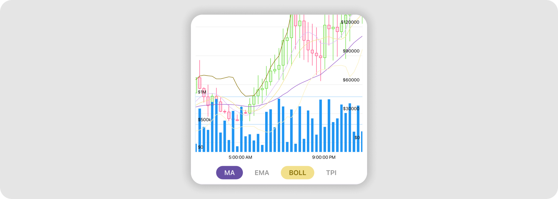
Candlestick Financial Chart with Volume Bars, Indicators and Time Frames

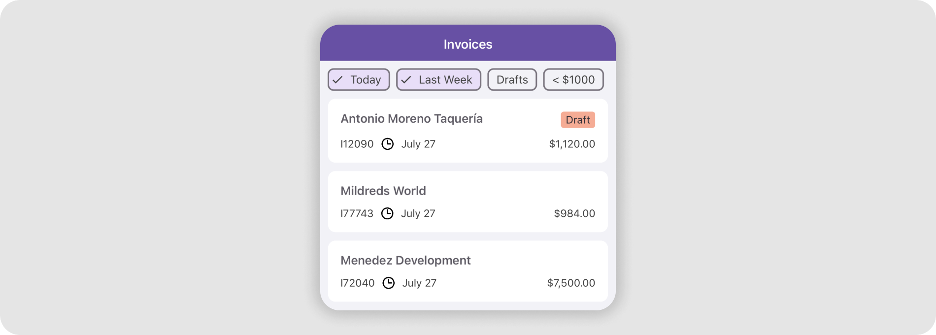
Chip Filters for a CollectionView
