DXSliderTickmarkAppearance.Height Property
In This Article
Gets or sets the tick mark height. This is a bindable property.
Namespace: DevExpress.Maui.Editors
Assembly: DevExpress.Maui.Editors.dll
NuGet Package: DevExpress.Maui.Editors
#Declaration
C#
public double Height { get; set; }#Property Value
| Type | Description |
|---|---|
| Double | The tick mark height. |
#Example
The following example changes tick mark appearance in DXSlider and DXRangeSlider controls:
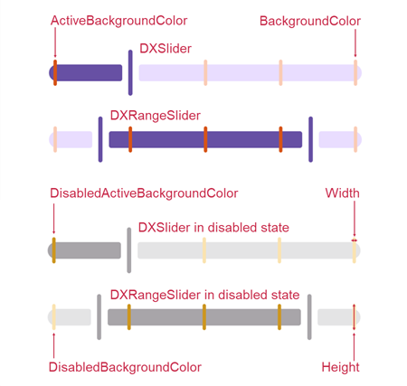
<dxe:DXSlider Value="25" TickmarkStep="25" >
    <dxe:DXSliderBase.TickmarkAppearance>
        <dxe:DXSliderTickmarkAppearance
            ActiveBackgroundColor="#d65418"
            BackgroundColor="#faccb6"
            DisabledActiveBackgroundColor="#cc9621"
            DisabledBackgroundColor="#fae3b1"
            CornerRadius="10"
            Height="25"
            Width="3" />
    </dxe:DXSliderBase.TickmarkAppearance>
</dxe:DXSlider>

<dxe:DXRangeSlider StartValue="15" EndValue="85" TickmarkStep="25">
    <dxe:DXSliderBase.TickmarkAppearance>
        <dxe:DXSliderTickmarkAppearance
            ActiveBackgroundColor="#d65418"
            BackgroundColor="#faccb6"
            DisabledActiveBackgroundColor="#cc9621"
            DisabledBackgroundColor="#fae3b1"
            CornerRadius="10"
            Height="25"
            Width="3" />
    </dxe:DXSliderBase.TickmarkAppearance>
</dxe:DXRangeSlider>
See Also