ViewerApiExtensionOptions Interface
Provides options for customizing the ViewerApiExtension.
Declaration
export interface ViewerApiExtensionOptionsProperties
onDashboardTitleToolbarUpdated Property
Specifies a handler for the event that occurs before the dashboard title toolbar is updated.
Declaration
onDashboardTitleToolbarUpdated?: (args: DevExpress.Dashboard.DashboardTitleToolbarUpdatedEventArgs) => voidProperty Value
| Type | Description |
|---|---|
| (args: DashboardTitleToolbarUpdatedEventArgs) => void | A function that is executed when the dashboard title toolbar is updated. |
Remarks
Handle the dashboardTitleToolbarUpdated event to customize the dashboard title. For instance, you can add custom command buttons, create additional menus, add static texts, etc. The DashboardItemCaptionToolbarOptions class contains options used to customize a dashboard title’s elements (the ViewerToolbarItem objects).
Use the following event handlers depending on the platform:
- HTML JavaScript:
ViewerApiExtensionOptions.onDashboardTitleToolbarUpdated - ASP.NET Core: DashboardViewerApiOptionBuilder.OnDashboardTitleToolbarUpdated
- ASP.NET MVC: DashboardControlClientSideEvents.DashboardTitleToolbarUpdated
- ASP.NET Web Forms: ASPxClientDashboard.DashboardTitleToolbarUpdated
Refer to the following article for more information: Dashboard Title in the Web Dashboard.
The code snippet below shows how to add a custom menu item to the existing dashboard export menu and handle its click event:
var colorSchemeIcon = '<svg id="colorSchemeIcon" xmlns="http://www.w3.org/2000/svg" viewBox="0 0 24 24"><defs><style>.dx_gray{fill:#7b7b7b;}</style></defs><path class="dx_gray" d="M12,3a9,9,0,0,0,0,18c7,0,1.35-3.13,3-5,1.4-1.59,6,4,6-4A9,9,0,0,0,12,3ZM5,10a2,2,0,1,1,2,2A2,2,0,0,1,5,10Zm3,7a2,2,0,1,1,2-2A2,2,0,0,1,8,17Zm3-8a2,2,0,1,1,2-2A2,2,0,0,1,11,9Zm5,1a2,2,0,1,1,2-2A2,2,0,0,1,16,10Z" /></svg>';

function onBeforeRender(dashboardControl) {
    DevExpress.Dashboard.ResourceManager.registerIcon(colorSchemeIcon);
}
function onDashboardTitleToolbarUpdated(e) {
    var exportItem = e.options.actionItems[0];
    exportItem.menu.items.push("colorSchemeIcon");

    var baseItemClick = exportItem.menu.itemClick;
    exportItem.menu.itemClick = function (itemData, element, index) {
        switch (index) {
            case 0:
            case 1:
            case 2: {
                baseItemClick(itemData, element, index);
                return;
            }
            case 3: {
                console.log('custom logic');
                return;
            }
        }
    }
}
The resulting export button looks as follows:

The following examples show how to use the onDashboardTitleToolbarUpdated event handler to add a custom button to the dashboard title in ASP.NET Core applications:
onItemActionAvailabilityChanged Property
Specifies a handler for the event that occurs after the available interactivity actions have changed for the specific dashboard item.
Declaration
onItemActionAvailabilityChanged?: (args: DevExpress.Dashboard.ItemActionAvailabilityChangedEventArgs) => voidProperty Value
| Type | Description |
|---|---|
| (args: ItemActionAvailabilityChangedEventArgs) => void | A function that is executed after the available interactivity actions have changed for the specific dashboard item. |
Remarks
The following examples demonstrate how to drill down on the client side in ASP.NET applications.
onItemCaptionToolbarUpdated Property
Specifies a handler for the event that occurs before the dashboard item caption toolbar is updated.
Declaration
onItemCaptionToolbarUpdated?: (args: DevExpress.Dashboard.ItemCaptionToolbarUpdatedEventArgs) => voidProperty Value
| Type | Description |
|---|---|
| (args: ItemCaptionToolbarUpdatedEventArgs) => void | A function that is executed when the dashboard item caption toolbar is updated. |
Remarks
Handle the itemCaptionToolbarUpdated event to customize the dashboard item’s caption. For instance, you can add custom command buttons, create additional menus, add static texts, etc. The DashboardItemCaptionToolbarOptions class contains options used to customize a dashboard item caption’s elements (the ViewerToolbarItem objects).
Use the following event handlers depending on the platform:
- HTML JavaScript:
ViewerApiExtensionOptions.onItemCaptionToolbarUpdated - ASP.NET Core: DashboardViewerApiOptionBuilder.OnItemCaptionToolbarUpdated
- ASP.NET MVC: DashboardControlClientSideEvents.ItemCaptionToolbarUpdated
- ASP.NET Web Forms: ASPxClientDashboard.ItemCaptionToolbarUpdated
For more information, refer to the following article: Dashboard Item Caption in the Web Dashboard.
The code snippet below shows how to add a custom menu item to the existing item export menu and handle its click event:
var colorSchemeIcon = '<svg id="colorSchemeIcon" xmlns="http://www.w3.org/2000/svg" viewBox="0 0 24 24"><defs><style>.dx_gray{fill:#7b7b7b;}</style></defs><path class="dx_gray" d="M12,3a9,9,0,0,0,0,18c7,0,1.35-3.13,3-5,1.4-1.59,6,4,6-4A9,9,0,0,0,12,3ZM5,10a2,2,0,1,1,2,2A2,2,0,0,1,5,10Zm3,7a2,2,0,1,1,2-2A2,2,0,0,1,8,17Zm3-8a2,2,0,1,1,2-2A2,2,0,0,1,11,9Zm5,1a2,2,0,1,1,2-2A2,2,0,0,1,16,10Z" /></svg>';

function onBeforeRender(s, e) {
    DevExpress.Dashboard.ResourceManager.registerIcon(colorSchemeIcon);
}

function onItemCaptionToolbarUpdated(e) {
    var exportItem = e.options.actionItems[0];
    exportItem.menu.items.push("colorSchemeIcon");

    var baseItemClick = exportItem.menu.itemClick;
    exportItem.menu.itemClick = function (itemData, element, index) {
        switch (index) {
            case 0:
            case 1:
            case 2: {
                baseItemClick(itemData, element, index);
                return;
            }
            case 3: {
                console.log('custom logic');
                return;
            }
        }
    }
}
The resulting export button looks as follows:

The following example shows how to use the onItemCaptionToolbarUpdated event handler to add a popup menu to the dashboard item caption:
onItemClick Property
Specifies a handler for the event that occurs when a user clicks a dashboard item.
Declaration
onItemClick?: (args: DevExpress.Dashboard.ItemClickEventArgs) => voidProperty Value
| Type | Description |
|---|---|
| (args: ItemClickEventArgs) => void | A function that is executed when a user clicks a dashboard item. |
Remarks
Use the e.itemName event parameter to obtain the dashboard item name for which the event has been raised.
The e.getAxisPoint method allows you to obtain the axis point that corresponds to the clicked visual element. Use the e.requestUnderlyingData method to request the underlying data related to this visual element.
The e.getData method returns the client data for this dashboard item.
See the following examples that show how to use the onItemClick event handler to obtain client data:
Limitations
The itemClick event has the following limitations:
- The
itemClickevent is not raised for the following dashboard items: Range Filter, Filter Elements, Text Box, Images. - The
itemClickevent is raised if a user clicks a specific visual element within the dashboard item (for instance, a Chart series point or an individual Card). If a user clicks an empty space, the event will not be raised.
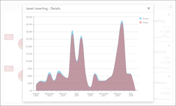
Example
The following example uses the DashboardControl‘s client-side API to obtain client data that corresponds to a particular visual element. When you click a card, the dxChart displays the detailed chart and shows a variation of actual/target values over time.
Handle the DashboardControlOptions.onBeforeRender event to get access to the DashboardControl instance:
<%@ Page Language="C#" AutoEventWireup="true" CodeBehind="Default.aspx.cs" Inherits="ASPxDashboard_ClientData.Default" %>

<!DOCTYPE html>

<html>
<head runat="server">
    <title></title>
    <script src="Scripts/ClientData.js"></script>
    <!-- ... -->
</head>
<body>
    <form id="form1" runat="server">
        <div id="myPopup"></div>
        <dx:ASPxDashboard ID="ASPxDashboard1" runat="server"
            WorkingMode="Viewer" Width="100%" Height="100%" DashboardStorageFolder = "~/App_Data/Dashboards">
            <ClientSideEvents BeforeRender="onBeforeRender"/>
        </dx:ASPxDashboard>
    </form>
</body>
</html>
The ViewerApiExtensionOptions.onItemClick event is handled to obtain client data and invoke the dxPopup component with the dxChart.
In the event handler, the e.getData method call obtains the dashboard item’s client data. The e.getAxisPoint method returns the axis point corresponding to the clicked card while the ItemData.getSlice method returns the slice of client data by this axis point.
The ItemDataAxis.getPoints method is used to obtain axis points that belong to the “Sparkline” data axis. Call the ItemData.getDeltaValue method to obtain corresponding actual/target values:
function onBeforeRender(sender) {
    var dashboardControl = sender.GetDashboardControl();

    var viewerApiExtension = dashboardControl.findExtension('viewerApi');
    if (viewerApiExtension)
        viewerApiExtension.on('itemClick', onItemClick);

    $("#myPopup").dxPopup({
        width: 800, height: 600,
        title: "Details",
        showCloseButton: true
    });
}

function onItemClick(args) {
    if (args.itemName == "cardDashboardItem1") {
        var clientData = [],
            clientDataTable = [],
            clickedItemData,
            delta;
        var sparklineAxis = "Sparkline",
            defaultAxis = "Default";

        clientData = args.getData();
        clickedPoint = args.getAxisPoint(defaultAxis);
        clickedItemData = clientData.getSlice(clickedPoint);
        delta = args.getDeltas()[0];

        for (var i = 0; i < clickedItemData.getAxis(sparklineAxis).getPoints().length; i++) {
            var dataTableRow = {},
            axisPoint = clickedItemData.getSlice(clickedItemData.getAxis(sparklineAxis).getPoints()[i]);

            dataTableRow["Argument"] = clickedItemData.getAxis(sparklineAxis).getPoints()[i].getValue();
            if (axisPoint.getDeltaValue(delta.id).getActualValue().getValue() != null &&
                axisPoint.getDeltaValue(delta.id).getTargetValue().getValue() != null) {
                dataTableRow["Actual"] = axisPoint.getDeltaValue(delta.id).getActualValue().getValue();
                dataTableRow["Target"] = axisPoint.getDeltaValue(delta.id).getTargetValue().getValue();
            }
            else {
                dataTableRow["Actual"] = 0;
                dataTableRow["Target"] = 0;
            }
            clientDataTable.push(dataTableRow);
        }

        var $chart = $('<div/>');
        $chart.dxChart({
            height: 500,
            dataSource: clientDataTable,
            series: [{
                valueField: 'Actual', name: 'Actual'
            }, {
                valueField: 'Target', name: 'Target'
            }
            ],
            commonSeriesSettings: {
                type: 'splineArea',
                argumentField: 'Argument',
                ignoreEmptyPoints: true
            },
            argumentAxis: {
                showZero: false,
                type: 'discrete'
            },
            valueAxis: {
                showZero: false,
                type: 'continuous',
                label: { format: 'currency' }
            }
        });

        var popup = $("#myPopup").data("dxPopup");
        popup.option('title', clickedPoint.getValue() + " - Details");
        $popupContent = popup.content();
        $popupContent.empty();
        $popupContent.append($chart);
        popup.show();
    };
}
onItemDrillDownStateChanged Property
Specifies a handler for the event that occurs when a drill-down/drill-up is performed.
Declaration
onItemDrillDownStateChanged?: (args: DevExpress.Dashboard.ItemDrillDownStateChangedEventArgs) => voidProperty Value
| Type | Description |
|---|---|
| (args: ItemDrillDownStateChangedEventArgs) => void | A function that is executed when a drill-down is performed. |
Remarks
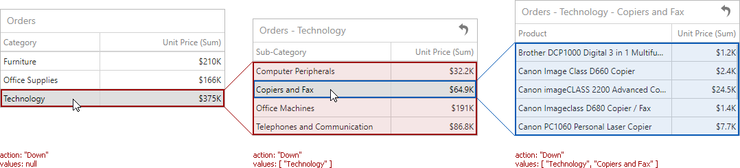
The itemDrillDownStateChanged event is raised when a user performs drill-down or drill-up in a dashboard item. To determine the component name of this dashboard item, use the itemName event parameter. Other event parameters include the following:
- e.action returns the action performed in the dashboard item. For example, ‘Down’ identifies a drill-down while ‘Up’ identifies a drill-up.
- e.values returns values from the current drill-down hierarchy. In OLAP mode, the e.values property returns unique names instead of values.
onItemElementCustomColor Property
Specifies a handler for the event that allows you to color the required dashboard item elements using the specified colors.
Declaration
onItemElementCustomColor?: (args: DevExpress.Dashboard.ItemElementCustomColorEventArgs) => voidProperty Value
| Type | Description |
|---|---|
| (args: ItemElementCustomColorEventArgs) => void | A function that is executed when coloring the required dashboard item elements. |
Remarks
The itemElementCustomColor event allows you to color dashboard item elements (for instance, chart series points, pie segments, or scatter chart points) with the specified colors.
The ItemElementCustomColorEventArgs class exposes the following settings that allow you to color the required element.
- Use the e.iItemName property to obtain the component name of the dashboard item for which the event was raised.
The e.getTargetElement method returns the axis point tuple that corresponds to the current dashboard item element.
The e.getMeasures method returns measures corresponding to the current dashboard item element.
Use the e.setColor method to set the color of the current dashboard item element.
Note that color modifications applied using the itemElementCustomColor event are not applied in the resulting exported document.
Example
The following example shows how to color the dashboard item’s elements on the client. To do this, handle the ViewerApiExtensionOptions.onItemElementCustomColor event, get the item’s multidimensional data, and apply the color to the dashboard item’s element based on the condition.
The image below displays the dashboard items whose values are colored based on their values:
- Chart
- For 2014, values that exceed 30k are colored green, values below 17k are red, and values that fall into the range between 170k and 30k are gray.
- Pies
- Values below 80k are colored yellow.

function onBeforeRender(sender) {
    window['control'] = sender;

    var viewerApiExtension = control.findExtension('viewerApi');

    if (viewerApiExtension)
        viewerApiExtension.on('itemElementCustomColor', setColors);
}

function setColors(args) {

    var argumentAxis = 'Argument',
        seriesAxis = 'Series';

    var viewerApiExtension = control.findExtension('viewerApi');

    var chartClientData = viewerApiExtension.getItemData("chartDashboardItem1"),
        pieClientData = viewerApiExtension.getItemData("pieDashboardItem1");
    var currentElement = args.getTargetElement();

    if (args.itemName === "chartDashboardItem1") {
        var year = currentElement.getAxisPoint(seriesAxis).getValue();
        var value = chartClientData.getSlice(currentElement.getAxisPoint(argumentAxis)).
            getSlice(currentElement.getAxisPoint(seriesAxis)).
            getMeasureValue(chartClientData.getMeasures()[0].id).getValue();
        // For 2015, values that exceed 80k are colored in green, values below 40k are colored in red,
        // and values that fall into the range between 40k and 80k are colored in gray.
        if (year == 2014) {
            if (value > 30000) {
                args.setColor("#336633");
            }
            else if (value < 17000) {
                args.setColor("#993300");
            }
            else if (value >= 17000 && value <= 30000) {
                args.setColor("#999999");
            }
        }
    }

    if (args.itemName === "pieDashboardItem1") {
        var value = pieClientData.getSlice(currentElement.getAxisPoint(argumentAxis)).
            getMeasureValue(pieClientData.getMeasures()[0].id).getValue();
        if (value < 80000)
            args.setColor("#fdb400");
    }
};
onItemMasterFilterStateChanged Property
Specifies a handler for the event that occurs when the master filter state is changed.
Declaration
onItemMasterFilterStateChanged?: (args: DevExpress.Dashboard.ItemMasterFilterStateChangedEventArgs) => voidProperty Value
| Type | Description |
|---|---|
| (args: ItemMasterFilterStateChangedEventArgs) => void | A function that is executed when the master filter state is changed. |
Remarks
The ViewerApiExtensionOptions.onItemMasterFilterStateChanged event occurs when filtering is applied or the state of the master filter item changes. Its e.values property allows you to obtain the selected values for the dashboard item that causes the event.
For instance, for the dashboard in the image below, the e.values property returns the following objects for the Grid dashboard item:
[['UK', 'Anne Dodsworth'], ['USA', 'Andrew Fuller']]

For the Range Filter dashboard item, the e.values property returns the Date objects for minimum and maximum values in the selected range. The minimum is Sun Feb 01 2015 and the maximum is Sun Jan 31 2016.
The ViewerApiExtensionOptions.onItemActionAvailabilityChanged event occurs after the available interactivity actions are changed for the specific dashboard item.
The following examples show how to update the dashboard parameter value when the item’s master filter state is changed:
onItemSelectionChanged Property
Specifies a handler for the event that occurs after the selection within the dashboard item is changed.
Declaration
onItemSelectionChanged?: (args: DevExpress.Dashboard.ItemSelectionChangedEventArgs) => voidProperty Value
| Type | Description |
|---|---|
| (args: ItemSelectionChangedEventArgs) => void | A function that is executed after the selection within the dashboard item is changed. |
Remarks
The itemSelectionChanged event is raised after the selection within the dashboard item is changed.
The selection can be changed in the following ways:
- The state of the master filter item is changed (by an end user or using the DashboardControl‘s API).
- The selection within the dashboard item for which custom visual interactivity is implemented is changed (using the ASPxClientDashboard.ItemVisualInteractivity event).
The e.itemName property returns the name of the dashboard item for which the event was raised. Use the e.getCurrentSelection method to obtain the currently selected elements.
Example
The Web Dashboard allows you to add custom interactivity to dashboards. For this, handle the ViewerApiExtensionOptions.onItemVisualInteractivity event. You can get data axes used to apply custom interactivity actions, specify the selection mode for dashboard item elements and so on. Use event arguments to process the multidimensional data to get the slice, axes, or tuples.
The change of the selection in the dashboard item raises the ViewerApiExtensionOptions.onItemSelectionChanged event.
Select categories in the Grid dashboard item to visualize its quantity in the
dxBarGaugewidget. The hidden ‘Quantity’ measure is used to pass values to the client.
The Chart dashboard item highlights bars corresponding to a hovered argument value.

var dimensionValues = [];

function onBeforeRender(dashboardControl) {
    if (dashboardControl) {
        dashboardControl.on('dashboardEndUpdate', createControls);
        var viewerApiExtension = dashboardControl.findExtension("viewerApi");
    }
    if (viewerApiExtension) {
        viewerApiExtension.on('itemVisualInteractivity', addCustomInteractivity);
        viewerApiExtension.on('itemSelectionChanged', applyCurrentSelection);
    }
}

function addCustomInteractivity(args) {
    if (args.itemName == "gridDashboardItem1") {
        args.setTargetAxes(["Default"]);
        args.setSelectionMode("Multiple");
    }
    if (args.itemName == "chartDashboardItem1") {
        args.setTargetAxes(["Argument"]);
        args.enableHighlighting(true);
    }
}

function createControls() {
    $('#barGauge').dxBarGauge({
        startValue: 0,
        endValue: 10000,
        values: getAllValues(),
        title: {
            text: "Product Quantity",
            font: {
                size: 28,
            }
        },
        label: {
            format: 'fixedPoint',
            precision: 0
        },
        tooltip: {
            enabled: true,
            customizeTooltip(arg) {
                return {
                    text: getText(dimensionValues[arg.index], arg.value),
                };
            },
        },
        legend: {
            visible: true,
            verticalAlignment: 'bottom',
            horizontalAlignment: 'center',
            customizeText(arg) {
                return getText(dimensionValues[arg.item.index], arg.text);
            }
        }
    });
}

function getText(item, text) {
    return `${item} - ${text}`
}

function applyCurrentSelection(args) {
    var quantityValues = [];
    dimensionValues = [];
    if (args.itemName == "gridDashboardItem1" & args.getCurrentSelection().length != 0) {
        var viewerApiExtension = dashboardControl.findExtension('viewerApi');
        var clientData = viewerApiExtension.getItemData("gridDashboardItem1");
        for (var i = 0; i < args.getCurrentSelection().length; i++) {
            var dimensionValue = args.getCurrentSelection()[i].getAxisPoint().getValue();
            var currentTuple = args.getCurrentSelection()[i],
                slice = clientData.getSlice(currentTuple.getAxisPoint()),
                quantity = (slice.getMeasureValue(clientData.getMeasures()[0].id)).getValue();
            quantityValues.push(quantity);
            dimensionValues.push(dimensionValue);
        }
    } else {
        quantityValues = getAllValues();
    }
    $("#barGauge").dxBarGauge("instance").values(quantityValues);
}

function getAllValues() {
    var viewerApiExtension = dashboardControl.findExtension('viewerApi');
    dimensionValues = [];
    var quantityValues = [];
    var   clientData = viewerApiExtension.getItemData("gridDashboardItem1");
    for (var i = 0; i < clientData.getAxis("Default").getPoints().length; i++) {
        var slice = clientData.getSlice(clientData.getAxis("Default").getPoints()[i]),
            quantity = (slice.getMeasureValue(clientData.getMeasures()[0].id)).getValue(),
            dimensionValue = clientData.getAxis("Default").getPoints()[i].getValue();
        quantityValues.push(quantity);
        dimensionValues.push(dimensionValue);
    }
    return quantityValues;
}
onItemVisualInteractivity Property
Specifies a handler for the event allowing you to provide custom visual interactivity for data-bound dashboard items that support element selection and highlighting.
Declaration
onItemVisualInteractivity?: (args: DevExpress.Dashboard.ItemVisualInteractivityEventArgs) => voidProperty Value
| Type | Description |
|---|---|
| (args: ItemVisualInteractivityEventArgs) => void | A function that is executed when you implement custom visual interactivity for data-bound dashboard items that support element selection and highlighting. |
Remarks
The itemVisualInteractivity event allows you to implement custom visual interactivity for data-bound dashboard items that support element selection and highlighting. This event is raised for dashboard items with disabled master filtering. Visual interactivity is automatically enabled for master filter items. The DashboardControl also fires this event when master filtering is applied to the current dashboard item or drill-down is performed in this dashboard item.
Use the e.itemName event parameter to obtain the name of the dashboard item for which the event was raised. The e.setTargetAxes method allows you to specify data axes used to perform custom interactivity actions.
To specify the selection mode and enable highlighting, use the e.setSelectionMode and enableHighlighting methods respectively. The e.setDefaultSelection method provides the capability to specify the default selection for the current dashboard item.
After the selection is changed, the itemSelectionChanged event is raised. Its e.getCurrentSelection method returns the selected elements.
The following table lists possible target axes for each dashboard item and supported interactivity capabilities:
Dashboard Item | Target Axes | Selection | Highlighting |
|---|---|---|---|
|
| ||
|
|
| |
|
|
| |
|
|
| |
|
|
| |
|
|
| |
|
|
| |
|
|
|

Note that the Grid dashboard item does not support custom interactivity when Cell Merging is enabled.
The following examples show how to add custom interactivity to a dashboard:
onItemWidgetCreated Property
Specifies a handler for the event that occurs when the underlying UI/Data Visualization widget is created.
Declaration
onItemWidgetCreated?: (args: DevExpress.Dashboard.ItemWidgetEventArgs) => voidProperty Value
| Type | Description |
|---|---|
| (args: ItemWidgetEventArgs) => void | A function that is executed when the client widget is created. |
Remarks
The Web Dashboard uses DevExtreme widgets to visualize dashboard item data. The onItemWidgetCreated property allows you to access these widgets and customize their settings. See Access to Underlying Widgets for details.
The e.itemName property returns the component name of the dashboard item whose widget you can customize. Use the e.getWidget property to access the corresponding underlying widget.
When the dashboard item is re-rendered, all events connected to the dashboard item’s life cycle (onItemWidget…) are fired again.
Note
The itemWidgetCreated event is not fired for a custom dashboard item.
The following examples show how to customize options of underlying widgets based on the platform:
onItemWidgetOptionsPrepared Property
Specifies a handler for the event allowing you to access underlying UI/Data Visualization widgets and configure their options.
Declaration
onItemWidgetOptionsPrepared?: (args: DevExpress.Dashboard.ItemWidgetOptionEventArgs) => voidProperty Value
| Type | Description |
|---|---|
| (args: ItemWidgetOptionEventArgs) => void | A function that is executed before the client widget is prepared. |
Remarks
Use the e.dashboardItem property to get the dashboard item for which the event is raised. The options property provides access to its underlying widget’s options.
The example shows how to customize options of underlying widgets. Handle the onItemWidgetOptionsPrepared event to do the following:
- Highlight a hovered grid row in the underlying dxDataGrid.
- Disable a standard tooltip that appears when a user hovers over a chart’s series point.
- Create a custom tooltip that appears when a user clicks a label on the chart’s argument axis. The onArgumentAxisClick property executes a function that invokes the custom tooltip.
- Enable the animation for the dxChart and dxPieChart widgets.
- Display a legend in the dxPieChart widget.
import { GridItem, ChartItem, PieItem} from 'devexpress-dashboard/model';
// ...
function customizeWidgetOptions(e) {
  if (e.dashboardItem instanceof GridItem) {
    e.options.hoverStateEnabled = true
  };
  if (e.dashboardItem instanceof ChartItem) {
    e.options.tooltip = {
      enabled: false
    };
    e.options.animation = {
      enabled: true,
      duration: 1000
    };
    e.options.onArgumentAxisClick = function (info) {
      info.component.getAllSeries()[0].getPointsByArg(info.argument)[0].showTooltip()
    }
  };
  if (e.dashboardItem instanceof PieItem) {
    e.options.legend = {
      visible: true,
      border: {
          visible: true
      }
    };
    e.options.animation = {
      enabled: true,
      duration: 1000
    };
  }
}
onItemWidgetUpdated Property
Specifies a handler for the event that occurs when the underlying UI/Data Visualization widget is redrawn after the data used in this widget is changed.
Declaration
onItemWidgetUpdated?: (args: DevExpress.Dashboard.ItemWidgetEventArgs) => voidProperty Value
| Type | Description |
|---|---|
| (args: ItemWidgetEventArgs) => void | A function that is executed when the client widget is updated. |
Remarks
The Web Dashboard uses DevExtreme widgets to visualize dashboard item data. The onItemWidgetCreated property allows you to access these widgets and customize their settings. See Access to Underlying Widgets for details.
The ItemWidgetEventArgs.itemName property returns the component name of the dashboard item whose widget you can customize. Use the ItemWidgetEventArgs.getWidget property to access the corresponding underlying widget.
When the dashboard item is re-rendered, all events connected to the dashboard item’s life cycle (onItemWidget…) are fired again.
Note
The itemWidgetUpdated event is not fired for a custom dashboard item.
The following examples show how to customize options of underlying widgets:
onItemWidgetUpdating Property
Specifies a handler for the event allowing you to access underlying UI/Data Visualization widgets.
Declaration
onItemWidgetUpdating?: (args: DevExpress.Dashboard.ItemWidgetEventArgs) => voidProperty Value
| Type | Description |
|---|---|
| (args: ItemWidgetEventArgs) => void | A function that is executed when the client widget is about to be updated. |
Remarks
The Web Dashboard uses DevExtreme widgets to visualize dashboard item data. The onItemWidgetCreated property allows you to access these widgets and customize their settings. See Access to Underlying Widgets for details.
The ItemWidgetEventArgs.itemName property returns the component name of the dashboard item whose widget can be customized. Use the ItemWidgetEventArgs.getWidget property to access the corresponding underlying widget.
When the dashboard item is re-rendered, all events connected to the dashboard item’s life cycle (onItemWidget…) are fired again.
Note
The itemWidgetUpdating event is not fired for a custom dashboard item.
onSelectedTabPageChanged Property
Specifies a handler for the event that occurs when the selected tab page is changed.
Declaration
onSelectedTabPageChanged?: (args: DevExpress.Dashboard.SelectedTabPageChangedEventArgs) => voidProperty Value
| Type | Description |
|---|---|
| (args: SelectedTabPageChangedEventArgs) => void | A function that is executed when the selected tab page is changed. |