GridItem Class
A Grid dashboard item that visualizes data in tabular form.
Declaration
export class GridItem extends DataDashboardItemRemarks
The Grid shows data in tabular form while allowing you to summarize against specific measures or calculate differences between them.

The following documentation is available: Web Dashboard - Creating a Grid.
Example
The following example shows how to create the Grid dashboard item, bind it to data and add to the existing dashboard.
Create data items (measures and dimensions) and use the DataItem.dataMember property to bind them to the existing data source’s columns. Then use the created measures and dimensions in the dashboard item to bind it to data.
After you add the created dashboard item to the Dashboard.items collection, call the Dashboard.rebuildLayout method to rebuild the dashboard layout and display changes.
// Use the line below for a modular approach:
// import * as Model from 'devexpress-dashboard/model'
// Use the line below for an approach with global namespaces:
// var Model = DevExpress.Dashboard.Model;

// ...
public createGridItem() {
    // Create data items for the Grid dashboard item.
    var gridCategoryName = new Model.Dimension();
    gridCategoryName.dataMember("CategoryName");
    var gridProductName = new Model.Dimension();
    gridProductName.dataMember("ProductName");
    var gridUnitPrice = new Model.Measure();
    gridUnitPrice.dataMember("UnitPrice");

    // Create the Grid dashboard item and bind it to data.
    var gridItem = new Model.GridItem();
    gridItem.name('grid');
    gridItem.dataSource(sqlDataSource.componentName());
    gridItem.dataMember(sqlDataSource.queries()[0].name());

    var gridColumn1 = new Model.GridDimensionColumn(gridItem);
    gridColumn1.dimension(gridProductName);
    gridItem.columns.push(gridColumn1);

    var gridColumn2 = new Model.GridMeasureColumn(gridItem);
    gridColumn2.measure(gridUnitPrice);
    gridItem.columns.push(gridColumn2);

    var gridColumn3 = new Model.GridHyperlinkColumn(gridItem);
    gridColumn3.displayValue(gridCategoryName);
    gridColumn3.uriPattern("http://en.wikipedia.org/wiki/{0}");
    gridItem.columns.push(gridColumn3);

    control.dashboard().items.push(gridItem);
    // ...
    control.dashboard().rebuildLayout();
}
Inherited Members
Inheritance
constructor
Initializes a new instance of the GridItem class.
Declaration
constructor(
    dashboardItemJSON?: any,
    serializer?: DevExpress.Analytics.Utils.ModelSerializer
)
Parameters
| Name | Type | Description |
|---|---|---|
| dashboardItemJSON | any | A JSON object used for dashboard deserialization. Do not pass this parameter directly. |
| serializer | ModelSerializer | An object used for dashboard deserialization. Do not pass this parameter directly. |
Properties
columnFilterOptions Property
Provides access to the Grid’s column filter settings.
Declaration
columnFilterOptions: DevExpress.Dashboard.Model.GridColumnFilterOptionsProperty Value
| Type | Description |
|---|---|
| GridColumnFilterOptions | A GridColumnFilterOptions object that contains the Grid’s column filter options. |
Remarks
Column filters allow users to search data in the Grid item. These filters do not affect data outside the Grid.
- Set the GridColumnFilterOptions.showFilterRow property to
trueto enable the filter row. - Set the GridColumnFilterOptions.updateTotals property to
trueto reflect changes in column values and recalculate totals based on the applied column filter.
The following example shows how to enable the filter row for each Grid item after a dashboard is initialized:
function onDashboardInitialized(args) {
  args.dashboard.items().forEach(element => {
    if (element instanceof GridItem) {
      element.columnFilterOptions.showFilterRow(true);
    }
  });
}
columns Property
Specifies the collection of grid columns.
Declaration
columns: ko.ObservableArray<DevExpress.Dashboard.Model.GridColumn>Property Value
| Type | Description |
|---|---|
| ObservableArray<GridColumn> | An array of GridColumn objects that are grid columns. |
Remarks
The Columns collection elements contain data binding information and column display settings.
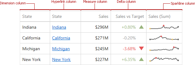
The Grid dashboard item supports five column types:
- GridDimensionColumn - displays grouped values from the bound data item and allows you to provide discrete categorical information.
- GridHyperlinkColumn - allows you to display hyperlinks in the Grid dashboard item.
- GridMeasureColumn - displays summaries calculated against data in the bound data item.
- GridDeltaColumn - is bound to two measures, calculates summaries for both measures, and displays the difference between these summaries.
- GridSparklineColumn displays values in the bound data item using sparklines.
gridOptions Property
Provide access to the GridItem‘s options.
Declaration
gridOptions: DevExpress.Dashboard.Model.GridOptionsProperty Value
| Type | Description |
|---|---|
| GridOptions | A GridOptions object that contains options of the |
interactivityOptions Property
Declaration
interactivityOptions: DevExpress.Dashboard.Model.DashboardItemInteractivityOptionsProperty Value
| Type |
|---|
| DashboardItemInteractivityOptions |
sparklineArgument Property
Declaration
sparklineArgument: ko.Observable<DevExpress.Dashboard.Model.Dimension>Property Value
| Type |
|---|
| Observable<Dimension> |