Access to Underlying Widgets in DashboardControl
- 6 minutes to read
The Web Dashboard control uses widgets and UI components to visualize data inside dashboard items.
Overview
Most dashboard items use DevExtreme UI Components to visualize data. You can use the DashboardControl API to access these widgets and customize settings you cannot access from the Web Dashboard’s UI.
The Web Dashboard renders an underlying widget as follows:
The Web Dashboard loads the widget’s default configuration.
The onItemWidgetOptionsPrepared event is raised. Handle this event to customize the DevExtreme widget’s options before the widget is rendered.
The Web Dashboard renders the widget with the configured options.
The onItemWidgetCreated event is raised. It occurs once for each widget when the dashboard is loaded to the client. You can use this event to customize the widget instance. Use the ViewerApiExtension.on and ViewerApiExtension.off methods to subscribe to and unsubscribe from the widget’s events.
The widget is updated (for example, when you apply filters or change parameter values).
The onItemWidgetUpdated event is raised. It occurs every time the widget should be re-rendered. Use the ViewerApiExtension.on and ViewerApiExtension.off methods to subscribe to and unsubscribe from the DevExtreme widget’s events.
The e.itemName property returns the component name of the dashboard item whose widget can be customized. The e.getWidget property provides access to the corresponding underlying widget.
Note
The e.getWidget property can return an array of widgets for the dashboard items below in case these dashboard items have series:
- For the PieItem,
e.getWidgetreturns an array of dxPieChart widgets. - For the GaugeItem,
e.getWidgetreturns an array of dxCircularGauge or dxLinearGauge widgets.
The following table lists dashboard items whose DevExtreme UI widgets can be accessed when you handle the ItemWidget… events.
| Dashboard Items | onItemWidgetCreated/onItemWidgetUpdated | onItemWidgetOptionsPrepared |
|---|---|---|
| GridItem | dxDataGrid | dxDataGridOptions |
| ChartItem ScatterChartItem |
dxChart | dxChartOptions |
| PieItem | an array of dxPieChart components | dxPieChartOptions (for each pie) |
| GaugeItem | an array of dxCircularGauge or dxLinearGauge components | dxCircularGaugeOptions or dxLinearGaugeOptions (for each gauge) |
| ChoroplethMapItem GeoPointMapItem PieMapItem BubbleMapItem |
dxVectorMap | dxVectorMapOptions |
| PivotItem | dxPivotGrid | dxPivotGridOptions |
| ComboBoxItem | dxSelectBox dxTagBox |
dxSelectBoxOptions dxTagBoxOptions |
| ListBoxItem | dxList | dxListOptions |
| TreeViewItem | dxTreeList dxTreeView (for v17.1 and earlier) |
dxTreeListOptions dxTreeViewOptions (for v17.1 and earlier) |
| TreemapItem | dxTreeMap | dxTreeMapOptions |
| RangeFilterItem | dxRangeSelector | dxRangeSelectorOptions |
The dashboard items below use built-in components instead of DevExtreme-based UI widgets. You cannot use the onItemWidgetOptionsPrepared event to customize their options:
| Dashboard Items | onItemWidgetCreated/onItemWidgetUpdated | onItemWidgetOptionsPrepared |
|---|---|---|
| CardItem | CardWidget |  |
| DateFilterItem | DateFilterWidget | |
| TextBoxItem | HTML element / HTML element wrapped in a jQuery object | |
| ImageItem | HTML element / HTML element wrapped in a jQuery object | |
| BoundImageItem | HTML element / HTML element wrapped in a jQuery object | |
| CustomItem | A custom component that you can customize directly. | |
Note
Layout items do not have underlying components, so you cannot customize them with the onItemWidget... events:
Custom Export
Although the export does not automatically applies custom settings, you can customize the exported document.
The Dashboard Control raises the ASPxDashboard.CustomExport/DashboardConfigurator.CustomExport event before saving the exported document to the PDF and Image formats. The event allows you to customize the exported document.
- Use the e.GetPrintableControl and e.GetPrintableControls methods to obtain a printable control(s) for a specific dashboard item or the entire dashboard.
- Use the e.Report property to customize the underlying report.
The following table illustrates dashboard items and their corresponding printable XRControls:
Limitations
Do not change the following settings to avoid possible issues:
- Data binding settings
- Basic data presentation settings (for instance, a set of grid columns or chart series)
Note that changes made with the ItemWidget… events do not change the dashboard or dashboard item appearance in exported documents.
Examples
Customize UI Component Options
The example shows how to customize options of underlying widgets. Handle the onItemWidgetOptionsPrepared event to do the following:
- Highlight a hovered grid row in the underlying dxDataGrid.
- Disable a standard tooltip that appears when a user hovers over a chart’s series point.
- Create a custom tooltip that appears when a user clicks a label on the chart’s argument axis. The onArgumentAxisClick property executes a function that invokes the custom tooltip.
- Enable the animation for the dxChart and dxPieChart widgets.
- Display a legend in the dxPieChart widget.
import { GridItem, ChartItem, PieItem} from 'devexpress-dashboard/model';
// ...
function customizeWidgetOptions(e) {
  if (e.dashboardItem instanceof GridItem) {
    e.options.hoverStateEnabled = true
  };
  if (e.dashboardItem instanceof ChartItem) {
    e.options.tooltip = {
      enabled: false
    };
    e.options.animation = {
      enabled: true,
      duration: 1000
    };
    e.options.onArgumentAxisClick = function (info) {
      info.component.getAllSeries()[0].getPointsByArg(info.argument)[0].showTooltip()
    }
  };
  if (e.dashboardItem instanceof PieItem) {
    e.options.legend = {
      visible: true,
      border: {
          visible: true
      }
    };
    e.options.animation = {
      enabled: true,
      duration: 1000
    };
  }
}
Custom Export
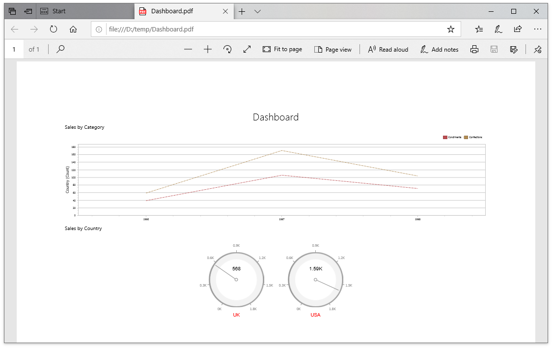
The following example shows how to customize dashboard items in the exported document when you handle the ASPxDashboard.CustomExport / DashboardConfigurator.CustomExport events. You can use the CustomExportWebEventArgs.GetPrintableControls method to obtain the printable controls.
using DevExpress.DashboardCommon;
using DevExpress.DashboardWeb;
using DevExpress.XtraCharts;
using DevExpress.XtraReports.UI;
using System;
using System.Drawing;
using System.Linq;

protected void CustomizeExport(object sender, CustomExportWebEventArgs e) {
  foreach(var printControl in e.GetPrintableControls()) {
    if(printControl.Value is XRGaugeDashboardItem) {
      var gaugeItemName = printControl.Key;
      var gaugeDashboardItem = e.GetDashboardItem(gaugeItemName) as GaugeDashboardItem;
      foreach(var dashGaugeElement in gaugeDashboardItem.Gauges) {
        foreach(var gaugePanel in e.GetGaugeContext(gaugeItemName).GetPrintableGauges(dashGaugeElement).Cast<XRDashboardGauge>()) {
          if(gaugePanel != null) {
              gaugePanel.MainSeriesLabel.ForeColor = Color.Red;
          }
        }
      }
    }

    if(printControl.Value is XRChart) {
      var chartItemName = printControl.Key;
      var chartDashboardItem = e.GetDashboardItem(chartItemName) as ChartDashboardItem;
      foreach(var pane in chartDashboardItem.Panes) {
        if(pane.Series.Count > 0) {
          foreach(var dashSeries in pane.Series) {
            if(dashSeries != null) {
              var controlSeries = e.GetChartContext(chartItemName).GetControlSeries(dashSeries);
              if(controlSeries != null) {
                foreach(var ser in controlSeries) {
                  LineSeriesView view = ser.View as LineSeriesView;
                  if(view != null) {
                      view.LineStyle.DashStyle = DashStyle.DashDot;
                  }
                }
              }
            }
          }
        }
      }
    }
  }
}