XY-Diagram
- 4 minutes to read
This document details the specifics of the XY-Diagram type. It lists the series view types associated with this diagram type, demonstrates how its specific options can be accessed (both at design and runtime), and briefly describes these options. Before reading this text, you may wish to review the basics of using diagram in the WinForms Chart Control.
This document consists of the following sections.
Associated Series View Types
The XY-Diagram is the most common diagram type, since it’s used to plot the series which are displayed using both axes: the axis of arguments (X-axis) and the axis of values (Y-axis). There are many such series view types available in XtraCharts. You can freely plot multiple series of these view types together, within the same diagram object, as shown in the following image.
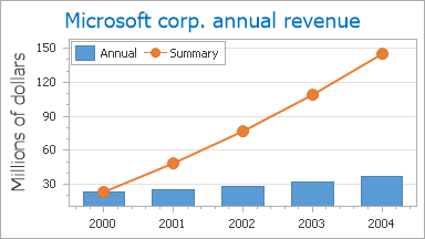
In particular, the XY-Diagram is used to plot series of the following view types:
- Area;
- Box Plot;
- Bubble;
- Candlestick;
- Full-Stacked Area;
- Full-Stacked Bar;
- Full-Stacked Spline Area;
- Line;
- Overlapped Range Bar;
- Point;
- Scatter Line;
- Side-by-Side Bar;
- Side-by-Side Full-Stacked Bar;
- Side-by-Side Range Bar;
- Side-by-Side Stacked Bar;
- Spline;
- Spline Area;
- Stacked Area;
- Stacked Bar;
- Stacked Spline Area;
- Step Line;
- Stock;
- Waterfall.
Accessing a Diagram
To access the XY-Diagram’s options at design time, click your chart, to select it. Then, in the Properties window, expand the ChartControl.Diagram property.
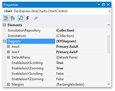
At runtime, cast your instance of the Diagram object to the XYDiagram type.
// Cast Diagram to the XYDiagram type.
XYDiagram diagram = chart.Diagram as XYDiagram;
if (diagram != null) {
    // Access diagram properties, for example rotate the diagram.
    diagram.Rotated = true;
    // Access properties of objects that belong to the diagram,
    // for example axes and panes.
    diagram.AxisY.Title.Text = "Population mid-year, millions";
    diagram.DefaultPane.Weight = 2;
}
Specific Options
The available options, specific for the XY-Diagram type, are briefly described below. For the more detailed information about them, refer to these properties’ descriptions.
The XYDiagram.AxisX and XYDiagram.AxisY properties provide access to the options specific for the diagram’s primary axes.
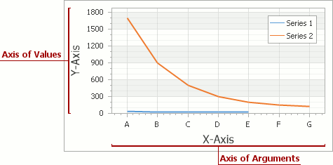
Via these properties, you can adjust the appearance and layout of axes, and also access the elements which belong to them (axis titles, axis labels, strips and constant lines).
The XYDiagram.SecondaryAxesX and XYDiagram.SecondaryAxesY properties provide access to the diagram’s collections of secondary axes.
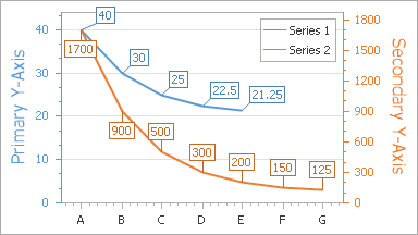
The same as primary axes, there are special visual elements which belong to secondary axes, and can be accessed via these properties (axis titles, axis labels, strips and constant lines).
The XYDiagram2D.DefaultPane and XYDiagram2D.Panes properties provide access to the diagram’s default and additional panes. The XYDiagram2D.PaneDistance and GridPaneLayout.Direction properties determine the layout of panes.
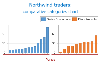
The XYDiagram2D.EnableAxisXScrolling, XYDiagram2D.EnableAxisYScrolling, XYDiagram2D.EnableAxisXZooming and XYDiagram2D.EnableAxisYZooming properties allow you to enable the scrolling and zooming along the corresponding axes for the diagram’s panes.

- The XYDiagram2D.Margins property determines the indents between the diagram’s body and its edges.
- The XYDiagram.Rotated property allows you to swap the diagram’s X and Y-axes.
In addition, it’s possible to control the diagram’s appearance. Since XY-Diagram supports panes, there is a difference on how the appearance properties of this diagram are accessed. So, for the default pane, they can be accessed via the XYDiagram2D.DefaultPane property, as shown in the following image.

These properties are listed below. Note that these properties are also available for additional panes, the collection of which can be accessed via the XYDiagram2D.Panes property.
- The XYDiagramPaneBase.BackColor, XYDiagramPaneBase.BackImage and XYDiagramPaneBase.FillStyle properties determine the background settings of the diagram’s default pane.
- The XYDiagramPaneBase.BorderColor and XYDiagramPaneBase.BorderVisible properties determine the default pane’s borders settings.
- The XYDiagramPaneBase.Shadow property determines the default pane’s shadow appearance.