Data Grid Tooltips
- 2 minutes to read
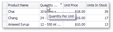
Most DevExpress controls allow you to display a tooltip when the mouse pointer hovers a control or its particular visual element. The Data Grid can display tooltips for truncated captions (for example, in a column header).
This topic explains how to enable/disable tooltips for truncated captions and customize their appearance. For more information on tooltips, see the following topic: Tooltips.
Grid View Tooltip Options
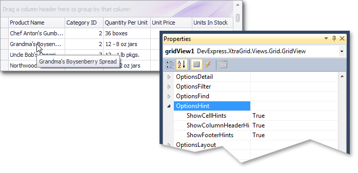
Use the GridView.OptionsHint property to access the following options:
- ShowCellHints — gets or sets whether the view displays tooltips for cells with truncated content.
ShowColumnHeaderHints — gets or sets whether the view displays tooltips for column headers with truncated captions.
You can also use the ToolTip property to assign a custom tooltip to a column.
ShowFooterHints — gets or sets whether the view displays tooltips for footer cells with truncated content.
gridView1.OptionsHint.ShowCellHints = false;
gridView1.Columns["productPrice"].ToolTip = "Price of the product per item";
Banded Grid View Tooltip Options
Use the BandedGridView.OptionsHint property to access the ShowBandHeaderHints option that specifies whether hints are displayed for band headers with truncated captions.
You can also use the ToolTip property to assign a custom tooltip to a band.
Card View Tooltip Options
Use the CardView.OptionsView property to access the ShowFieldHints option that specifies whether hints are displayed for card fields with truncated content.
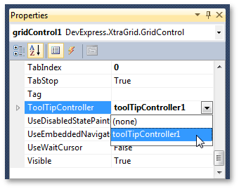
Tooltip Controller
The ToolTipController component allows you to customize hints displayed for controls and their elements. You can specify appearance settings, icons, show and hide delays, and so forth.
The DefaultToolTipController component is a toolbox component that allows you to access the default controller in the designer. To access the default controller in code, use the static (Shared in VB.NET) ToolTipController.DefaultController property.
You can also assign a specific controller to the Data Grid’s ToolTipController property. If you assign a custom controller to this property, it is used instead of the default controller.
For more information, see the following topic: Hints and Super Tooltips.