Timeline View
- 3 minutes to read
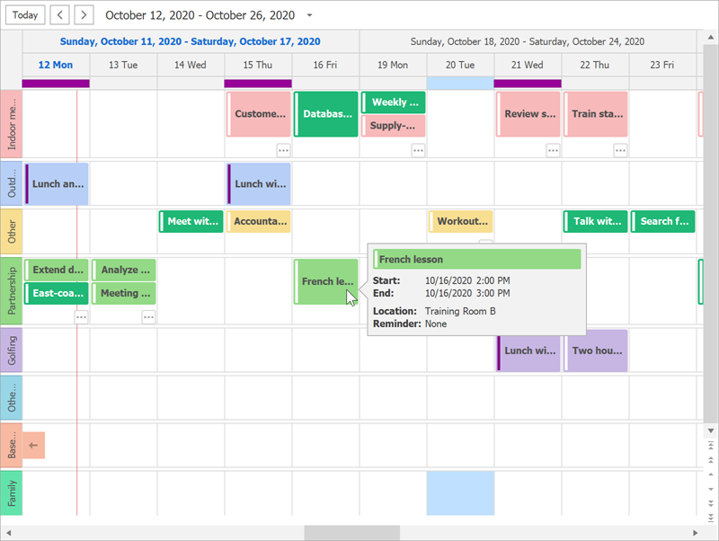
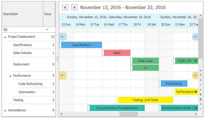
The Timeline View (TimelineView) displays appointments as horizontal bars along the Time Scales.

To activate the Timeline View, set the SchedulerControl.ActiveViewType property to SchedulerViewType.Timeline:
using DevExpress.XtraScheduler;

public Form1() {
    InitializeComponent();
    schedulerControl.Start = System.DateTime.Now;
    schedulerControl.ActiveViewType = SchedulerViewType.Timeline;
}
Use the SchedulerControl.TimelineView property to access view settings.
Time Scales
The Timeline View can display built-in and custom time scales.

Built-in time scales include:
- TimeScaleYear
- TimeScaleQuarter
- TimeScaleMonth
- TimeScaleWeek
- TimeScaleDay
- TimeScaleWorkDay
- TimeScaleHour
- TimeScaleWorkHour
- TimeScale15Minutes
See the following help topic for more information and code snippets: Time Scales.
Resources Tree
Bind the ResourcesTree control to the Scheduler control to display a resource hierarchy. Set the SchedulerViewBase.GroupType property to SchedulerGroupType.Resource group appointments by resource and ensure synchronized display.
resourcesTree1.SchedulerControl = schedulerControl;
schedulerControl.TimelineView.GroupType = DevExpress.XtraScheduler.SchedulerGroupType.Resource;

See the following help topic for more information: Resources Tree.
Timeline API
Properties and Methods
Member Name | Description |
|---|---|
Provides access to the properties that control the appearance of the TimelineView‘s elements. | |
Provides access to the appointment’s display options. | |
Gets or sets a value indicating whether the date-time scrollbar is visible. Note This property has no equivalent in WPF. | |
Gets the time scale with the most detailed time interval. | |
Provides access to properties which specify how the time cell selection changes when the Timeline scale is changed. | |
Provides access to a collection of time scales displayed in the Timeline view. | |
Gets the time interval currently selected in the scheduler’s active view by an end-user. | |
Provides access to the selection bar options. | |
Gets or sets whether resource headers are displayed. | |
Specifies whether a vertical row scrollbar is visible, and the vertical scrolling is enabled in rows of the Timeline view grouped by resource. | |
Returns a copy of the visible time interval collection for the current view. | |
Fills the visible time interval collection with new items. | |
Gets or sets the work time interval for a Timeline View. |
Events
Event Name | Description |
|---|---|
Allows you to manually paint the square area at the top left corner of the Timeline View. Fires when the SchedulerViewBase.GroupType is set to SchedulerGroupType.Date. | |
Allows you to manually paint day headers. | |
Allows you to paint group separators. | |
Allows you to paint navigation buttons. | |
Allows you to paint resource headers. | |
Allows you to paint time cells. |
Services
| Service | Description |
|---|---|
| HeaderCaptionService | Allows you to custom format header captions. |
| HeaderToolTipService | Allows you to specify custom tooltips for day headers. |