Quick Runtime Customization
- 3 minutes to read
The LayoutControl supports two customization modes: default and quick. In default mode, customization commands are provided using context menus; while in quick mode, these commands are available in the touch-friendly Customization Form. You can select the appropriate mode by setting the LayoutControl.CustomizationMode property to Default or Quick.
For general information on runtime customization, how to disable this feature and how to save and restore layouts, see Runtime Customization Overview. To learn the specifics of the default customization mode, see Default Runtime Customization.
Quick Customization Mode Activation
To activate quick customization mode, an end-user has to press and hold a finger (on touch devices) or press and hold a right-click with a mouse within the LayoutControl’s bounds until an animated load indicator is filled.
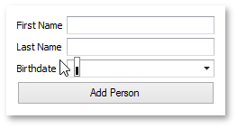
After that, all elements residing within the LayoutControl will be disabled and the touch-oriented Customization Form will be displayed showing customization options for the clicked item.
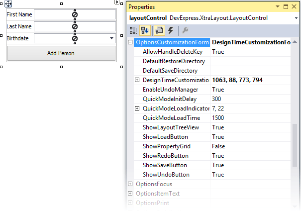
You can regulate various aspects of quick mode initialization using options provided by the LayoutControl.OptionsCustomizationForm:
- OptionsCustomizationForm.QuickModeInitDelay - Gets or sets a delay between pressing the LayoutControl and the start of quick customization mode initialization.
- OptionsCustomizationForm.QuickModeLoadTime - Gets or sets quick mode activation time.
- OptionsCustomizationForm.QuickModeLoadIndicatorSize - Gets or sets the size of the quick customization mode load indicator.
Note
Layout item context menus are not available in quick customization mode.
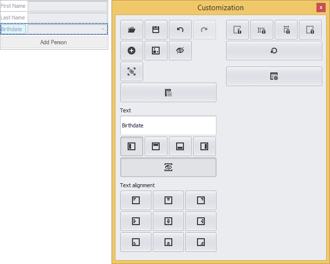
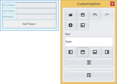
Customization Form
The Customization Form provides various control elements (buttons encapsulating customization actions, a text box specifying a selected element caption, Properties grid, etc.). Its appearance depends on the type of selected element. The following image demonstrates the Customization Form invoked for a LayoutControl’s root group.
To access the Customization Form’s extended capabilities, click the Show more/fewer options button  . This displays additional elements: Hidden Items and Layout Tree View tabbed pages and Properties grid.
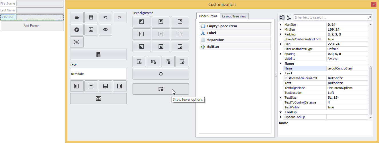
The LayoutControl.OptionsCustomizationForm property contains the settings that determine the availability of the specific elements of a Customization Form.
Layout Customization
In customization mode, an end-user is able to modify a layout using the drag-and-drop functionality, resizing operations and actions provided by the Customization Form.
An end-user can rename a layout item by selecting it and typing the required text in the Customization Form dedicated field. This field is synchronized with the item’s Text property.
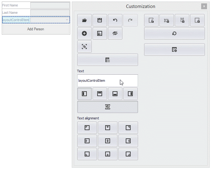
The Customization Form displays buttons that provide various customization capabilities.
General Customization Buttons

Saves the current layout to an XML file.

Loads one of the previously saved layouts from an XML file.

Perform undo and redo customization operations.

Automatically calculates and applies optimal element sizes.

Extends/shrinks the Customization Form to show more/fewer options.

Chooses the selected element’s parent group.
Item Customization Buttons

Adds a new item representing an empty region (an Empty Space Item).

Hides the currently selected items and groups.

Apply custom or default size constraints. See Size and Alignment to learn more.
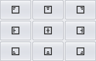
Specify the vertical (Top, Middle or Bottom) and horizontal (Left, Center or Right) label alignment.
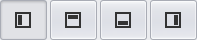
Specify the label position, group caption position or tabbed group page header position (Top, Bottom, Left or Right).

Shows/hides the selected item’s label.
Specify the control alignment.
Grouping Buttons

Groups the currently selected items (creates a new group and adds the selected items to it).

Ungroups the currently selected group (destroys the currently selected group and moves its items to the parent group.).

Creates a new tabbed group from the selected group or adds a new tabbed page to the selected tabbed group.

Ungroups the currently selected tabbed group (destroys the selected tabbed group and moves its tabbed pages to the parent group).