Size and Alignment
- 8 minutes to read
The layout control contains layout items that embed controls. When a control is placed in a layout item, the layout item automatically sets its Size property according to the current layout. LayoutControl resizes its items so that they fill all available space. You can set Size Constraints — which limit the maximum width and height for a layout item when LayoutControl resizes it. This topic describes how to set size constraints and align a control within a layout item.
Size Constraints
The LayoutControlItem.SizeConstraintsType property specifies whether to use size constraints of the embedded control or the layout item:
- Default — uses the embedded control’s Control.MinimumSize and MaximumSize properties (or the IXtraResizableControl.MinSize and MaxSize properties - if the control implements this interface). The layout item sets the embedded control’s constraints based on its type. See the Default Size Constraints section below for details.
- SupportHorzAlignment — uses the embedded control’s Default size constraints, but supports horizontal alignment. In this mode, you can horizontally align the control in the layout item if the control width is less than the layout item width. See the Align Controls in Layout Items section below for details.
- Custom — uses the layout item’s LayoutControlItem.MinSize, MaxSize properties. The embedded control’s constraints are ignored. See Custom Size Constraints below.
Default Size Constraints
Default size constraints depend on the control type. Use the following properties to change the default constraints:
- Control.MinimumSize — gets or sets the minimum size. If this size is larger than the available area, scrollbars are shown.
- Control.MaximumSize — gets or sets the maximum size. You can also add Empty Space Items that occupy all remaining space when the availble area becomes larger than the maximum control size. This allows you to limit the maximum size of one specific item, while other items can be freely resized.
Most DevExpress WinForms controls implement the IXtraResizableControl interface. You can also use the following properties:
- IXtraResizableControl.MinSize — gets or sets the minimum size.
- IXtraResizableControl.MaxSize — gets or sets the maximum size.
Note
The ControlDefaultMaxSizeCalcMode property specifies whether to use the Control.MaximumSize property value, the IXtraResizableControl.MaxSize property value, or the larger of the two values. The ControlDefaultMinSizeCalcMode property specifies whether to use the Control.MinimumSize property value, the IXtraResizableControl.MinSize property value, or the smaller of the two values.
Default Size Constraints for Standard WinForms Controls
The table below contains default size constraints and caption visibility for standard .NET controls.
Control | Minimum Size (Width, Height) | Maximum Size (Width, Height) | Show Caption |
|---|---|---|---|
20, 20 | No limit, No limit | No | |
20, 20 | No limit, 20 | Yes | |
20, 20 | No limit, No limit | No | |
20, 20 | No limit, 20 | Yes | |
20, 20 | No limit, 20 | No | |
20, 25 | No limit, 25 | No | |
20, 20 | No limit, No limit | Yes | |
20, 20 | No limit, No limit | Yes | |
20, 21 | No limit, 21 | Yes | |
20, 20 | No limit, No Limit | Yes | |
20, 20 | No limit, No Limit | Yes | |
20, 20 | No limit, No Limit | Yes | |
20, 20 | No limit, 20 | Yes | |
20, 20 | No limit, No limit | Yes | |
20, 20 | No limit, 20 | Yes | |
20, 20 | No limit, 20 | Yes | |
20, 20 | No limit, No limit | No | |
20, 20 | No limit, No limit | No | |
20, 20 | No limit, No limit | Yes | |
100, 30 | No limit, 30 | No |
To register default size constraints for a custom control, use the static (Shared in VB) ConstraintsManager.RegisterControlConstraints method.
using DevExpress.XtraLayout;

ConstraintsManager.Default.RegisterControlConstraints(
    type:typeof(MyButton),
    minSize:new Size(20, 20),
    maxSize:Size.Empty,
    IsCaptionVisible:false);
Custom Size Constraints
To override the default size constraints, set the SizeConstraintsType property to Custom and use the MinSize and MaxSize properties. If the width or height is set to 0, the corresponding dimension has no limit. The minimum size of a layout item is 1 (setting the MinSize property to Size(0, 0) sets the MinSize property to Size(1, 1)).
The code below shows how to set custom size constraints.

using DevExpress.XtraEditors;
using DevExpress.XtraLayout;
using DevExpress.XtraLayout.Utils;

layoutControl.Root.DefaultLayoutType = LayoutType.Vertical;
LayoutControlItem item1 = layoutControl.AddItem("Memo 1", new MemoEdit() { Name = "Memo1" });
item1.SizeConstraintsType = SizeConstraintsType.Custom;
item1.MinSize = new Size(0, 50);
item1.MaxSize = new Size(0, 200);
layoutControl.AddItem(new SplitterItem());
layoutControl.AddItem("Memo 2", new MemoEdit() { Name = "Memo2" });
Tip
To view more code examples, run the following demo: Custom size constraints.
End-User Capabilities
Users can invoke the Customization Form to customize the layout — show/hide/replace layout items, show/hide captions, add/remove separators, etc. To specify size constraints, users can utilize an item’s context menu.

The following table describes commands in the context menu.
Command | Description |
|---|---|
| Applies the default size constraints to the layout item. Sets the layout item’s SizeConstraintsType to Default. Sets the MaxSize and MinSize properties to default values. |
| Removes size constraints. Sets the layout item’s SizeConstraintsType to Custom. Nullifies the MaxSize property. Sets the MinSize property to the default minimum value. |
| Locks the layout item’s current width and height. Sets the SizeConstraintsType to Custom. The MaxSize and MinSize properties are set to the current Size property value. |
| Locks the layout item’s current width. Sets the SizeConstraintsType to Custom. The Width property (for MaxSize and MinSize properties) is set to the Size property’s Width property value. |
| Locks the layout item’s current height. Sets the SizeConstraintsType to Custom. The |
Tip
You can also use the Customization Form in the Windows Forms Designer to specify size constraints at design time.
Example
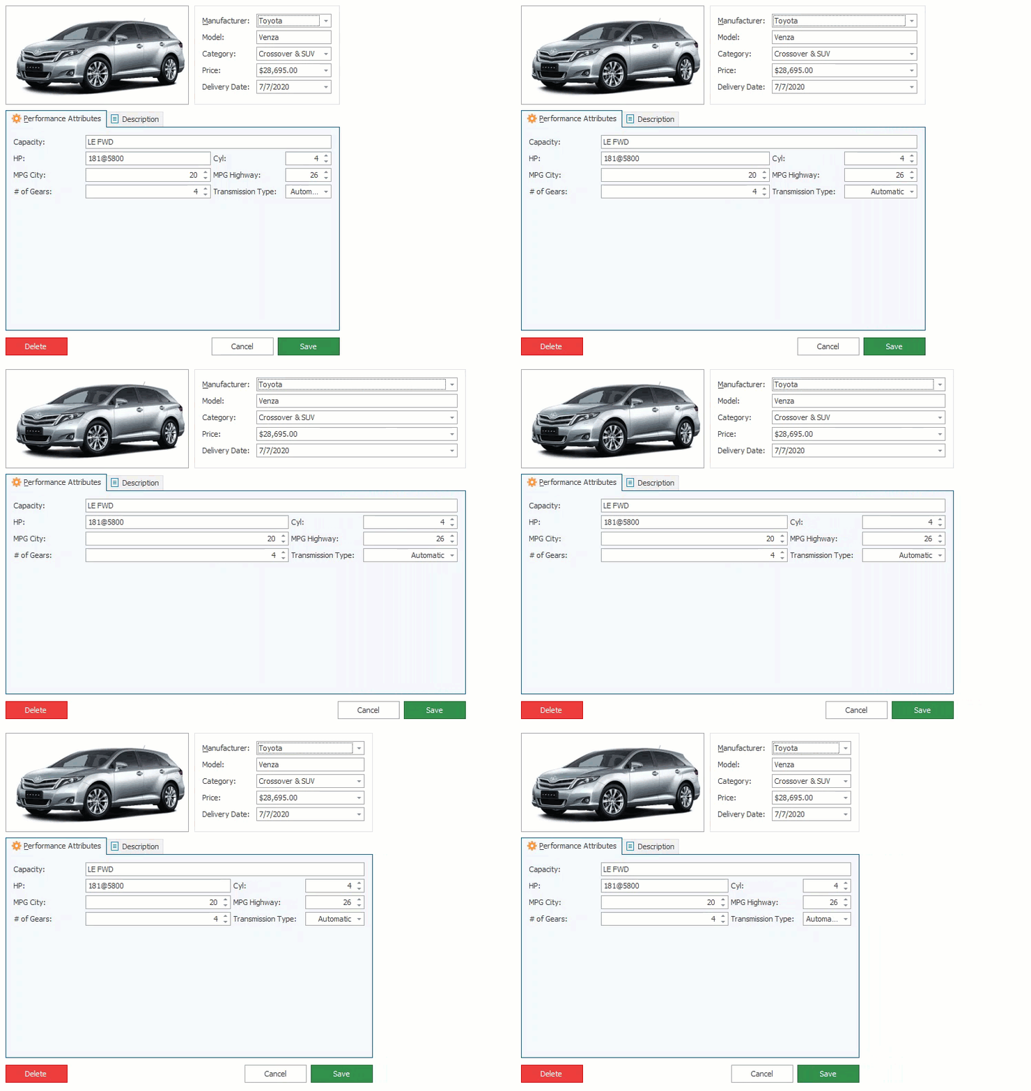
In the image below, the Delete, Cancel, and Save buttons have a fixed size. When a user resizes the form, only the empty space between them is resized.

Remove the empty space and allow the control to resize the buttons. Right-click the button and select Size Constraints | Free Sizing - as shown in the image below.

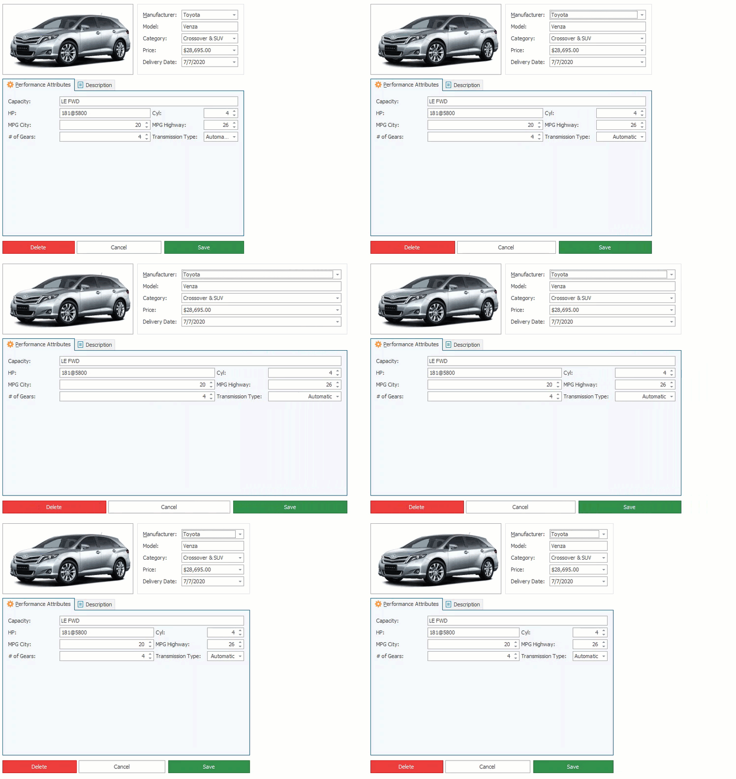
The buttons are now resized when a user resizes the form.

Size Constraints of Layout Groups
Size constraints of a layout group depend on size constraints set to its items or embedded controls.
using System.Drawing;
using DevExpress.XtraLayout;

layoutControlItemA1.SizeConstraintsType = SizeConstraintsType.Custom;
layoutControlItemA1.MaxSize = new Size(250, 24);
layoutControlItemA1.MinSize = new Size(100, 24);

Control Size Based on Content
Certain controls can be automatically sized to fit the content, not the layout item. To enable this mode, use the following properties:
- RadioGroup.AutoSizeInLayoutControl
- CheckEdit.AutoSizeInLayoutControl
- ToggleSwitch.AutoSizeInLayoutControl
- LabelControl.AutoSizeInLayoutControl
- StandaloneBarDockControl.AutoSizeInLayoutControl
- OfficeNavigationBar.AutoSizeInLayoutControl
- WindowsUIButtonPanel.AutoSizeInLayoutControl
- SimpleButton.AutoWidthInLayoutControl
Align Controls in Layout Items
When the form is resized, the layout item and embedded control are also resized. If the embedded control cannot be stretched because size constraints (defined by the MinSize and MaxSize properties) are set, the control’s size is fixed, or the control is sized to fit its content, the layout item contains an empty space. In this instance, you can use the ContentHorzAlignment and ContentVertAlignment properties to align the control within the layout item at the near or far edge, or at the center. Note that the SizeConstraintsType property should be set to SupportHorzAlignment.
Example
The example below displays the following controls:
- CheckEdit — the size is set to fit the content. The control is aligned at the center.
- RadioGroup — the maximum size is limited. The control is aligned at the left.

using DevExpress.XtraLayout;
using DevExpress.XtraEditors;

CheckEdit checkEdit1 = new CheckEdit() { Name = "CheckEdit" };
LayoutControlItem layoutControlItem1 = layoutControl.AddItem("Check box", checkEdit1);
checkEdit1.AutoSizeInLayoutControl = true;
layoutControlItem1.ContentHorzAlignment = HorzAlignment.Center;
//layoutControlItem1.ContentHorzAlignment = HorzAlignment.Far;

RadioGroup radioGroup1 = new RadioGroup() { Name = "RadioGroup" };
radioGroup1.Properties.Items.AddEnum<HorzAlignment>();
LayoutControlItem layoutControlItem2 = layoutControl.AddItem("Radio Group", radioGroup1);
layoutControlItem2.TextVisible = false;
radioGroup1.AutoSizeInLayoutControl = true;
radioGroup1.Properties.ItemsLayout = RadioGroupItemsLayout.Column;
radioGroup1.Properties.Columns = 1;
radioGroup1.MaximumSize = new Size(200, 0);
layoutControlItem2.ContentHorzAlignment = HorzAlignment.Center;
//layoutControlItem2.ContentHorzAlignment = HorzAlignment.Far;
layoutControlItem2.ContentVertAlignment = VertAlignment.Center;
//layoutControlItem2.ContentVertAlignment = VertAlignment.Bottom;
Tip
To see the complete example, run the following demo: Content Alignment. Click Open Solution in the ribbon for source codes.
Third-Party Controls
To support size constraints for third-party controls, use one of the following approaches:
- implement the IXtraResizableControl interface:
- MaxSize, MinSize — specify the size constraints.
- IsCaptionVisible — specifies whether the layout item should display the caption.
- Changed — the control fires this event when a property that affects the layout changes (for example, font settings).
use the
ConstraintsManager.RegisterControlConstraintsmethod to specify size constraints and caption visibility. Note that this method must be called for each LayoutControl that applies size constraints.
 Reset to Default
 Free Sizing
 Lock Size
 Lock Width
 Lock Height