With the Wizard Control (WizardControl), you can easily generate multi-step wizard dialogs and installer UIs that fully conform to Microsoft Windows standards. Regardless of which standard you require, the Wizard allows you to take full advantage of our Skinning technology, so you can deliver cutting-edge interfaces that are consistent with your application.
Learn the Basics

| Features
Enumerates essential Wizard Control features in a short list format.
Page Layout
This topic is dedicated to the layout of Wizard pages in both Wizard 97 and Aero Wizard styles.
|
Wizard Elements

| This section UI elements provided by the Wizard Control - Wizard pages and buttons.
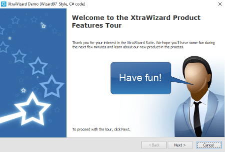
Welcome Page
The Welcome page is the first page in a Wizard, which explains the purpose of the wizard.
Interior Page
A regular page shown between the first and the last Wizard page. The Wizard control can display any number of interior pages.
Completion Page
The Completion page is the last page in a Wizard (if it exists), which provides users with feedback on completion.
Buttons
Buttons are clickable UI elements that allow end-users to navigate through Wizard pages. You do not need to manually add and arrange buttons since they are generated automatically depending on the parent page type.
|
Navigation

| Page Events
This help topic describes the sequence of events raised when an end-user navigates between wizard pages.
Conditional Navigation
Learn how to re-route your end-users by implementing conditional (not linear) navigation.
|