NavBarControl to AccordionControl Converter
- 3 minutes to read
The NavBarControl and AccordionControl allow you to implement a navigation functionality in your application. The accordion control, which was released later than the nav bar control, provides a modern view and the following features.
- Unlimited number of hierarchy levels (AccordionControl.Elements, AccordionControlElement.Elements)
- Items and groups can display images and text in their headers (AccordionControlElementBase.Image, AccordionControlElementBase.ImageIndex, AccordionControlElementBase.Text)
- Items can display custom controls in an expandable area below their headers (AccordionControlElementBase.ContentContainer)
- The Hamburger Menu paint style. (AccordionControl.ViewType, AccordionOptionsHamburgerMenu.DisplayMode)
- Load items’ content dynamically (AccordionControl.HasContentContainer, AccordionControl.GetContentContainer)
- One or multiple elements can be expanded simultaneously (AccordionControl.ExpandElementMode)
- Context buttons in item and group headers (AccordionControl.ItemContextButtons, AccordionControl.GroupContextButtons and AccordionControl.ContextButtonCustomize)
- Custom controls in item headers (AccordionControlElementBase.HeaderControl)
- Item selection feature (AccordionControl.AllowItemSelection) - Allows you to highlight a clicked item.
- Item and group expanding/collapsing animation (AccordionControl.AnimationType)
- The built-in search box (AccordionControl.ShowFilterControl) - Allows you to filter items based on the search text.
- Support for an external search box (SearchControl).
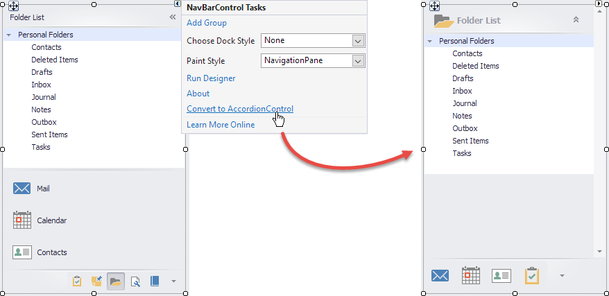
To automatically convert an existing NavBarControl to an AccordionControl, invoke the corresponding command in the smart tag menu. The controls are converted automatically, and your assistance is not required. However, this topic describes how controls, groups, and items are interchanged, and which settings are affected.
Tip
Since a backward automatic conversion is not supported, make a back-up copy of the project before proceeding.
How the Controls are Converted
Paint Style
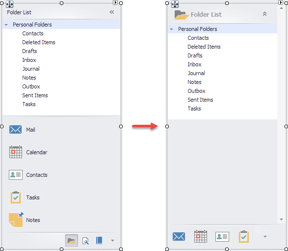
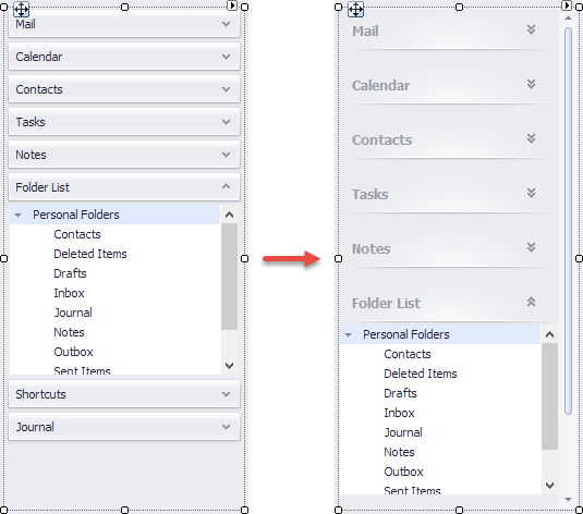
The NavBarControl can be displayed in different styles (see NavBarControl.PaintStyleKind). The AccordionControl does not support styles, but it can display the root groups and items in the control footer. This allows it to mimic the nav bar control’s view and behavior.
If the initial NavBarControl is painted in the NavigationPane style, the resulting AccordionControl displays its root groups and items in the control footer.
If the NavBarControl‘s paint style differs from the NavigationPane, the AccordionControl does not display the footer.
Selecting Items
If the NavBarControl‘s NavBarControl.LinkSelectionMode option is set to OneInControl, the AccordionControl also allows users to select items (see AccordionControl.AllowItemSelection).
Other Settings
Review the information below to see how the AccordionControl properties are specified based on the NavBarControl properties. You can adjust these properties after the conversion if necessary.
|
NavBarControl.Appearance.Background NavBarControl.Appearance.Hint NavBarControl.Appearance.GroupHeader NavBarControl.Appearance.GroupHeaderHotTracked NavBarControl.Appearance.GroupHeaderPressed NavBarControl.Appearance.Item NavBarControl.Appearance.ItemHotTracked NavBarControl.Appearance.ItemPressed NavBarControl.Appearance.ItemDisabled |
AccordionControl.Appearance.AccordionControl AccordionControl.Appearance.Hint AccordionControl.Appearance.Group.Normal AccordionControl.Appearance.Group.Hovered AccordionControl.Appearance.Group.Pressed AccordionControl.Appearance.Item.Normal AccordionControl.Appearance.Item.Hovered AccordionControl.Appearance.Item.Pressed AccordionControl.Appearance.Item.Disabled |
Groups and Items
For each group, item or separator in the nav bar, a corresponding accordion group, item or separator is created. If a nav bar group contains other controls (see NavBarGroup.ControlContainer), these controls are moved to the accordion group. The table below contains equivalent properties of the nav bar and accordion elements.
|
Depending on the NavBarGroup.GroupCaptionUseImage or NavBarGroup.GroupStyle property, the accordion group or item uses large or small images. |
Converting the Application Form to a Fluent Design Form
You can enable the HamburgerMenu view for the created AccordionControl by using the AccordionControl.ViewType property. The hamburger menu can be embedded to a FluentDesignForm that features:
- Adaptive Layout mode for the Hamburger Menu (automatically switches between Inline, Overlay and Minimal display modes when you resize the form)
- Acrylic Material effect (a partially transparent texture)
- Reveal Highlight visual effect
To convert the application form to the FluentDesignForm, use the Form Assistant component. For more information, see Fluent Design Form.