Tile Bar
- 11 minutes to read
The TileBar control allows you to implement a tile-based UI in your application:
- A row/column of static or clickable tiles
- A simple or hierarchical tile-based menu
- Tiles with a drop-down functionality (you can display any control in a tile’s dropdown), etc.
Tiles act as regular buttons by default, but also support the pressed state and checking functionality.
This topic consists of the following sections:
- Create Tiles and Tile Groups
- Display One Text Region and Image
- Display Multiple Text Regions and Images
- Orientation, Scrolling, and Element Layout
- Set Item Size
- Actions on Tile Clicking
- Selection
- Checked Tiles
- Drop-Down Functionality
-
Background Images and Shadows
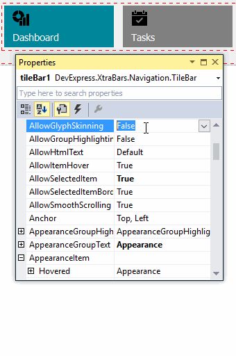
Glyph Skinning
HTML Text Formatting
- Context Buttons
- Pager Navigation
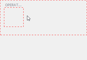
Create Tiles and Tile Groups
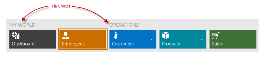
The Tile Bar control consists of tile groups (TileBarGroup objects), which consist of tiles (TileBarItem objects).
You can add and customize tiles and tile groups at design time in the following ways: context-dependent popup menus, Smart Tags, Visual Studio Properties window and dedicated designer which allows you to add multiple image and text regions to tiles.
First, add at least one tile group.
Then, you can create tiles using, for example, the context menu.
TileBarGroup group1 = new TileBarGroup();
tileBar1.Groups.Add(group1);
group1.Text = "OPERATIONS";

TileBarItem item1 = new TileBarItem();
item1.ItemSize = TileBarItemSize.Medium;

TileBarItem item2 = new TileBarItem();
item2.ItemSize = TileBarItemSize.Wide;
group1.Items.Add(item1);
group1.Items.Add(item2);

tileBar1.ItemSize = 70;
tileBar1.WideTileWidth = 150;
The TileBar, TileBarGroup, and TileBarItem objects are TileControl, TileGroup, and TileItem class descendants, respectively. Most of the APIs these classes expose are in effect for the TileBar control, its groups, and items.
Related API
Display One Text Region and Image
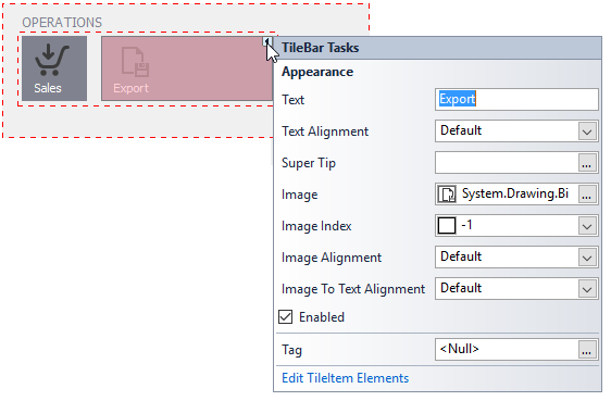
Use the properties the Tile (TileBarItem object) exposes to display one text region and/or one image within a tile.
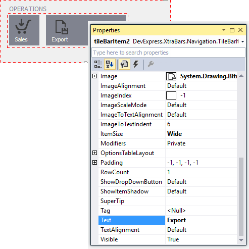
You have quick access to these settings from the tile’s Smart Tag.
TileBarItem item1, item2;
//...
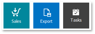
item1.Text = "Sales";
item1.Image = global::MyApplication.Properties.Resources.shoppingcart_32x32;
item1.ImageAlignment = DevExpress.XtraEditors.TileItemContentAlignment.TopLeft;
item2.Text = "Export";
item2.Image = global::MyApplication.Properties.Resources.exportfile_32x32;
item2.ImageAlignment = DevExpress.XtraEditors.TileItemContentAlignment.TopLeft;
You can specify that tiles only display text when the mouse pointer hovers over them using the TileControl.ItemTextShowMode property.
Related API
- TileItem.Text
- TileItem.TextAlignment
- TileControl.AllowHtmlText, TileItem.AllowHtmlText
- TileItem.Image
- TileItem.ImageIndex
- TileItem.ImageAlignment
- TileItem.ImageScaleMode
- TileItem.ImageToTextAlignment
- TileItem.ImageToTextIndent
- TileControl.ItemTextShowMode
- TileBar.ItemPadding, TileItem.Padding
Display Multiple Text Regions and Images
To add multiple text and image regions to tiles, create tile elements which can display an image and text. You can use tile elements’ options to control text and image positions and the image scaling mode. A tile element can be aligned relative to another element.
At design time, use the Tile Element Designer to edit tile elements.
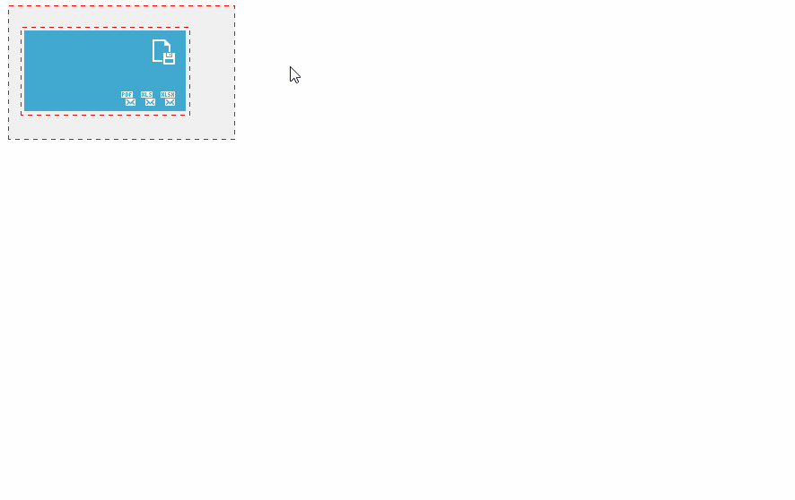
You can add tile item elements in code using the TileItem.Elements property. See the Tile Item Structure to learn more.
Example
tileBar1.AppearanceItem.Normal.BackColor = Color.FromArgb(65, 168, 207);
tileBar1.AppearanceItem.Normal.ForeColor = Color.White;

TileBarGroup group1 = new TileBarGroup();
tileBar1.Groups.Add(group1);

TileBarItem tile1 = new TileBarItem();
tile1.ItemSize = DevExpress.XtraBars.Navigation.TileBarItemSize.Wide;

TileItemElement tileItemElement1 = new TileItemElement();
TileItemElement tileItemElement2 = new TileItemElement();
TileItemElement tileItemElement3 = new TileItemElement();
TileItemElement tileItemElement4 = new TileItemElement();
TileItemElement tileItemElement5 = new TileItemElement();

tile1.Elements.Add(tileItemElement1);
tile1.Elements.Add(tileItemElement2);
tile1.Elements.Add(tileItemElement3);
tile1.Elements.Add(tileItemElement4);
tile1.Elements.Add(tileItemElement5);

group1.Items.Add(tile1);

tileItemElement1.Image = Properties.Resources.exportfile_32x32;
tileItemElement1.ImageAlignment = TileItemContentAlignment.TopRight;
tileItemElement1.Text = "";

tileItemElement2.Image = Properties.Resources.sendxlsx_16x16;
tileItemElement2.ImageAlignment = TileItemContentAlignment.BottomRight;
tileItemElement2.Text = "";

tileItemElement3.AnchorAlignment = DevExpress.Utils.AnchorAlignment.Left;
tileItemElement3.AnchorElement = tileItemElement2;
tileItemElement3.Image = Properties.Resources.sendxls_16x16;
tileItemElement3.Text = "";

tileItemElement4.AnchorAlignment = DevExpress.Utils.AnchorAlignment.Left;
tileItemElement4.AnchorElement = tileItemElement3;
tileItemElement4.Image = Properties.Resources.sendpdf_16x16;
tileItemElement4.Text = "";

tileItemElement5.Text = "<size=+4>Export and Mail";
tileItemElement5.TextAlignment = DevExpress.XtraEditors.TileItemContentAlignment.TopLeft;
Related API
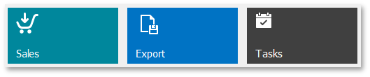
Orientation, Scrolling and Tile Layout
Tiles are arranged horizontally by default. To change the orientation, use the TileControl.Orientation property.
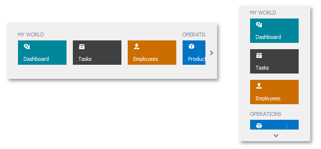
Scroll buttons appear if the Tile Bar size exceeds the available bounds. You can use the TileControl.ScrollMode setting to enable the scroll bar or disable the scroll handles.
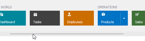
The Tile Bar provides settings to align tiles within the control’s bounds, hide group captions, and specify the distance between items and groups.
Related API
- TileControl.Orientation
- TileControl.ScrollMode
- TileControl.HorizontalContentAlignment, TileControl.VerticalContentAlignment
- TileBar.IndentBetweenGroups
- TileBar.IndentBetweenItems
- TileBar.GroupTextToItemsIndent
- TileBar.ShowGroupText
Set Item Size
Tiles in the Tile Bar can be Medium or Wide.
A medium tile is square. The TileBar.ItemSize integer setting specifies its width and height.
A wide tile is rectangular. The TileBar.ItemSize and TileBar.WideTileWidth properties specify the item’s height and width.
After a tile is created, you can specify the tile’s size format with the TileBarItem.ItemSize property.
tileBar1.ItemSize = 80;
tileBar1.WideTileWidth = 160;
item1.ItemSize = TileBarItemSize.Medium;
item2.ItemSize = TileBarItemSize.Wide;
Related API
Actions on Tile Clicking
Tiles act as buttons and raise the following events on a mouse click by default:
- TileControl.ItemClick - Allows you to respond to clicking any tile.
- TileItem.ItemClick - Allows you to respond to clicking a specific tile.
TileBarItem item1, item2;
//...
item1.Tag = 111;
item2.Tag = 112;

private void tileBar1_ItemClick(object sender, DevExpress.XtraEditors.TileItemEventArgs e) {
    int itemTag = Convert.ToInt32(e.Item.Tag);
    switch (itemTag) {
        case 111:
            //...
            break;
        case 112:
            //...
            break;
        default:
            XtraMessageBox.Show(e.Item.Text + " clicked");
            break;
    }
}
The Tile Bar also provides events for responding to other mouse actions (double-clicking, right button clicking, etc.). See the Related API list below.
Related API
TileControl.ItemDoubleClick, TileItem.ItemDoubleClick, TileControl.EnableItemDoubleClickEvent, TileItem.EnableItemDoubleClickEvent
Selection
The TileControl.AllowSelectedItem property enables the tile selection mode, in which tiles act as radio-buttons. Clicking on a tile switches it to the pressed state.
An end user can also select tiles by navigating between them using the Arrow keys.
Handle the TileControl.SelectedItemChanged event to respond to selection changes.
tileBar1.AllowSelectedItem = true;
tileBar1.SelectedItem = item2;
tileBar1.SelectedItemChanged += tileBar1_SelectedItemChanged;
tileBar1.SelectionBorderWidth = 4;
tileBar1.SelectionColorMode = SelectionColorMode.UseItemBackColor;

void tileBar1_SelectedItemChanged(object sender, TileItemEventArgs e) {
    //...
}
Related API
- TileControl.AllowSelectedItem
- TileControl.SelectedItem
- TileBar.SelectionBorderWidth
- TileControl.SelectionColor
- TileBar.SelectionColorMode
- TileControl.SelectedItemChanged
- TileItemAppearances.Selected (available from TileControl.AppearanceItem and TileItem.AppearanceItem)
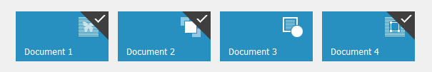
Checked Tiles
The Tile Bar control supports the item checking functionality in which single or multiple tiles can be checked by right-clicking (on non-touch screens) or dragging tiles down (on touch-input devices).
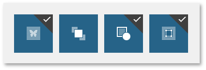
Use the TileControl.ItemCheckMode property to enable single or multiple item check mode.
tileBar1.ItemCheckMode = TileItemCheckMode.Multiple;
tileBar1.ItemCheckedChanged += tileBar1_ItemCheckedChanged;
item2.Checked = true;

void tileBar1_ItemCheckedChanged(object sender, TileItemEventArgs e) {
    //...
}
Related API
- TileControl.ItemCheckMode
- TileControl.ItemCheckedChanged
- TileItem.CheckedChanged
- TileItem.Checked
- TileControl.GetCheckedItems
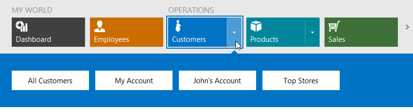
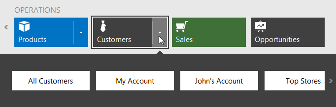
Drop-Down Functionality
Each tile can be associated with a drop-down control using the TileBarItem.DropDownControl property. Drop a TileBarDropDownContainer control from the Toolbox onto the form. Add custom controls to the created TileBarDropDownContainer, and then assign the container to the TileBarItem.DropDownControl property. Tiles with associated drop-down controls automatically display drop-down buttons.
You can add any control to a TileBarDropDownContainer, including another TileBar control.
The Tile Bar allows you to associate drop-down containers with tiles dynamically by handling the TileBar.DropDownShowing event.
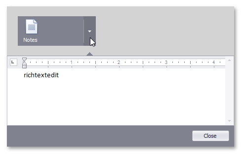
Example
The following code demonstrates how to create a TileBar control with one tile and associate a dropdown control with this tile.
using DevExpress.XtraBars.Navigation;
using DevExpress.XtraEditors;
using DevExpress.XtraRichEdit;

private TileBar tileBar;

private void Form1_Load(object sender, EventArgs e) {
    tileBar = new TileBar();
    this.Controls.Add(tileBar);
    tileBar.Dock = DockStyle.Top;
    tileBar.Height = 100;
    tileBar.BackColor = Color.LightGray;
    TileBarGroup tileBarGroup = new TileBarGroup();
    tileBar.Groups.Add(tileBarGroup);
    TileBarItem item = new TileBarItem();
    item.Text = "Notes";
    item.Image = global::WindowsFormsApplication1.Properties.Resources.textbox_32x32;
    item.DropDownOptions.BackColorMode = BackColorMode.UseTileBackColor;
    item.DropDownOptions.Height = 185;
    tileBarGroup.Items.Add(item);
    TileBarDropDownContainer ddContainer = new TileBarDropDownContainer();
    ddContainer.Size = new System.Drawing.Size(595, 185);
    SimpleButton button = new SimpleButton();
    button.Anchor = ((System.Windows.Forms.AnchorStyles)((System.Windows.Forms.AnchorStyles.Bottom | System.Windows.Forms.AnchorStyles.Right)));
    button.Location = new System.Drawing.Point(510, 152);
    button.Size = new System.Drawing.Size(75, 22);
    button.Text = "Close";
    button.Click += button_Click;
    RichEditControl richEditControl = new RichEditControl();
    richEditControl.Dock = System.Windows.Forms.DockStyle.Top;
    richEditControl.Text = "";
    richEditControl.Height = 142;
    richEditControl.ActiveViewType = RichEditViewType.Draft;
    richEditControl.Options.HorizontalScrollbar.Visibility = RichEditScrollbarVisibility.Hidden;
    ddContainer.Controls.Add(button);
    ddContainer.Controls.Add(richEditControl);
    item.DropDownControl = ddContainer;
}

void button_Click(object sender, EventArgs e) {
    tileBar.HideDropDownWindow();
}
Related API
- TileBarItem.DropDownControl
- TileBarDropDownContainer
- TileBarItem.ShowDropDownButton
- TileBar.DropDownButtonWidth
- TileBar.DropDownShowDirection
- TileBar.DropDownOptions, TileBarItem.DropDownOptions:
Appearance Customization
All DevExpress .NET Windows Forms controls provide various Appearances to specify their look and feel. See this help article to learn more about Appearance objects: Application Appearance and Skin Colors.
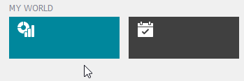
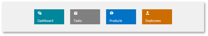
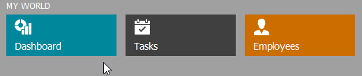
Use the Tile Bar’s TileControl.AppearanceItem property to customize tiles’ default appearance settings in the normal, hovered, pressed and selected states. You can override these settings for individual tiles using their TileItem.AppearanceItem properties. The image below demonstrates a combined effect of both properties.
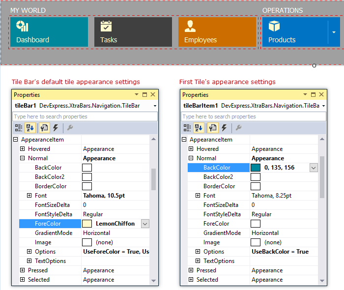
tileBar1.AppearanceItem.Normal.Font = new Font("Tahoma", 10.5f);
tileBar1.AppearanceItem.Normal.ForeColor = Color.LemonChiffon;
tileBar1.AllowGlyphSkinning = true;
tileBar1.Groups[0].Items[0].AppearanceItem.Normal.BackColor = Color.FromArgb(0, 135, 156); //green
tileBar1.Groups[0].Items[1].AppearanceItem.Normal.BackColor = Color.FromArgb(64, 64, 64); //dark gray
tileBar1.Groups[0].Items[2].AppearanceItem.Normal.BackColor = Color.FromArgb(204, 109, 0); //orange
tileBar1.Groups[1].Items[0].AppearanceItem.Normal.BackColor = Color.FromArgb(0, 115, 196); //blue
Related API
TileBar.BackColor, TileBar.BackgroundImage, TileBar.BackgroundImageLayout
Background Images and Shadows
Tiles can display background images and shadows. You can use the corresponding settings to change the background image’s alignment and scaling mode.
Related API
TileControl.ItemBackgroundImageAlignment, TileItem.BackgroundImageAlignment
TileControl.ItemBackgroundImageScaleMode, TileItem.BackgroundImageScaleMode
Glyph Skinning
If tiles display gray-scale images you can enable the glyph skinning feature, which paints tile images using the tile’s foreground color.
Related API
HTML Text Formatting
The Tile Bar allows you to provide contents for tile items in a simplified HTML format. When specifying the tile’s Text property, you can specify font size, style, and color for the entire text or its part, and insert line breaks.
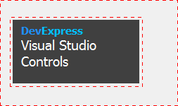
tileBarItem1.Text = "<b><Size=+3><COLOR=DodgerBlue>Dev</COLOR><Color=DeepSkyBlue>Express<br></COLOR></size></b><COLOR=White><SIZE=+6>Visual Studio<br>Controls</SIZE><COLOR>";
Related API
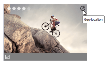
Context Buttons
Context buttons allow you to implement additional functionality for tiles. For instance, you can use a regular context button (it can display text and image) that fires a certain action on a click. A check context button allows you to implement custom tile checking logic. A rating context button displays a rating control in each tile.
Related API
- TileControl.ContextButtons
- TileControl.ContextButtonOptions
- TileControl.ContextButtonClick
- TileControl.ContextButtonCustomize
- TileControl.CustomContextButtonToolTip
Pager Navigation
The RadioGroup and WindowsUIButtonPanel can be used as a pager for the following controls:
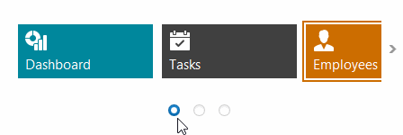
The pager automatically splits the target control’s content into pages, and displays navigation buttons to scroll to corresponding pages. The pager navigation functionality is implemented as a Behavior and can be added to your controls using the BehaviorManager component.