NavBarGroup.GroupStyle Property
Gets or sets the way links are displayed within the current group, or whether to display a custom control within the group.
Namespace: DevExpress.XtraNavBar
Assembly: DevExpress.XtraNavBar.v25.2.dll
NuGet Package: DevExpress.Win
Declaration
Property Value
| Type | Default | Description |
|---|---|---|
| NavBarGroupStyle | Default | A NavBarGroupStyle value specifying how the group’s content is presented. |
Available values:
| Name | Description |
|---|---|
| Default | The link arrangement mode is dependent on the current View. In the following Views, links are painted in the LargeIconsText mode: BaseView, FlatView, Office1View, Office2View, Office3View, AdvExplorerBarView, ExplorerBarView, UltraFlatExplorerBarView, XP1View, XP2View and XPExplorerBarView. In other Views, links are painted in the SmallIconsText mode. |
| SmallIconsText | A group’s links are displayed in one column, using small icons and with captions.
|
| LargeIconsText | A group’s links are displayed in one column, using large icons and with captions.
In the VSToolBoxView paint style, links are painted in the SmallIconsText mode. |
| SmallIconsList | A group’s links are displayed across then down, using small icons and without captions.
This mode is supported in the following paint Views: BaseView, FlatView, Office1View, Office2View, Office3View, VSToolBoxView, UltraFlatExplorerBarView, XP1View, XP2View and NavigationPane. In other paint Views, links are painted in the SmallIconsText mode. |
| LargeIconsList | A group’s links are displayed across then down, using large icons and without captions.
This mode is supported in the following paint Views: BaseView, FlatView, Office1View, Office2View, Office3View, UltraFlatExplorerBarView, XP1View, XP2View and NavigationPane. In other paint Views, links are painted differently:
|
| ControlContainer | This setting allows you to display any controls within the group. In this case, the group does not display its links. Instead, it provides a container control - a surface on which you can place any arbitrary controls. For more information, see the NavBarGroupControlContainer topic. In the image below the NavBarControl’s group displays a Tree List control.
|
Remarks
Use the GroupStyle property to specify how the group content is presented to an end-user. By default, this property is set to NavBarGroupStyle.Default and this ensures that the group’s links are displayed according to the currently applied View.
By setting the GroupStyle property to NavBarGroupStyle.LargeIconsText, NavBarGroupStyle.SmallIconsText, NavBarGroupStyle.LargeIconsList or NavBarGroupStyle.SmallIconsList value, you can explicitly specify a link arrangement mode and whether links are displayed using large or small images, with and without captions.
Setting the GroupStyle property to NavBarGroupStyle.ControlContainer allows you to display any control(s) within the group. See the NavBarGroupControlContainer topic for more information.
Example
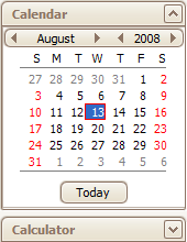
The following sample code embeds a DateControl into a NavBarControl’s group. To allow control embedding, the NavBarGroup.GroupStyle property is set to ControlContainer. Then, the DateControl is added to the group via the NavBarGroup.ControlContainer property.
The image below shows the result.

DevExpress.XtraEditors.DateControl dc = new DevExpress.XtraEditors.DateControl();

navBarGroup1.GroupStyle = DevExpress.XtraNavBar.NavBarGroupStyle.ControlContainer;
navBarGroup1.ControlContainer.Controls.Add(dc);
navBarGroup1.GroupClientHeight = dc.Height + 3;
navBarControl1.Width = dc.Width + 3;
