Lookup Editors
- 15 minutes to read
Data Lookups
The DevExpress WinForms Subscription includes four lookup controls. Lookups are data-bound editors that display data source records in their dropdowns. Users can select one item (record) at a time. Users cannot edit records in the dropdown.
Standard Lookup
LookUpEdit is a text box editor with a dropdown panel that displays data in a simple table layout.

Grid-based Lookup
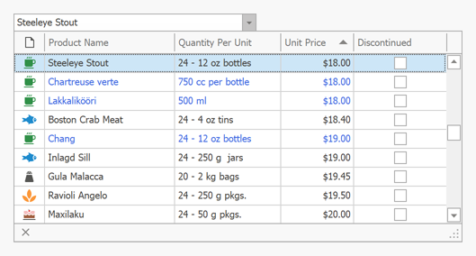
GridLookUpEdit is a lookup editor that embeds the Data Grid within the dropdown. With the Data Grid’s countless visualization and data presentation options, you have total control over the lookup’s UI/UX.
Lookup with Integrated Search
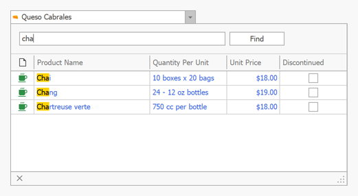
SearchLookUpEdit is a grid-based lookup with an embedded Find Panel. Unlike the GridLookUpEdit, this editor supports Instant Feedback mode, but does not allow users to enter values in the text box.
TreeList-based Lookup
TreeListLookUpEdit is a lookup editor that embeds the Tree List control within the dropdown. Users can select values form hierarchical lists.

Feature Matrix
| Lookup | Grid Lookup | TreeList Lookup | Search Lookup | |
|---|---|---|---|---|
| In-Place Mode (use within data-aware controls) |  |
 |
 |
 |
| Resizable Dropdown Window |  |
 |
 |
 |
| Multiple Columns |  |
 |
 |
 |
| Unbound Columns |  |
 |
 |
 |
| Show/Hide Horizontal and Vertical Lines |  |
 |
 |
 |
| Insert New Records/Values |  |
 |
 |
 |
| Autocomplete |  |
 |
 |
 |
| Case Sensitive Search |  |
 |
 |
 |
| AI-powered Semantic Search |  |
 |
 |
 |
| Sorting |  |
 |
 |
 |
| Display Data in Table Layout |  |
 |
 |
 |
| Autosuggest Mode |  |
 |
 |
 |
| Data Aggregation (Summaries) |  |
 |
 |
 |
| Arrange Columns into Bands |  |
 |
 |
 |
| Row Auto Height |  |
 |
 |
 |
| Grouping |  |
 |
 |
 |
| Server Mode (Optimized Data Loading) |  |
 |
 |
 |
| Instant Feedback UI |  |
 |
 |
 |
| Auto Filter Row |  |
 |
 |
 |
| Find Panel |  |
 |
 |
 |
| Display Records as Tiles (Table, List, Kanban Board) |  |
 |
 |
 |
| Hierarchical Data Structures |  |
 |
 |
 |
| Multiple Item Selection |  |
 |
 |
 |
Note
Use the PopupContainerEdit control if you need functionality that is not supported by lookup editors. This control allows you to display any controls within its popup window.
How to Use a PopupContainerEdit to Create an Editable Grid-based Lookup
Bind to Data
Lookups are data-bound controls. Use the following properties to bind a lookup editor to a data source:
- DataSource – Specifies the source of records.
- DisplayMember – The data source field with display values. A value from this field is displayed in the lookup’s text box when a user selects a record.
- ValueMember – The data source field with unique/key values. A value from this data field is assigned to the lookup’s
EditValueproperty when a user selects a record.
Important
When a lookup editor is used to edit cell values in the Data Grid, the type of the ValueMember field must match the type of the field assigned to the grid’s lookup column (GridColumn.FieldName). Enable the lookup’s ThrowExceptionOnInvalidLookUpEditValueType option to detect data type issues.
Use the lookup’s smart tag menu to bind it to data.

The following example shows how to bind a lookup editor to data created at runtime:
using System;
using System.Collections.Generic;
using System.ComponentModel.DataAnnotations;

public partial class Form1 : DevExpress.XtraEditors.XtraForm {
    public Form1() {
        InitializeComponent();
        // Binds the lookup to data.
        lookUpEdit1.Properties.DataSource = Employee.GetSampleData();
        // Sets the lookup's data fields.
        lookUpEdit1.Properties.DisplayMember = "FullName";
        lookUpEdit1.Properties.ValueMember = "ID";
        // Sets the lookup's value. Selects the first record.
        lookUpEdit1.EditValue = 0;
    }
}

public class Employee {
    public Employee(int iD, string firstName, string lastName) {
        ID = iD;
        FirstName = firstName;
        LastName = lastName;
    }
    public static List<Employee> GetSampleData() {
        return new List<Employee>() {
            new Employee(0, "Bart", "Arnaz"),
            new Employee(1, "Leah", "Simpson"),
            new Employee(2, "Arnold", "Schwartz"),
            new Employee(3, "William", "Zimmer"),
            new Employee(4, "Samantha", "Piper")
        };
    }
    // The 'ID' field must contain unique values.
    public int ID { get; private set; }
    public string FirstName { get; set; }
    public string LastName { get; set; }
    [Display(Order = -1)]
    public string FullName {
        get {
            return string.Format("{0} {1}", FirstName, LastName);
        }
    }
}
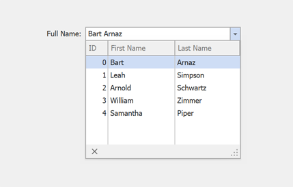
The image below shows the result.
See the following articles for more information:
- LookUp Standard Binding (Simple Data Types)
- LookUp Advanced Binding (Business Objects)
- How to Bind LookUp to a Dictionary
Allow Users to Enter New Values
Set the lookup’s TextEditStyle property to Standard to allow users to type in the text box. Handle the ProcessNewValue event to parse entered values and add new records to the lookup’s data source.

using DevExpress.Utils;
using DevExpress.XtraEditors;
using DevExpress.XtraEditors.Controls;
using System.ComponentModel.DataAnnotations;

public Form1() {
    InitializeComponent();
    // Binds the lookup to data.
    lookUpEdit1.Properties.DataSource = Task.GetSampleData();
    // Sets the lookup's data fields.
    lookUpEdit1.Properties.DisplayMember = "Caption";
    lookUpEdit1.Properties.ValueMember = "ID";
    // Sets the lookup's value.
    lookUpEdit1.EditValue = 0;
    // Enables adding new values.
    lookUpEdit1.Properties.TextEditStyle = TextEditStyles.Standard;
    lookUpEdit1.ProcessNewValue += new ProcessNewValueEventHandler(this.lookUpEdit1_ProcessNewValue);
}
private void lookUpEdit1_ProcessNewValue(object sender, ProcessNewValueEventArgs e) {
    if((string)e.DisplayValue == String.Empty) return;
    List<Task> dataSource = (sender as LookUpEdit).Properties.DataSource as List<Task>;
    dataSource.Add(new Task(dataSource.Count) { Caption = (string)e.DisplayValue});
    e.Handled = true;
}

public class Task {
    public Task(int id) {
        ID = id;
        CreateDate = DateTime.Today;
    }
    [Display(Order = -1)]
    public int ID { get; private set; }
    public string Caption { get; set; }
    public DateTime CreateDate { get; set; }
    public static List<Task> GetSampleData() {
        return new List<Task>() {
            new Task(0){Caption = "Research", CreateDate = new DateTime(2022, 10, 15)},
            new Task(1){Caption = "UI Design", CreateDate = new DateTime(2022, 11, 5)},
            new Task(2){Caption = "Environment Setup", CreateDate = new DateTime(2022, 11, 10)},
            new Task(3){Caption = "Sprint 1", CreateDate = new DateTime(2022, 11, 11)},
            new Task(4){Caption = "Sprint 2", CreateDate = new DateTime(2022, 12, 12)},
            new Task(5){Caption = "Sprint 3", CreateDate = new DateTime(2023, 1, 10)},
            new Task(6){Caption = "Testing", CreateDate = new DateTime(2022, 2, 10)}
        };
    }
}
Note
The LookUpEdit and GridLookUpEdit support ComboBox mode. In this mode, the lookups behave as a standard ComboBox control. Read the following topic for detailed information: ComboBox Mode for LookUp Controls.
Enable Multiple Item Selection
Important
Multiple item selection is supported only in the WinForms LookUpEdit control. GridLookUpEdit, TreeListLookUpEdit, and SearchLookUpEdit controls do not support this feature.
Set the EditValueType property to ValueList or CSVString to allow users to select multiple items.

Display a Checkbox Selector Column
You can display the checkbox selector column in two ways:
Create Columns Manually Before Data Binding
Use AddCheckBoxSelectorColumn() and RemoveCheckBoxSelectorColumn() methods to manually add and remove the checkbox selector column.
var lookUpEdit1 = new LookUpEdit() {
    EditValue = new List<object>() { 0, 1 }
};
lookUpEdit1.Properties.EditValueType = LookUpEditValueType.ValueList;

// Create lookup columns manually.
lookUpEdit1.Properties.Columns.AddRange(new LookUpColumnInfo[] {
    new LookUpColumnInfo("ID"),
    new LookUpColumnInfo("FirstName"),
    new LookUpColumnInfo("LastName"),
});

// Add a checkbox selector column manually.
lookUpEdit1.Properties.AddCheckBoxSelectorColumn();

// Bind the lookup to data and set data fields.
lookUpEdit1.Properties.DataSource = Employee.GetSampleData();
lookUpEdit1.Properties.DisplayMember = "FullName";
lookUpEdit1.Properties.ValueMember = "ID";

this.Controls.Add(lookUpEdit1);
Auto-Create Columns
If you do not define lookup columns manually, the LookUpEdit generates columns for all data fields when you bind it to a data source. The LookUpEdit also creates a checkbox selector column automatically.
Specify the EditValue Type
The EditValueType property specifies the data type of the EditValue property:
- ValueList
The
EditValueproperty returns a List<object> object with selected items.Use the EnableEditValueCollectionEditing property to bind
EditValueto a read-only collection property (for example, a HashSet<T>).- CSVString
- The
EditValueproperty returns a String with DisplayMember values of selected items, separated by SeparatorChar + space.
The following example activates multiple item selection. The example sets the lookup’s EditValue property to a list with IDs to select corresponding products on app startup. In this example, the LookUpEdit automatically creates a checkbox selector column.
using System.Windows.Forms;
using System.Collections.Generic;
using System.ComponentModel.DataAnnotations;
using DevExpress.XtraEditors;
using DevExpress.XtraEditors.Repository;

public partial class Form1 : XtraForm {
    public Form1() {
        InitializeComponent();
        lookUpEdit1.Properties.DataSource = ProductA.GetList();
        lookUpEdit1.Properties.DisplayMember = "Name";
        lookUpEdit1.Properties.ValueMember = "ID";
        lookUpEdit1.Properties.EditValueType = LookUpEditValueType.ValueList;
        lookUpEdit1.EditValue = new List<object>() {0, 1, 4};
    }
}
public class ProductA {
    int id;
    public ProductA(int id) {
        this.id = id;
    }
    [Display(Order = -1)]
    public int ID {
        get { return id; }
    }
    [Display(ShortName = "Bakery & Desserts")]
    public string Name { get; set; }
    [DisplayFormat(DataFormatString = "c2")]
    public double Price { get; set; }
    public static List<ProductA> GetList() {
        return new List<ProductA>() {
            new ProductA(0){ Name = "Butter Cake", Price = 56.99 },
            new ProductA(1){ Name = "Chocolate Pie ", Price = 89.99 },
            new ProductA(2){ Name = "Frozen Cookie Dough", Price = 54.99 },
            new ProductA(3){ Name = "Truffie Cake", Price = 59.99 },
            new ProductA(4){ Name = "Original Apple Pie", Price = 59.99 }
        };
    }
}
Bind the Selected State to a Property
Use the CheckBoxSelectorMember property bind item selection state to a data source field. The column created for this field becomes the selector column.

- The
LookUpEditupdates the bound field when users change selection. - The Cancel button is hidden in this mode.
EditValueis not populated automatically. Specify it explicitly to display selected items in the editor.
The following example binds selection to the “Selected” data field (with Boolean values):
public partial class Form1 : XtraForm {
    public Form1() {
        InitializeComponent();
        lookUpEdit2.Properties.DataSource = ProductB.GetList();
        lookUpEdit2.Properties.DisplayMember = "Name";
        lookUpEdit2.Properties.ValueMember = "ID";
        lookUpEdit2.Properties.CheckBoxSelectorMember = "Selected";
        lookUpEdit2.Properties.EditValueType = LookUpEditValueType.ValueList;
        lookUpEdit2.EditValue = new List<object>() {0, 1};
    }
}
public class ProductB {
    int id;
    public ProductB(int id) {
        this.id = id;
    }
    [Display(Order = -1)]
    public int ID {
        get { return id; }
    }
    [Display(ShortName = "Bakery & Desserts")]
    public string Name { get; set; }
    [DisplayFormat(DataFormatString = "c2")]
    public double Price { get; set; }
    public int InStock { get; set; }
    [Display(ShortName = "Add to Order")]
    public bool Selected { get; set; }
    public static List<ProductB> GetProductList() {
        return new List<ProductB>() {
            new ProductB(0){ Name = "Butter Cake", Price = 56.99, InStock = 50 },
            new ProductB(1){ Name = "Chocolate Pie ", Price = 89.99, InStock = 32 },
            new ProductB(2){ Name = "Frozen Cookie Dough", Price = 54.99, InStock = 0 },
            new ProductB(3){ Name = "Truffie Cake", Price = 59.99, InStock = 42 },
            new ProductB(4){ Name = "Original Apple Pie", Price = 59.99, InStock = 0}
        };
    }
}
If the bound field is not Boolean, handle he following events to convert values:
Control User Behavior
The LookUpEdit raises the following events when a user selects items in the popup:
| Method | Description |
|---|---|
| SelectionChanging | Occurs before a user selects an item in the editor’s popup. |
| SelectionChanged | Occurs after a user selects an item in the editor’s popup. |
Handle the SelectionChanging event and set the e.Cancel parameter to true to cancel item selection:
using DevExpress.XtraEditors.Controls;

public partial class Form1 : XtraForm {
    List<ProductB> products;
    public Form1() {
        InitializeComponent();
        //...
        lookUpEdit1.Properties.SelectionChanging += Properties_SelectionChanging;
    }
    private void Properties_SelectionChanging(object sender, PopupSelectionChangingEventArgs e) {
        e.Cancel = products[e.RecordIndex].InStock == 0;
    }
}
If the editor works in AutoSearch or AutoSuggest mode, users can type text in the edit box to search for items:

- AutoSearch Mode
- The
LookUpEditalways displays selected items regardless of the search string. - AutoSuggest Mode
- The
LookUpEdit‘s data source should always include selected items. Add these items to the suggestion collection in the AutoSuggest event handler to support the multiple items selection.
If the edit box contains selected items, users can edit only the last item.
Cascading Lookups
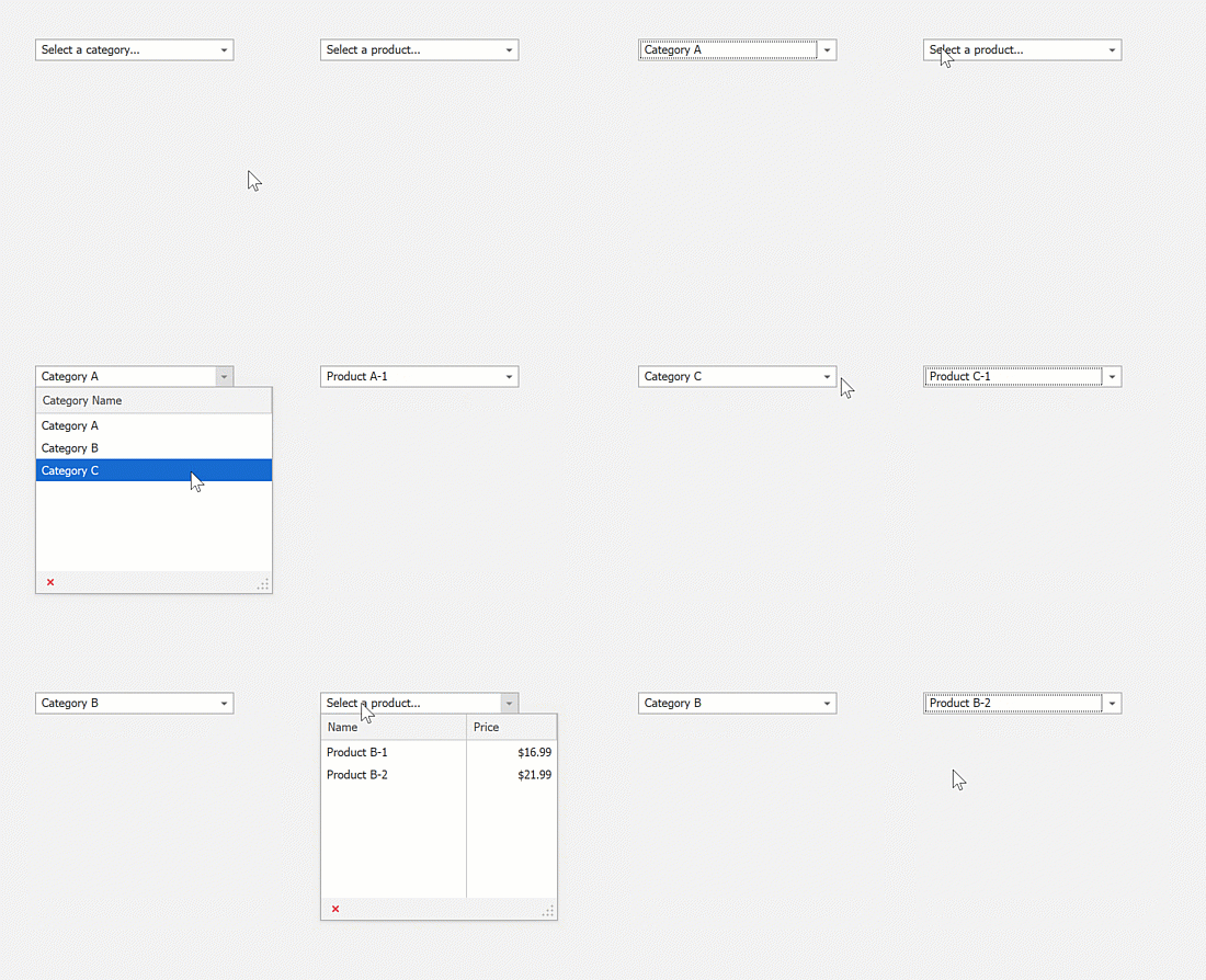
Lookups can filter their values based on the currently selected values of other lookups. See the following examples for detailed information:
- How to Implement Standalone Cascading Lookups
- How to Implement Cascading Lookups within Data Grid Control (In-Place Mode)
Unbound Columns
Lookups can display columns that are not bound to data source fields.
LookUpEdit – Handle the RepositoryItemLookUpEdit.GetNotInListValue event.
GridLookUpEdit, SearchLookUpEdit – Use the Grid Unbound Columns feature.
TreeListLookUpEdit – Use the TreeList Unbound Columns feature.
AutoSuggest and AutoSearch
A lookup can filter its records or suggest matching values as a user types.
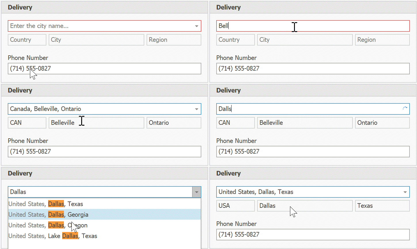
Read the corresponding sections in the LookUpEdit topic for detailed information and examples.
Tip
GridControl, GridLookUpEdit, and SearchLookUpEdit support AI-powered Semantic Search. Unlike standard keyword-based search, semantic search leverages Natural Language Processing (NLP) to analyze search queries beyond exact keyword matching. See the following help topic for additional information: Semantic Search.
Custom Filter Expression
Handle the LookUpEdit’s PopupFilter event to specify a custom filter expression.
using DevExpress.Data.Filtering;
using DevExpress.XtraEditors.Controls;

private void LookUpEdit1_PopupFilter(object sender, PopupFilterEventArgs e)
{
    e.Criteria = CriteriaOperator.Parse(string.Format("DeliveryDate < '{0}'", DateTime.Today));
}
Examples
- WinForms LookupEdit - Standard Binding (Simple Data Types)
- How to filter a Lookup column based on the value of another Lookup column in a Grid Control
- WinForms Lookup Editors - Combobox mode
- Create cascading lookup editors
- How to select multiple items in the WinForms Grid Lookup
- WinForms Data Grid - How to create an editable GridLookUpEdit with PopupContainerEdit
- Display custom text if the lookup’s value is not found in the drop-down list
- WinForms Lookup - Custom draw drop-down rows, cells, and column headers
- WinForms Lookup - Add an empty item to the drop-down list