Editors and Simple Controls
- 8 minutes to read
The DevExpress Editors suite includes three types of controls:
- Editors that can be used in stand-alone mode and embedded in cells of data-aware controls (for example, see the Cell Values, Editors, and Validation Data Grid help topic).
- Editors that can be used as stand-alone controls only.
- Utility components.
See the following topic for a complete list of included controls and components: Controls and Components included in XtraEditors Suite.
Demos:
Editor Architecture: Repositories and Repository Items
Any DevExpress editor that can be embedded into composite controls (Data Grid, Ribbon, etc.) stores its behavior settings, content settings, and event handlers in an object called a “repository item”.
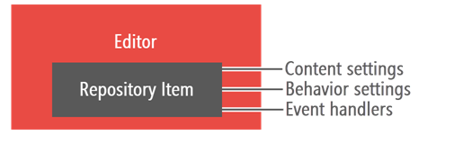
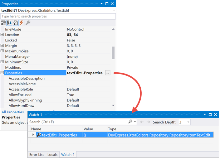
You can “see” a repository item if you drop an editor onto a form and inspect its settings in Visual Studio. All settings in the “Properties” group are owned by a repository item.
Composite controls like Data Grid store these repository items instead of real editors. When a user needs to edit data, the host control dynamically creates an editor from a repository item, and destroys this editor when it is no longer needed. This design improves application performance and reduces the resource consumption rate.
Create and Access Repository Items
A repository item is an object of a class whose name starts with “RepositoryItem”, followed by the related editor class name. For instance, a RepositoryItemTextEdit object is a repository item for a TextEdit editor, and a RepositoryItemDateEdit stores DateEdit settings.
To access a repository item, use the editor’s “Properties” setting.
using DevExpress.XtraEditors;

var myToggleSwitch = new ToggleSwitch();
myToggleSwitch.Width = 200;
// Access a repository item.
var repoItem = myToggleSwitch.Properties;
repoItem.OnText = "Enabled";
repoItem.OffText = "Disabled";
this.Controls.Add(myToggleSwitch);
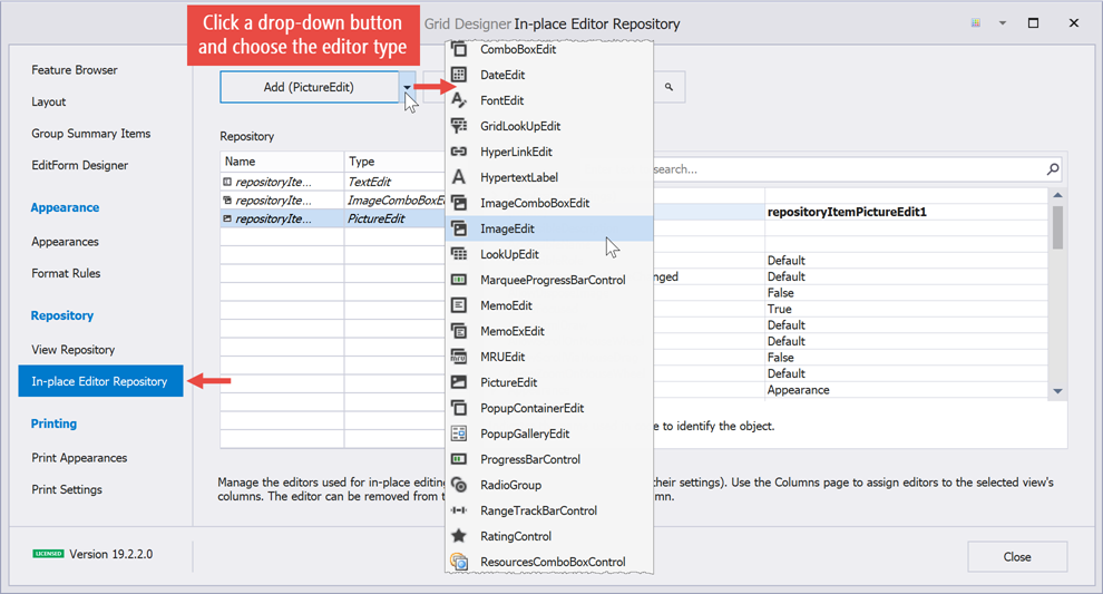
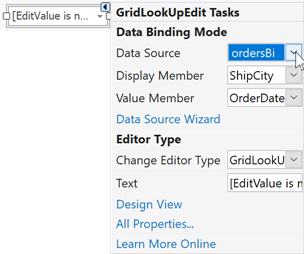
To embed editors in data-aware controls, use the designers of the controls in the image below.
You can also create repository items in code. To do so, add these items to a data-aware control’s RepositoryItems collection and assign them to columns or individual cells.
// Use a ToggleSwitch editor for the Boolean "Mark" column.
RepositoryItemToggleSwitch edit = new RepositoryItemToggleSwitch();
edit.OnText = "Enabled";
edit.OffText = "Disabled";
gridControl.RepositoryItems.Add(edit);
gridView.Columns["Mark"].ColumnEdit = edit;
You can also add repository items to an external repository (the PersistentRepository class object) instead of the internal storage of individual controls. This allows you to share editors across all controls that are bound to this storage.
The following example shows how to handle the events of repository items.
using DevExpress.XtraEditors;

private void repositoryItemLookUpEdit1_CloseUp(object sender, DevExpress.XtraEditors.Controls.CloseUpEventArgs e) {
    // Gets the the editor created by a container control (e.g. Data Grid) from a repository item (RepositoryItemLookUpEdit).
    LookUpEdit lookUpEdit = sender as LookUpEdit;
    /*
        Implement the event handler.
    */
}
Editor Value
A textbox-based editor’s Text and EditValue properties specify their current value. These properties override the corresponding BaseEdit virtual properties.
- BaseEdit.EditValue — returns the object that is the actual editor value, stored internally.
- BaseEdit.Text — the string representation of the EditValue visible to users.
A TextEdit with default settings returns the same string value for both properties.
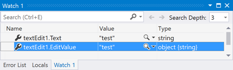
However, in the majority of cases the Text differs from the EditValue.
- The editor stores non-string values. For example, a SpinEdit.

- The edit value was formatted (see the RepositoryItem.DisplayFormat and RepositoryItem.EditFormat properties).

- The editor has an input Mask.

Tip
Read the following help topic for information and examples on how to set up the DevExpress Lookup Editor:
EditValue in Multi-Item Editors
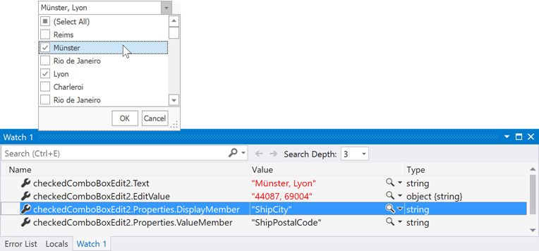
If an editor has multiple child items (radio buttons in a RadioGroup, checkbox items in a CheckedComboBoxEdit, etc.), each item has a unique value. When a user checks an item, its value is assigned to the editor’s EditValue (or added to it if the editor supports multiple checked items).
In the code sample below, the editor’s EditValue is a string that contains comma-separated values of every child item.
var ri = checkedComboBoxEdit1.Properties;
//parameter #1 - value, parameter #2 - item caption
ri.Items.Add(1, "Integer item");
ri.Items.Add(true, "Boolean item");
ri.Items.Add("Hello", "String item");
ri.Items.Add(Color.Red, "Color item");

checkedComboBoxEdit1.CheckAll();
// Text: "Integer item, Boolean item, String item, Color item" (string)
// EditValue: "1, True, Hello, Color [Red]" (string)
Tip
A CheckedComboBoxEdit can also store the values of checked items as a List object, assigned to the EditValue. To do this, change the RepositoryItemCheckedComboBoxEdit.EditValueType property to List.
EditValue in Data-Bound Editors
EditValue and Text property values of data-bound editors (lookups) depend on what data field you bind to the following properties:
- ValueMember — gets or sets a data field whose cell value is assigned to the EditValue property.
- DisplayMember — a data field whose cell value is assigned to the Text property.
Tip
Read the following help topic for information and examples on how to set up the DevExpress Lookup Editor:
Bind Editors to Data
Single-Value Editors
Single-value editors (TextEdit, ButtonEdit, CheckEdit, etc.) can be bound to the current data source record. To do that, expand the DataBindings section in the Visual Studio “Properties” window, click the ellipsis button in the “Advanced” row, and bind a data field to the EditValue property.
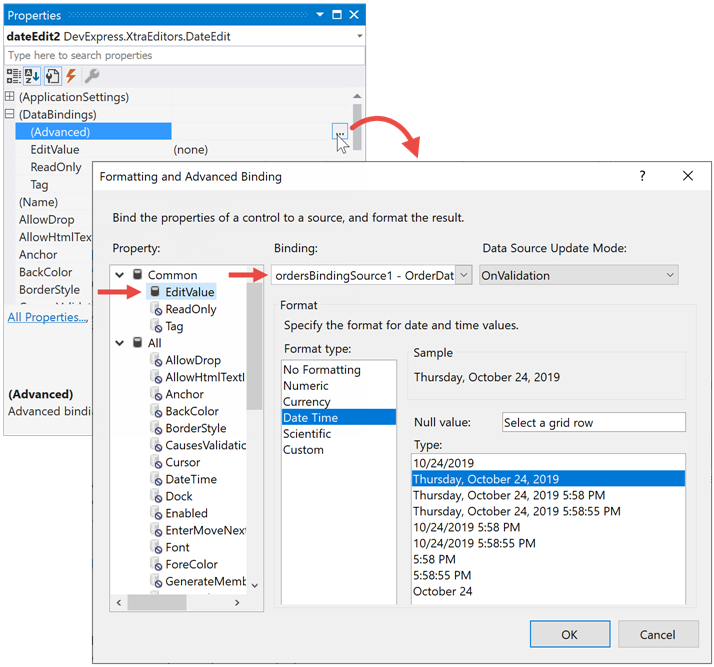
dateEdit2.DataBindings.Add(new System.Windows.Forms.Binding(
    "EditValue", this.ordersBindingSource1, "OrderDate", true,
    System.Windows.Forms.DataSourceUpdateMode.OnValidation));
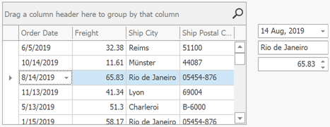
Single-value editors display values from the current source record only. To display a value from a different row, use a control or a component bound to the same data source that can traverse source records. In the figure below, editors display values of a data source record when a user selects a corresponding Data Grid row.
Lookups and other Bindable Multi-Value Editors
Editors with the DataSource property (LookUpEdit, GridLookUpEdit, SearchLookUpEdit, TreeListLookUpEdit, BaseListBoxControl descendants) can retrieve values from a data source.
Tip
Read the following help topic for information and examples on how to set up the DevExpress Lookup Editor:
Multi-Value Editors without the DataSource Property
Editors in this group (ComboBoxEdit, BreadCrumbEdit, TokenEdit, ColorEdit, etc.) cannot be bound to a source directly. Instead, process data source records and initialize new editor items.
The example below illustrates how to fill a TokenEdit with items that correspond to records stored in the “northwindDataSet”.
public void FillTokenEditor() {
    foreach (DataRow Row in northwindDataSet1.Products.Rows) {
        TokenEditToken token = new TokenEditToken() {
            Value = Row["ProductID"],
            Description = Row["ProductName"].ToString()
        };
        tokenEdit1.Properties.Tokens.Add(token);
    }
}
Bind to Enumerations
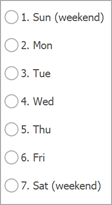
If an editor’s repository item exposes the AddEnum and AddEnum<T> methods, you can populate this editor with enumeration values.
public enum Day
{
    Sat = 7,
    Sun = 1,
    Mon = 2,
    Tue = 3,
    Wed = 4,
    Thu = 5,
    Fri = 6
};

tokenEdit1.Properties.AddEnum(typeof(Day));
You can change item captions with the System.ComponentModel.Description attribute:
public enum Day
{
    [Description("Saturday")]
    Sat = 7,
    [Description("Sunday")]
    Sun = 1,
    //. . .
};
Alternatively, you can use custom converters assigned as parameters to typed AddEnum methods:
radioGroup1.Properties.AddEnum<Day>(new Converter<Day, string>(MyConverter));

public static string MyConverter(Day d)
{
    Type dayType = d.GetType();
    Type dayUnderlyingType = Enum.GetUnderlyingType(dayType);
    string result = Convert.ChangeType(d, dayUnderlyingType).ToString() + ". " + d.ToString();
    if (d == Day.Sat || d == Day.Sun) result += " (weekend)";
    return result;
}
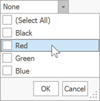
The CheckedComboBoxEdit editor also allows you to call the RepositoryItemCheckedComboBoxEdit.SetFlags(Type) method to generate values based on bit-wise (flag) enumerators.
checkedComboBoxEdit1.Properties.SetFlags(typeof(MultiHue));

[Flags]
public enum MultiHue
{
    None = 0,
    Black = 1,
    Red = 2,
    Green = 4,
    Blue = 8
};
The following figure illustrates the result. Note that the zero-value flag (“None”) is not present in the drop-down menu but is selected when all other items are unchecked.