LayoutGroup.GroupBorderStyle Property
Gets or sets the group’s border style. This option is in effect when the LayoutGroup is used to combine layout items. This is a dependency property.
Namespace: DevExpress.Xpf.Docking
Assembly: DevExpress.Xpf.Docking.v26.1.dll
Declaration
Property Value
| Type | Description |
|---|---|
| GroupBorderStyle | A GroupBorderStyle value that specifies the group’s border style. |
Available values:
| Name | Description |
|---|---|
| NoBorder | A container has no borders. |
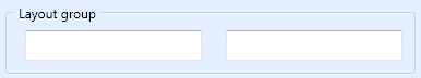
| Group | A container is displayed with borders and a caption.
|
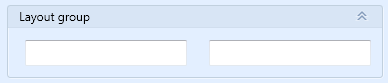
| GroupBox | A container is displayed with borders and a title bar.
|
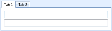
| Tabbed | Child items are displayed as tabs.
|
Remarks
Set the BaseLayoutItem.ShowCaption property to false to hide the group’s caption that the BaseLayoutItem.Caption property specifies.
You can increase indents for groups without borders. Refer to the LayoutGroup.HasAccent for more information.
Note
Group border styles can vary based on the application’s DevExpress Theme.
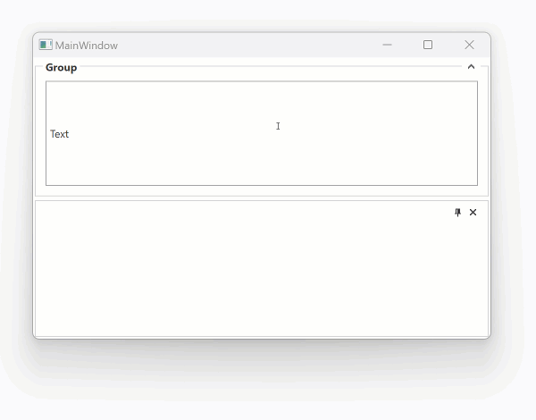
Expand a LayoutGroup on the TitleBar Click
The following code snippet expands the myGroup LayoutGroup when you click its group box title:
<Window ...
        xmlns:dxe="http://schemas.devexpress.com/winfx/2008/xaml/editors"
        xmlns:dxdo="http://schemas.devexpress.com/winfx/2008/xaml/docking">
    <dxdo:DockLayoutManager >
        <dxdo:LayoutGroup Orientation="Vertical" >
            <dxdo:LayoutGroup Name="myGroup" GroupBorderStyle="GroupBox" Caption="Group" ShowCaption="True"  PreviewMouseLeftButtonUp="myGroup_PreviewMouseLeftButtonUp">
                <dxdo:LayoutControlItem>
                    <dxe:TextEdit EditValue="Text"/>
                </dxdo:LayoutControlItem>
                <dxdo:LayoutGroup.CaptionTemplate>
                    <DataTemplate>
                        <TextBlock Background="White" PreviewMouseLeftButtonDown="TextBlock_PreviewMouseLeftButtonDown" Text="{Binding}" />
                    </DataTemplate>
                </dxdo:LayoutGroup.CaptionTemplate>
            </dxdo:LayoutGroup>
            <dxdo:LayoutPanel/>
        </dxdo:LayoutGroup>
    </dxdo:DockLayoutManager>

</Window>
using System;
using DevExpress.Xpf.Docking;

// ...

    private void myGroup_PreviewMouseLeftButtonUp(object sender, System.Windows.Input.MouseButtonEventArgs e) {
        LayoutGroup layoutGroup = (LayoutGroup)sender;
        if (layoutGroup != null) {
            if (!layoutGroup.IsExpanded) {
                layoutGroup.Expanded = true;
                e.Handled = true;
            }
        }
    }
Related GitHub Examples
The following code snippet (auto-collected from DevExpress Examples) contains a reference to the GroupBorderStyle property.
Note
The algorithm used to collect these code examples remains a work in progress. Accordingly, the links and snippets below may produce inaccurate results. If you encounter an issue with code examples below, please use the feedback form on this page to report the issue.