DXExpander Class
Represents the DXExpander control.
Namespace: DevExpress.Xpf.Core
Assembly:
DevExpress.Xpf.Core.v25.2.dll
NuGet Package:
DevExpress.Wpf.Core
Declaration
public class DXExpander :
    Decorator
Public Class DXExpander
    Inherits Decorator
The following members return DXExpander objects:
The DXExpander control enables you to make your user interface elements expandable. The DXExpander’s content can be expanded or collapsed with a predefined or custom animation.
The DXExpander‘s expand state is specified via the DXExpander.IsExpanded property. When the DXExpander.IsExpanded property’s value is changed, the DXExpander plays the collapse or expand animation. To obtain the current progress of animation play, use the DXExpander.AnimationProgress property. To obtain whether the DXExpander is currently expanding or collapsing, use the DXExpander.Expanding and DXExpander.Collapsing properties, respectively.
The DXExpander can play two types of animation: horizontal and vertical, and provides three animation styles for each type. The horizontal animation styles are used to display content collapsing or expanding from left to right, from right to left, or from center to edges. The vertical animation styles represent top-to-bottom, bottom-to-top and center-to-edges animation. Animation styles are specified by the DXExpander.HorizontalExpand and DXExpander.VerticalExpand properties. You can also specify the animation speed via the DXExpander.Duration property.
The DXExpander‘s content can be either stretched or slid when expanding or collapsing. The animation effect used to show the content is specified by the DXExpander.StretchChild property.
To implement a custom collapse or expand animation, create a Storyboard object representing the animation storyboard, and assign it to the DXExpander.CollapseStoryboard or DXExpander.ExpandStoryboard property, respectively.
Example
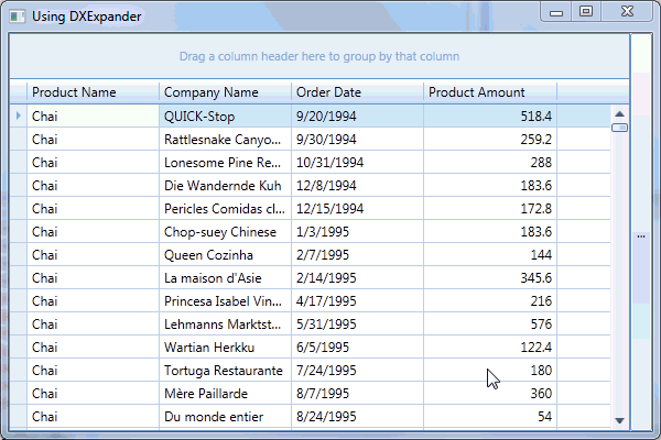
The following example demonstrates how to make visual elements expandable via the DXExpander.In this example, the DXExpander with a GroupBox inside it is placed into a standard Grid. The DXExpander can be expanded (or collapsed) by clicking the ellipsis button. This shows or hides the GroupBox.
<Application x:Class="DXExpander_CreatingAndUsing.App"
             xmlns="http://schemas.microsoft.com/winfx/2006/xaml/presentation"
             xmlns:x="http://schemas.microsoft.com/winfx/2006/xaml"
             StartupUri="MainWindow.xaml">
    <Application.Resources>

    </Application.Resources>
</Application>
Imports System.Windows
Imports DevExpress.Xpf.Core
Imports System.Collections.ObjectModel

Namespace DXExpander_CreatingAndUsing
    Partial Public Class MainWindow
        Inherits Window

        Public Sub New()
            InitializeComponent()
            Me.DataContext = New MyViewModel()
            ApplicationThemeHelper.ApplicationThemeName = "Office2016White"

        End Sub
        Private Sub Button_Click(ByVal sender As Object, ByVal e As RoutedEventArgs)
            expander.IsExpanded = Not expander.IsExpanded
        End Sub
        Private Sub rbAzure_Checked(ByVal sender As Object, ByVal e As RoutedEventArgs)
            If gridControl1 Is Nothing Then
                Return
            End If
            If rbAzure.IsChecked = True Then
                ApplicationThemeHelper.ApplicationThemeName = "Office2016White"
            End If
        End Sub
        Private Sub rbGray_Checked(ByVal sender As Object, ByVal e As RoutedEventArgs)
            If gridControl1 Is Nothing Then
                Return
            End If
            If rbGray.IsChecked = True Then
                ApplicationThemeHelper.ApplicationThemeName = "LightGray"
            End If
        End Sub
        Private Sub rbOfficeBlack_Checked(ByVal sender As Object, ByVal e As RoutedEventArgs)
            If gridControl1 Is Nothing Then
                Return
            End If
            If rbOfficeBlack.IsChecked = True Then
                ApplicationThemeHelper.ApplicationThemeName = "Office2007Black"
            End If
        End Sub
        Private Sub rbOfficeBlue_Checked(ByVal sender As Object, ByVal e As RoutedEventArgs)
            If gridControl1 Is Nothing Then
                Return
            End If
            If rbOfficeBlue.IsChecked = True Then
                ApplicationThemeHelper.ApplicationThemeName = "Office2007Blue"
            End If
        End Sub
        Private Sub rbOfficeSilver_Checked(ByVal sender As Object, ByVal e As RoutedEventArgs)
            If gridControl1 Is Nothing Then
                Return
            End If
            If rbOfficeSilver.IsChecked = True Then
                ApplicationThemeHelper.ApplicationThemeName = "Office2007Silver"
            End If
        End Sub
    End Class

    Partial Public Class Person
        Public Sub New()

        End Sub
        Public Sub New(ByVal i As Integer)
            FirstName = "FirstName" & i
            LastName = "LastName" & i
            Age = i * 10

        End Sub

        Private _firstName As String
        Public Property LastName() As String
        Private _age As Integer

        Public Property FirstName() As String
            Get
                Return _firstName
            End Get
            Set(ByVal value As String)
                _firstName = value
            End Set
        End Property

        Public Property Age() As Integer
            Get
                Return _age
            End Get
            Set(ByVal value As Integer)
                _age = value
            End Set
        End Property
    End Class
    Partial Public Class MyViewModel
        Public Sub New()
            CreateList()
        End Sub

        Public Property ListPerson() As ObservableCollection(Of Person)

        Private Sub CreateList()
            ListPerson = New ObservableCollection(Of Person)()

            For i As Integer = 0 To 9
                Dim p As New Person(i)
                ListPerson.Add(p)
            Next i
        End Sub
    End Class
End Namespace
Imports System
Imports System.Collections.Generic
Imports System.Configuration
Imports System.Data
Imports System.Linq
Imports System.Windows

Namespace DXExpander_CreatingAndUsing
    ''' <summary>
    ''' Interaction logic for App.xaml
    ''' </summary>
    Partial Public Class App
        Inherits Application

        Private Sub OnAppStartup_UpdateThemeName(ByVal sender As Object, ByVal e As StartupEventArgs)

        End Sub
    End Class
End Namespace
<Window x:Class="DXExpander_CreatingAndUsing.MainWindow"
        xmlns="http://schemas.microsoft.com/winfx/2006/xaml/presentation"
        xmlns:x="http://schemas.microsoft.com/winfx/2006/xaml"
        xmlns:dx="clr-namespace:DevExpress.Xpf.Core;assembly=DevExpress.Xpf.Core.v16.1"
        xmlns:dxg="http://schemas.devexpress.com/winfx/2008/xaml/grid"
        xmlns:dxe="http://schemas.devexpress.com/winfx/2008/xaml/editors"
        Title="Using DXExpander" Height="400" Width="600">
    <Grid x:Name="LayoutRoot" Background="White">
        <Grid.ColumnDefinitions>
            <ColumnDefinition Width="*" />
            <ColumnDefinition Width="20" />
            <ColumnDefinition Width="Auto" />
        </Grid.ColumnDefinitions>
        <Button Grid.Column="1" Content="..." Click="Button_Click" />
        <dx:DXExpander x:Name="expander" Grid.Column="2" FlowDirection="LeftToRight"
                       VerticalExpand="None" HorizontalExpand="FromLeftToRight"
                       IsExpanded="False">
                <GroupBox Header="Application Theme:" VerticalAlignment="Center"
                          Margin="5,0,5,0">
                    <StackPanel>
                    <RadioButton x:Name="rbAzure" Content="Office2016White"
                                     Checked="rbAzure_Checked" Margin="0,5,0,2" IsChecked="True" />
                        <RadioButton x:Name="rbGray" Content="Light Gray"
                                     Checked="rbGray_Checked" Margin="0,2,0,2" />
                        <RadioButton x:Name="rbOfficeBlack" Content="Office 2007 Black"
                                     Checked="rbOfficeBlack_Checked" Margin="0,2,0,2" />
                        <RadioButton x:Name="rbOfficeBlue" Content="Office 2007 Blue"
                                     Checked="rbOfficeBlue_Checked"
                                     Margin="0,2,0,2" />
                        <RadioButton x:Name="rbOfficeSilver" Content="Office 2007 Silver"
                                     Checked="rbOfficeSilver_Checked" Margin="0,2,0,0" />
                    </StackPanel>
                </GroupBox>
        </dx:DXExpander>
        <dxg:GridControl x:Name="gridControl1" AutoGenerateColumns="AddNew" ItemsSource="{Binding ListPerson}">
            <dxg:GridControl.View>
                <dxg:TableView />
            </dxg:GridControl.View>
        </dxg:GridControl>
    </Grid>
</Window>
using System.Windows;
using DevExpress.Xpf.Core;
using System.Collections.ObjectModel;

namespace DXExpander_CreatingAndUsing {
    public partial class MainWindow : Window {
        public MainWindow() {
            InitializeComponent();
            this.DataContext = new MyViewModel();
            ApplicationThemeHelper.ApplicationThemeName = "Office2016White";

        }
        private void Button_Click(object sender, RoutedEventArgs e) {
            expander.IsExpanded = !expander.IsExpanded;
        }
        private void rbAzure_Checked(object sender, RoutedEventArgs e) {
            if (gridControl1 == null)
                return;
            if (rbAzure.IsChecked == true)
                ApplicationThemeHelper.ApplicationThemeName = "Office2016White";
        }
        private void rbGray_Checked(object sender, RoutedEventArgs e) {
            if (gridControl1 == null)
                return;
            if (rbGray.IsChecked == true)
                ApplicationThemeHelper.ApplicationThemeName = "LightGray";
        }
        private void rbOfficeBlack_Checked(object sender, RoutedEventArgs e) {
            if (gridControl1 == null)
                return;
            if (rbOfficeBlack.IsChecked == true)
                ApplicationThemeHelper.ApplicationThemeName = "Office2007Black";
        }
        private void rbOfficeBlue_Checked(object sender, RoutedEventArgs e) {
            if (gridControl1 == null)
                return;
            if (rbOfficeBlue.IsChecked == true)
                ApplicationThemeHelper.ApplicationThemeName = "Office2007Blue";
        }
        private void rbOfficeSilver_Checked(object sender, RoutedEventArgs e) {
            if (gridControl1 == null)
                return;
            if (rbOfficeSilver.IsChecked == true)
                ApplicationThemeHelper.ApplicationThemeName = "Office2007Silver";
        }
    }

    public partial class Person {
        public Person() {

        }
        public Person(int i) {
            FirstName = "FirstName" + i;
            LastName = "LastName" + i;
            Age = i * 10;

        }

        string _firstName;
        public string LastName { get; set; }
        int _age;

        public string FirstName {
            get { return _firstName; }
            set {
                _firstName = value;
            }
        }

        public int Age {
            get { return _age; }
            set { _age = value; }
        }
    }
    public partial class MyViewModel {
        public MyViewModel() {
            CreateList();
        }

        public ObservableCollection<Person> ListPerson { get; set; }

        void CreateList() {
            ListPerson = new ObservableCollection<Person>();

            for (int i = 0; i < 10; i++) {
                Person p = new Person(i);
                ListPerson.Add(p);
            }
        }
    }
}
See Also