Views
- 2 minutes to read
The NavBarControl content is organized using Groups and Items. The content layout is realized via Views. The View specifies the way in which groups and their contents are displayed on screen. Views manage the location and visual representation of the NavBarControl elements, and respond to end-user actions, such as expanding/collapsing groups, clicking items, etc.
The NavBarControl provides the following view types.
Explorer Bar View | Side Bar View | Navigation Pane View |
|---|---|---|
|
|
|
This view is implemented by the ExplorerBarView type.
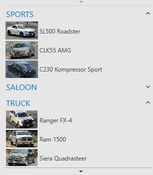
The view emulates the explorer bars found in Microsoft Explorer. Groups are arranged one under another. End-users can expand/collapse each group individually. | This view is implemented by the SideBarView type.
The view is similar to the side bars found in Microsoft Outlook, prior to version 2003. Only one group’s content can be visible at a time. End-users can click the required group’s header to make that group’s content visible. Clicking a collapsed group’s header expands the corresponding group, and collapses the previously expanded group. | This view is implemented by the NavigationPaneView type.
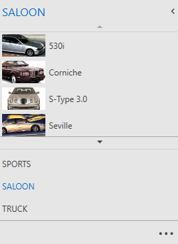
The behavior and appearance of this view is similar to the Navigation Pane found in Microsoft Outlook 2007. Only one group’s content can be visible at a time. End-users can activate a group by clicking its header. The Navigation Pane (that is the entire NavBarControl) can be collapsed/expanded by a click on the header section’s expand button in the same manner as the Navigation Pane in Microsoft Office® 2007. The NavigationPaneView.MaxVisibleGroupCount property specifies how many visible group headers can be displayed within the group button panel. Use the NavigationPaneView.IsOverflowPanelVisible property to control the visibility if the overflow panel. |

Use the control’s NavBarControl.View property to apply a View to a NavBarControl,.
<dxn:NavBarControl x:Name="NavBar" >
            <dxn:NavBarControl.View>
                <dxn:ExplorerBarView />
            </dxn:NavBarControl.View>
        ...
        </dxn:NavBarControl>
Each view contains a set of common and view-specific properties that allow you to customize the layout and appearance of view elements.